 |
|
The kitchen, once hidden behind a sliding door, now opens onto the main living space. The result? Distinct, aesthetically harmonious zones rather than separate rooms. A neutral palette, streamlined furniture, and ingenious storage keep the look uncluttered. : : : View Photo Gallery |
Architect Peter Roesch first came to Chicago as a young graduate student seeking to learn from the master of modernism, Ludwig Mies van der Rohe. Today, more than 50 years later, he is still guided by Mies’s famous “less is more” aesthetic. The studio apartment he and his wife Biba recently renovated and decorated as a city pied-à-terre—in a Mies building, naturally—occupies only 500 square feet, but feels as open and uncluttered as a far larger home. Biba, who handled the decorating, says the key is to carefully consider how each element relates to and enhances the overall space. “Everything should be restful and harmonious, like a Zen garden,” she says. For the Roesches, that meant neutral colors, streamlined modern furniture, and ample hidden storage.
 |
|
A large painting (untitled) by artist Lynda Jarman draws the eye upward while Barcelona chairs suit |
The result was so successful that when the couple decided to sell the apartment, their friends Tracy and Irv Kupferberg bought the studio as is, furniture included. “It’s very rare to have a client who lets you do what you want,” Peter says. “But I’ve never had a client say, ‘Don’t change a thing!’”
The space is divided into two distinct zones, which provide the illusion of separate rooms without cutting up the space. Previously, the kitchen had been concealed behind a sliding door, making it look “like a giant crate in the middle of the room,” according to Peter. He removed the door and tucked all the appliances along one wall, where they blend in with the black cabinets and countertops. “It looks more like a bar than a kitchen,” he says.
Fitting all the kitchen necessities into such a compact space involved creative problem solving. Since just two people would be living in the apartment, Peter installed a two-burner stove and a mini-dishwasher instead of full-size appliances. He also ditched the standard refrigerator, buying an undercounter freezer and a small fridge that’s installed alongside the upper cabinets. Rehanging the door upside down made the refrigerator’s handle easy to reach.
 |
|
Colorful glass on floor-to-ceiling shelves provides bright touches. : : : View Photo Gallery |
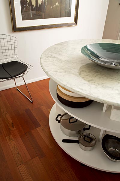
To keep the kitchen from looking crowded, storage is cleverly concealed everywhere. The space between the top of the cabinets and the ceiling was enclosed with doors so it could function as a cupboard. Additional drawers and shelves are hidden under the marble-topped kitchen table. Keeping the streamlined look going are a stainless steel backsplash and handle-less cabinets. “By rehanging the cabinet doors slightly lower,” Peter says, “you can simply grab underneath to open them.”
In the living room, a modern black leather couch folds out into a bed; sliders were added to the bottom of the coffee table so it could be moved out of the way easily. Scattered throughout the apartment are iconic pieces of modern design, including Barcelona chairs in the living room, Knoll Bertoia chairs in the kitchen, and a PH lamp hanging from the kitchen ceiling. (This last piece, originally created by renowned Danish designer Poul Henningsen, is a nod to Biba, who grew up in Denmark.) But the Roesches have no problem mixing high and low. Most of the furniture and accessories are reproductions from European Furniture Warehouse; kitchen cabinets are from Ikea.
Floor-to-ceiling bookshelves along one wall of the living room provide ample storage for Tracy’s collection of glass art and her favorite books. The seemingly simple shelves were carefully designed by Roesch with recessed sections that cast subtle shadows, adding visual interest and a sense of dimension. “It’s more difficult to get away with less and still make it beautiful,” Peter says.
 |
|
Shelves are built into one side of the table base : : : View Photo Gallery |
He is passing on that Miesian sentiment to a younger generation at the Illinois Institute of Technology, where he is a professor of architecture. “Mies was a very quiet man,” he says. On one occasion, Peter recalls, he drew up a project that was very simple—maybe too simple. Showing it to his teacher, Peter began pointing out sections where he thought he might add details to make the building more interesting. Mies’s response? “Don’t make it interesting. Make it good.”
In this compact apartment, the Roesches created something both good and interesting—a home with style as well as practicality. “Living in a Mies building is like living in a piece of art,” says Biba. No doubt Mies would feel right at home.
Photography: Alan Shortall
Styling: Diane Ewing