|
Photography: Tyllie Barbosa
 |
 |
 |
Terry Ledford is a color fanatic. "I’m fascinated by it. I’m inspired by it. I love it," he says. A former visual manager for Ann Taylor and Banana Republic, Ledford has channeled this love into his new home furnishings store, the shabby-chic-meets-city-chic White Attic (5408 N. Clark St., 773-907-9800). There, pops of bright pink and green peek from dresser drawers, and shelves display creamware next to intensely hued throws, candles, and vases. "Every time I’m in a room, I stand back and ask myself, ‘What do I like about these colors? What’s not appealing to me?’" he says. "I ask for feedback from others. I always try to learn more." Here, Ledford-who also does in-home color consulting-shares tips and strategies for coloring your world.
The Element of Surprise
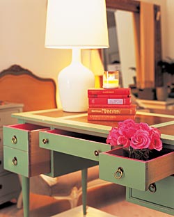
Ledford’s inspiration for the hidden bursts of color in his store is pulled largely from his years in the apparel industry. "I paint the insides of my pieces to add something special for the owner," he says. "It’s like a great crocodile bag with a fuchsia silk lining, or sexy lingerie that only you know you’re wearing. It just brings a smile to your face."
Consider painting the insides of drawers or cupboards a color that’s compatible with the exterior of the piece, but not the shade you wish to have on permanent display. If you’re redoing the outside, try hand-scuffing layers of paint for a calming, broken-in look, as Ledford does with furniture in his store. "The beauty of furniture like that," he says, "is that almost anything that happens to it down the road will only add character."
Go With the Flow
Before raising a paintbrush to any wall in your home, stop and consider the adjacent rooms. "Often people love each room in their home individually, but they know something is a bit off as they walk from room to room," Ledford says. "A lot of times it’s just the color relationships." He recently worked with a client who could see her dining room, living room, and entryway from her kitchen. For each space, Ledford chose a coordinating color: The entryway became buttercream, the living room a soft celadon green, the dining room a darker celadon. The trim throughout was painted white, which unified the spaces.
"Don’t be afraid to repeat a color," he says. "The objective of flowing color isn’t to create a house of many colors; it’s to enhance color relationships from room to room. It’s about giving the eyes a rest. It should be pleasing, not jarring." Plan your ideal color flow for your whole space from the start. "It helps you avoid costly mistakes," Ledford says. "Even if you don’t have the luxury of painting every room at once, at least you’ll have a color map you can follow as your budget allows."
The Right White
All-white rooms don’t have to look sterile. "Mix a matte buttercream wall, bright white trim, and ivory cashmere throws. Coordinate the tones; don’t match them," Ledford suggests. Or try painting walls with alternating 12-inch stripes of matte and glossy finishes in the same white. "It provides texture without being obvious," he says.
Flooding a room with white can be dramatic, but choose the shade carefully. (Differences that look slight on color chips speak much more loudly when the paint is on the walls.) Warm whites, such as cream or ivory, tend to go better with peaches, yellows, and brown-infused reds; whites with a blue or green cast to them blend well with turquoises, grays, and pinks. Then again, warmer whites can also add depth to a cool-colored room. Just be sure to stick to the same shade family. "White is sexy," Ledford says. "It’s the chameleon of color because it works with everything."