In the wake of the Great Depression, as Franklin Roosevelt began his first term, half of all American homeowners were behind on their mortgages. He resolved to do something quickly, and created the Home Owners Loan Corporation, or HOLC. Eventually it would lend $3.5 billion (almost $850 billion in current dollars) for one million new mortgages, and own about 20 percent of all mortgages in the country.
HOLC's 20,000 employees used qualitative and quantitative methods to create risk maps unlike anything that had ever existed in the country—outstripping even the data collection of the U.S. Census.
"The HOLC redlining maps are like the Rosetta stone of 20th century cities in the U.S.," says LaDale Winling, an assistant professor of history at Virginia Tech. Winling is one of the many academics behind the new site Mapping Inequality, which is putting those HOLC "security maps," from almost 250 cities including Chicago, online.
As I've written before, Chicago's academic and business communities were immensely influential within the national real-estate industries and within HOLC (and the Federal Housing Administration), and the city was extremely well documented by the agency.
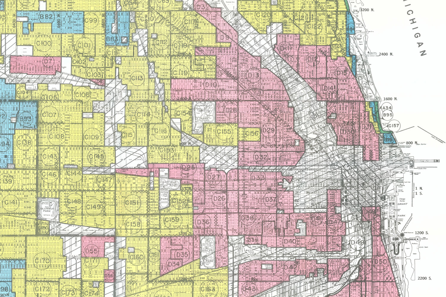
HOLC's map of Chicago is chilling. Of its four grades (A for "best," pictured in green; B, shaded blue, for "still desirable"; C, in yellow, for "definitely declining"; and D for "hazardous," shaded pink), just four percent of the city got an A grade and 17 percent got a B grade. Fully half the city was rated "definitely declining," and 29 percent "hazardous"—including most of the South Side and the city's core.

"[In the mid '30s,] we've had this first wave of the Great Migration up to Chicago. There's been five years of a lack of investment, whether it's in the Black Belt, or whether it's in some of these immigrant neighborhoods," Winling says. "Where there is continuing waves of immigration, of African-Americans, or European immigrants, or ruralites coming into the city, business leaders are not seeing them as potentially a great source of new wealth or new customers. They're only seeing and focusing on the dismal aspects of many of these places."
But Mapping Inequality has more than just the graded maps; it has qualitative descriptions of neighborhoods as perceived by local experts at the time. And they're no less chilling. I've written before about how the research of Chicago land economist Homer Hoyt, who correlated ethnicities with property values, made its way into HOLC and FHA evaluations.
"[Hoyt's] work, One Hundred Years of Land Values in Chicago and The Structure and Growth of Residential Areas in American Cities, is very, we'll say, blunt, and in some ways almost racist (but not just against African-Americans) about who has the ability to maintain a quality neighborhood," Winling says. "Hoyt has a hierarchy of who can keep a neighborhood nice, or who are the most detrimental forces or factors in neighborhood deterioration. He's one of the guys who is leading this project."
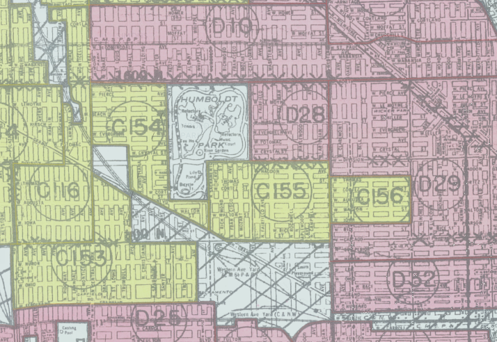
Take area D28, bordered by Humboldt Park, Western Avenue, North Avenue, and Division Street:
This is a very mixed district of congested appearance and changing character. The population is largely lower class Jewish, but there is at the present time a moderate infiltration of Polish families. The favorable influence of this population shift is minimized by threatening Negro infiltration along the eastern edge…. Properties immediately adjoining Humboldt Blvd. are perhaps more desirable than others, but the section as a whole is of such heterogeneous character that it is graded fourth class.
Or C68, a big area in Rogers Park extending from Devon almost up to Touhy:
[A]lthough there are few of the original owners still living there most of the better class people have moved to other neighborhood. This has been predominantly Jewish for 10 to 15 years, and the continuing infiltration is occurring, but those families coming in now are of a lower class than those already in the neighborhood. It is a typical Jewish section with the children playing all over the street, and properties generally showing lack of respect by tenants…. [T]he fact that is is practically 80 per cent Jewish limits its appeal to other than this class of resident, and it is most doubtful that any reversal of the present down trend can be expected.

Neighborhoods were downgraded for reasons other than race and poverty; raters took a dim view of density, turnover, and proximity to anything but the finest businesses. One of only A-grade neighborhoods outside the far North and Southwest Sides was a tiny strip of the Gold Coast along the lake containing the Drake and the Potter Palmer Mansion. "Because of the lack of competition in this class of building, and the high-class occupancy, the section is rated first class," they wrote, "although it does not meet any of the requirements of a typical first class residential neighborhood."
But just a few blocks west, the area of the Near North Side that includes Rush Street and what we now know as the Viagra Triangle was given a "hazardous" grade: "There is a very cosmopolitan population living here, and many of the hotels and apartments have a fairly good (over) class tenant, who desire a convenient location to the Loop. The neighborhood is graded fourth class because of its congested appearance, age and obsolescence of structures, and the encroaching business."

"In some ways, HOLC and the midcentury finance regime is really concerned with stability," Winling says. "Basically the best kind of place is where the population is not going to change, the economic strata is not going to change … if African Americans are moving closer to white working-class neighborhoods, they only see that as a potential negative. They only, in those cases, attach that to potential risks, whether it be economic change, the loss of jobs, or deterioration of infrastructure."
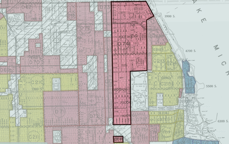
One manner in which neighborhood stability could be encouraged was restrictive covenants, a legally binding contract pioneered in Chicago that prevented homeowners from selling or renting to blacks. One of the longest descriptions of an area is that of D74, a huge area running from 35th Street near Comiskey Park south to 63rd Street along Washington Park:
Already Washington Park at the south, a very fine park, has been almost completely monopolized by the colored race. Criticism is heard of the location of the project, some believing it should have been located north of Oakwood and west of Indiana in order to keep the colored influence as far as possible from further encroaching on park and lake-water frontage…. Washington Park is already doomed. Throughout the area are many vacant lots for which there is no market, due in part to the class of inhabitant and age of improvements…. An organization known as the Hyde Park-Kenwood Protective Organization is endeavoring to keep that section south of 35th to Pershing, east of Cottage Grove (which is restricted) white…. It is believed that unless various real estate protective associations are strong enough to restrict the colored people, ultimately they will spread over that territory east of Cottage Grove between 39th and 37th.
Chicago is historically infamous for its segregation, and its housing market was hard hit by the Depression, contributing to its vast swaths of C- and D-rated areas. "Of course there was a national crisis, but I think in Chicago it was particularly severely felt," Winling says. "Not just the kind of legacy of late-19th century industrialization—as well as this early movement, this early pattern of suburbanization, disinvesting from these central city areas—but the entire city, and particularly real estate and financial leaders are in crisis."
It's the same across hundreds of cities, too. Seventy-nine percent of Chicago is graded "definitely declining" or "hazardous." But that's not especially bad by HOLC standards. Sixty-five percent of Manhattan fell into those two categories, but 54 percent of that fell into the D-grade "hazardous" category. In Brooklyn, 76 percent was C- or D-grade; 63 percent of San Francisco; 68 percent of Los Angeles; 87 percent of Boston; 86 percent of Indianapolis.
Cities with high percentages of A- and B-grade areas, meanwhile, tended to be wealthy suburbs of large cities, like Stamford/Darien/New Canaan (77 percent), Lower Westchester County in New York (70 percent), Essex County in New Jersey (70 percent; it encompasses Newark but also a number of wealthy suburbs), and Milton, Massachusetts (90 percent).
A preference for suburbs or suburban neighborhoods, and against density, was not necessarily or solely for aesthetic reasons. As Winling mentioned, HOLC favored stability, and single-family houses, in their view, promoted that for logistical reasons—officials considered renters to be more transient and homeowners to be more durable, especially in terms of building community bonds.
The HOLC descriptions sometimes vividly attest to the conditions renters faced in Chicago in the 1930s, and acknowledge the crisis of black residents in the market, even in the same breath as statements on the necessity of racially restricted housing. In D74, the area surrounding Washington Park, it's mentioned that "our contract broker exhibited a list of approximately 500 applications at present on file from responsible colored people looking for homes to purchase; and no matter how small a flat is, it is usually rented to from eight people and up [sic], who sleep in shifts. If a responsible mortgage corporation, building and loan or otherwise, composed of colored people could be established it would aid rehabilitation and the turnover of all properties."
How much the HOLC maps contributed to these processes—segregation, urban flight, suburbanization—is an ongoing question for historians. Amy Hillier of the University of Pennsylvania has shown that C and D grades did not prevent loans; for instance, 60 percent of HOLC's loans in Chicago went to C- and D-grade areas (though that is a lower percentage than the area of the city given those grades). Her research on Philadelphia found that "lenders did not categorically redline areas that HOLC colored red" in the city, though interest rates were higher (within a narrow range of four to six percent citywide). Hillier also questions whether the HOLC maps were a primary cause of housing discrimination, rather than part of a complex mix of cause and effect.
They may be as much or more an indicator of conditions as an influence on them. But even merely as indicators, the patterns are striking.
"Whether it's slum clearance and public housing, or running HOLC or FHA, what they're doing is institutionalizing, ratifying those local biases and local decisions about who gets capital [and] who should be homeowners, and then, with subsequent programs throughout the 20th century, there's facilitation of and subsidies for suburban dispersal to the low-density fringe," Winling says. "It's definitely not deterministic. In some places, these central areas can still get some forms of capital. But, it's basically placing the thumb on the scale in favor of movement out towards the suburbs for those of middle-class professional status and means."
Winling hopes that the site will allow researchers to tease out more of the implications of HOLC's maps to the development of the American city, especially ones that, unlike Chicago, have not been closely studied.
"Peoria versus Atlanta, versus Charlotte, versus a place like Portland, Oregon … there have not been significant studies of these places. History happened in these places too, and in some ways, the release of the archive is a way of engaging with the public—[giving] people resources to do some of this research on their own city," Winling says. "One of the ironies of this program is that the Chicago concentric-zone model was, in some ways, imposed or used to frame the way that HOLC and FHA and midcentury social scientists thought about all cities. That model, for Chicago, doesn't work; it obscures as much as it reveals for a lot of cities."