Three years ago, artist Alex Payne was bartending at R.J. Grunts and drawing chalkboard art to promote burger specials. Now, making art is his top priority. The 30-year-old Texas native has a unique job: He's the in-house illustrator for Lettuce Entertain You, responsible for hand-drawing art for its brands, from menus to merchandise.
"It's corny, but this is a dream job for me," Payne says. "I never thought that I would be somebody who just sits down and draws all day."
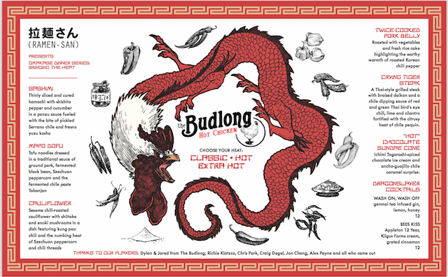
Trained in fine art at the University of Texas at San Antonio, Payne took on the position full-time in February and collaborates with Lettuce's team of graphic designers to finalize all visuals. His portfolio includes artwork for Three Dots and a Dash, Il Porcellino, Ramen-san, and, most recently, the new Ozzie's Pops & Pretzels at Navy Pier.
Most of Payne's work ends up being printed on menus and the like, but some unconventional projects do arise. Earlier this year, he sketched emoji faces for Sushi-San, which are now used as playful, edible embellishments for the restaurant's mochi (or, as they're officially called, Emochi). Lettuce Entertain You also updated its iOS app, LettuceEats, last month, and this latest version features a dozen stickers cooked up by Payne—animated icons that illustrate some of its restaurants' dishes (from pepperoni pizza to a seafood tower).
I spoke with Payne over the phone about his serendipitous career move, his artistic vision, and the challenges he faces in this rare position.
How exactly did you end up with this one-of-a-kind gig?
That's one of my favorite stories in the world. It was a whirlwind, kind of dream-come-true scenario. I was bartending at R.J. Grunts and doing art on the side. One morning, Rich Melman came in, and my general manager said he wanted to talk to me. I was really nervous. But Rich asked, "Did you do these chalkboards? They're really good. You should work with our team." I sent him my portfolio, and he called me in. A few months later we started the first couple of projects, which involved working on Windy City Smokeout stuff.
What is your typical process for translating a restaurant's concept into art?
I work alongside the Lettuce creative director, chefs, partners, and graphic designers to start brainstorming and sketching some rough ideas on paper. We'll work to tighten up from there until the final product is approved. Sometimes I'll look at photos or social media posts for inspiration, but often it's me actually going to the restaurant and experiencing the food and environment firsthand. I'll talk to the chefs and managers to better understand the overall restaurant culture including its cuisine, music, vibe, and overall guest experience. I then try to introduce my own style into the the visuals we are creating, but I always make sure to balance this with the restaurants aesthetic.
When Chef Doug Psaltis came to us to sketch the dessert menus at Ramen-san, I met with him and the general manager, and they walked me through their vision for the menus. They put out a few dishes and gave me a full tour of the restaurant: what the music was about, their style, etc. We looked at some Japanese illustration styles, talked hip hop culture and video game culture, and all of these different elements helped make up what the dessert menu at Ramen-san is today.
Can you describe your personal artistic style?
My style comes naturally. I don’t know if I have one particular style I can point to and say, that’s how I draw. I did a bit of everything at art school, learning how to paint, sculpt, and sketch. Every Lettuce restaurant is so different that my different styles work in favor of that. Back when I was in art school, my professors would often criticize my work by telling me it was too comic book-y or too illustrative. It was frowned upon. It’s been nice at Lettuce because for some projects, that’s exactly what they’re looking for.
How does a restaurant benefit from having an in-house illustrator work on its visual identity?
The whole graphic design team looks at the menu as the most important advertising piece of the restaurant. It’s the most forward-facing, and the design is an extension of the vibe the whole restaurant is going for. If we have all this creative control—there’s a unique photographer, there’s designers, there’s me—you can execute that exact vision and have it all be cohesive. Many companies use stock imagery off the internet and compile it all together. It's workable, but you can't get this specific. We know the brand: we eat at the restaurants, we go to the websites, we talk to the partners. The vision is deep and engrained.
Why do you think restaurants are increasingly investing in illustrated brand visuals?
I think that illustration has become a natural extension of existing brands especially as restaurants start to have their own visual language. Illustration helps to extend the aesthetic outside the four walls of restaurant. It also gives us the creative freedom to communicate our vision without having to modify existing visuals. For example, Sushi-san's delivery and carryout box is a boombox that the design team and I created that speaks to the music inside of Sushi-san. When it's delivered to the guests door, they get to experience a taste of Sushi-san's vibe while at home.
What are some particular challenges you face as a menu designer?
The reason why it’s challenging is also why it’s really fun and interesting. Lettuce has so many different concepts, and each place has their own visual identity and brand. It’s challenging to always be different. You have to make sure the illustrations match the customer base. You’re also trying to execute different partners’ visions. Some partners have a specific, solid vision of their restaurant—they want it to be this aesthetic and this style. Other chefs are pretty open-ended. Every day is a new challenge.