Yesterday Crain's ran a good article that's been making the rounds, in part because of its striking title: "Chicago isn't a good place to be sick: report." Among the many depressing findings:
• Medicare payments average $10,334 per patient, nearly 30 percent more than the national average.
• Commercial health insurance payments average $3,700 per patient, nearly 12 percent more than the national average of $3,314.
The report that inspired the article is a "Scorecard on Local Health System Performance" by the Commonwealth Fund. As the report explains, some of the problems Chicago faces are general ones among large urban areas. Chicago ranks very poorly in "potentially avoidable hospital use and cost," but among large metropolitan areas there's a lot of competition.
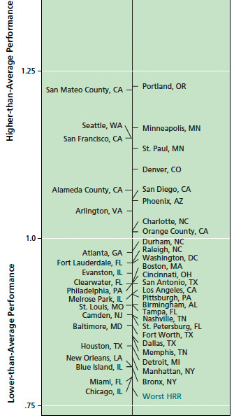
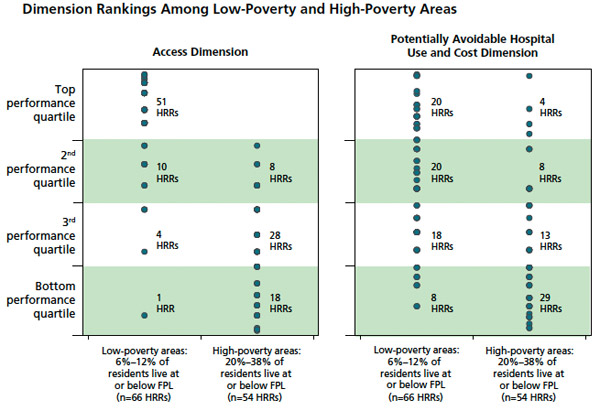
Looking at the chart, you'll likely notice that cities, suburbs, and boroughs with high concentrations of poverty tend to rank lower—the Bronx below Manhattan, Memphis below Nashville, and so on. Concentration of poverty isn't an exact correlation, but unsurprisingly, it's a very good indicator:
It's sad but not surprising. Chicago's health care system has been well-covered in recent years:
Clinics are scattered and family doctors few. Too many patients get too little care until small problems become big ones. Others who are not very sick go straight to hospital emergency rooms, where the care is costly and the wait is often long.
To put it simply, there is no health-care system for the 1.1 million residents of Chicago's South Side, said Eric E. Whitaker, a physician and public health specialist who is leading an ambitious and controversial University of Chicago project to remake the delivery of care.
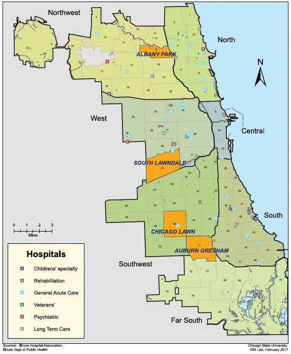
One problem (or at least a sacrifice of breadth over depth) in the Commonwealth study is that it's not very fine-grained; Chicago is lumped into one big statistical area. But the disparities within the city are notable. The Feinberg School of Medicine at Northwestern took a closer look in its study "A Profile of Health and Health Resources within Chicago’s 77 Communities," and in the maps you can see how scattered the clinics are. The biggest gaps, factoring in all of the study's metrics, are around Roseland and Chatham. Here's primary and specialist-care coverage, as of 2011:
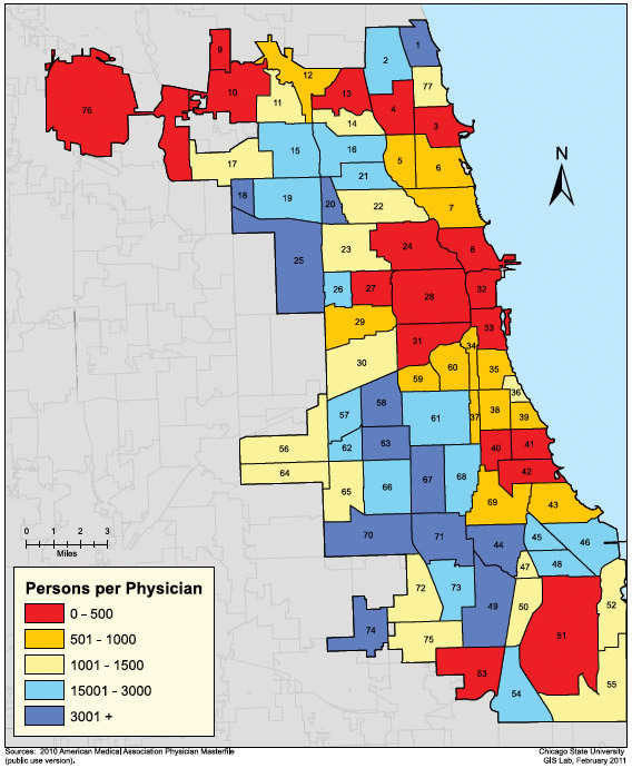
Primary care clinics:
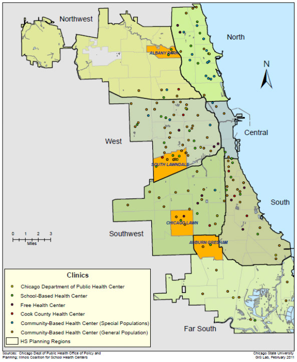
And hospital locations:
'
The South Side lost 2,000 hospital beds over the last decade. There are no trauma centers, and the time ambulance runs take to trauma centers correlates with the hospital and primary care gaps, as an excellent WBEZ analysis showed. This is why the University of Chicago's Urban Health Initiative exists—beginning, last year, by mapping the problem.


