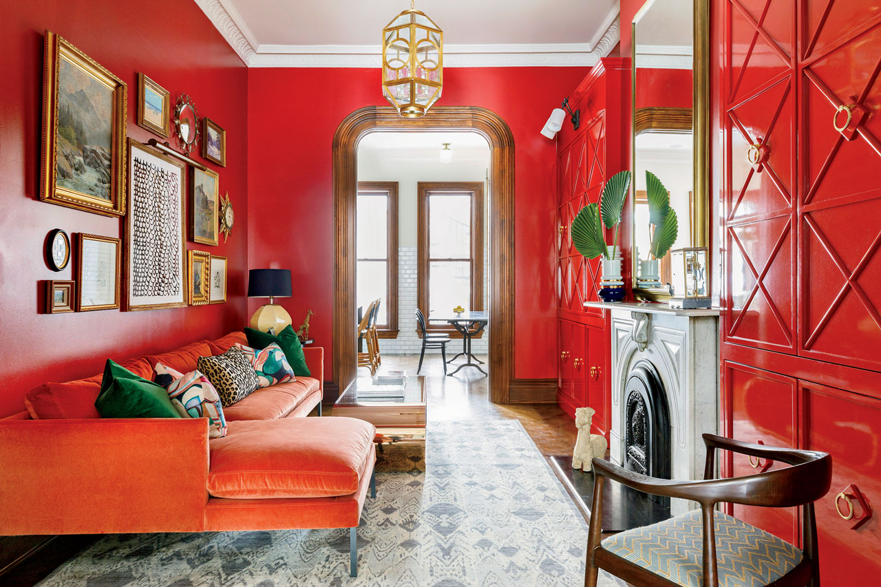
There’s nothing subtle about red walls. And that’s the point. For a client’s Lincoln Park brownstone, Chicago-based interior designer Sarah Vaile transformed a once-overlooked pass-through into the house’s most magnetic room by embracing vibrant, all-over color. “We didn’t just paint an accent wall and call it a day,” says Vaile. “We leaned in harder.” The bold move paid off. This high-energy family lounge demonstrates that saturated hues can be both dramatic and livable, if you know how to balance various elements. Here are some takeaways from the project.
1. GALLERY STYLE
Don’t be afraid to add noise to a loud room, like this gathering of art — a mix of media and scale. It also offers relief from the sea of red.
2. LIGHTEN THE MOOD
Instead of a statement chandelier, Vaile opted for a cozy lantern fixture to pack another surprise into a room that is itself one.
3. TOUCH OF NEUTRAL
Natural wood flooring and original unpainted crown molding — favorite touches Vaile uses in historic homes — offer contrast here.

4. DOSE OF WHIMSY
“The palms nod to a British Colonial aesthetic, both regal and escapist, just as the room is,” says Vaile (pictured).
5. GLOSS IT UP
Lustrous sheen on the cabinets for visual interest is a high-low trick Vaile uses when lacquered walls become cost prohibitive.