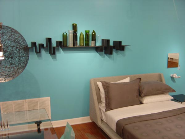
I’m driving down Halsted in Boystown. It’s dark, and most shops are tucked in for the night. Gotta get gas before I head home. I’m literally running on luck. I notice a glow up ahead. Seems to be coming through the windows of I.D. Steven Burgert’s bastion of cutting-edge home design and eyewear. Alien landing? No—a crazy coat of paint. A Tiffany-blue back wall has transformed the whole store and left me stone-cold stopped in the middle of the block (’til a beep restores me to reality). I’m known to guess Ben Moore names right off the walls of most places for sport, but this… this I must add to my palette. So obsessed. I leave a voicemail. They ring with the scoop: It’s “Fountain” by Sherwin Williams. Gotta go paint my bedroom immediately!
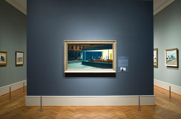
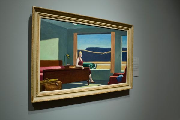
A few days later, inspiration strikes again at the Edward Hopper exhibit at the Art Institute. There is something magical about the way the paintings pop from their painted backdrops in the exhibit halls. Phone please! Is there a method to the madness of picking these colors? Indeed there is, according to Judith Barter, Field-McCormick Chair of the Department of American Art, who enhanced her Hopper with shades that she describes as “sympathetic to the paintings.” She warns that while these moody hues (Benjamin Moore’s “Evening Dove,” the rich navy behind Nighthawks, 1942, and “Seafoam,” the greener blue behind Western Motel, 1957) may work on big gallery walls, they may be too intense for one’s home. I say mix a batch at 50 percent; it will cut the depth a bit, while giving you the same rich shade. Solitude, introspection, and a can of Ben M. Yum!
—BARRI LEINER
Edward Hopper photos courtesy of the Art Institute
" />
I’m driving down Halsted in Boystown. It’s dark, and most shops are tucked in for the night. Gotta get gas before I head home. I’m literally running on luck. I notice a glow up ahead. Seems to be coming through the windows of I.D. Steven Burgert’s bastion of cutting-edge home design and eyewear. Alien landing? No—a crazy coat of paint. A Tiffany-blue back wall has transformed the whole store and left me stone-cold stopped in the middle of the block (’til a beep restores me to reality). I’m known to guess Ben Moore names right off the walls of most places for sport, but this… this I must add to my palette. So obsessed. I leave a voicemail. They ring with the scoop: It’s “Fountain” by Sherwin Williams. Gotta go paint my bedroom immediately!
A few days later, inspiration strikes again at the Edward Hopper exhibit at the Art Institute. There is something magical about the way the paintings pop from their painted backdrops in the exhibit halls. Phone please! Is there a method to the madness of picking these colors? Indeed there is, according to Judith Barter, Field-McCormick Chair of the Department of American Art, who enhanced her Hopper with shades that she describes as “sympathetic to the paintings.” She warns that while these moody hues (Benjamin Moore’s “Evening Dove,” the rich navy behind Nighthawks, 1942, and “Seafoam,” the greener blue behind Western Motel, 1957) may work on big gallery walls, they may be too intense for one’s home. I say mix a batch at 50 percent; it will cut the depth a bit, while giving you the same rich shade. Solitude, introspection, and a can of Ben M. Yum!
—BARRI LEINER
Edward Hopper photos courtesy of the Art Institute
April 3, 2008, 9:30 am
I’m driving down Halsted in Boystown. It’s dark, and most shops are tucked in for the night. Gotta get gas before I head home. I’m literally running on luck. I notice a glow up ahead. Seems to be coming through the windows of I.D. Steven Burgert’s bastion of cutting-edge home design and eyewear. Alien landing? No—a crazy coat of paint. A Tiffany-blue back wall has transformed the whole store and left me stone-cold stopped in the middle of the block (’til a beep restores me to reality). I’m known to guess Ben Moore names right off the walls of most places for sport, but this… this I must add to my palette. So obsessed. I leave a voicemail. They ring with the scoop: It’s “Fountain” by Sherwin Williams. Gotta go paint my bedroom immediately!
A few days later, inspiration strikes again at the Edward Hopper exhibit at the Art Institute. There is something magical about the way the paintings pop from their painted backdrops in the exhibit halls. Phone please! Is there a method to the madness of picking these colors? Indeed there is, according to Judith Barter, Field-McCormick Chair of the Department of American Art, who enhanced her Hopper with shades that she describes as “sympathetic to the paintings.” She warns that while these moody hues (Benjamin Moore’s “Evening Dove,” the rich navy behind Nighthawks, 1942, and “Seafoam,” the greener blue behind Western Motel, 1957) may work on big gallery walls, they may be too intense for one’s home. I say mix a batch at 50 percent; it will cut the depth a bit, while giving you the same rich shade. Solitude, introspection, and a can of Ben M. Yum!
—BARRI LEINER
Edward Hopper photos courtesy of the Art Institute