You know what they say about the cobbler’s kids. Well, that might just as easily apply to the architect’s house. Even with easy access to the most exclusive lines in the home improvement world, when it came to the gut-rehab conversion of her own Bucktown two-flat into a single-family home three years ago, then-pregnant Julie Fisher (co-owner, with Rachel Crowl, of FC Studio) didn’t have the money, the time, or, frankly, the inclination to go all high-end. While her clients tend to opt for top-of-the-line everything, she admits to getting a thrill out of "fooling the troops," using decidedly unglamorous resources like Menard’s and Home Depot to achieve the luxury look for less.
"I’d walk into a place and say, ‘What’s the cheapest stuff you’ve got? I’m going to make it work,’" she recalls. Not that this deal-lover doesn’t indulge in the occasional splurge-she budgeted accordingly when drawing up her plans-it’s just that at her place, you’re hard-pressed to tell the difference. Three years later, she can still honestly say, "Even if I’d had more to spend, I wouldn’t have done anything differently"-a testament to the fact that, done right, "budget" can be both smart and beautiful.
 |
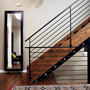 |
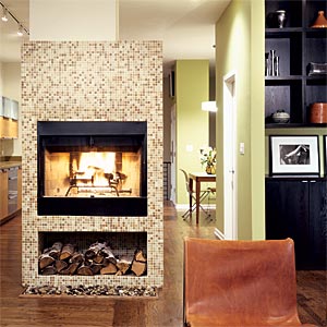
| The open feeling on the main floor is due in large part to a seven-foot-tall structure that divides the living room from the kitchen. On the living room side, it contains the fireplace; on the kitchen side, it houses the refrigerator. (Fisher’s firm uses this formula in many of its developments-"perfect for smaller spaces," she says.) This architectural element is covered entirely with small, earth-toned tiles-"the poor man’s Bisazza," says Fisher-from Tile Gallery. | Other highlights of the room include staircase rails made from iron fencing (the kind normally used outdoors, hence, not a budget-breaker) and "floors made from the cheapest oak there is, stained dark brown to make the space feel warm." Yet another design-on-a-dime feat: asking the floor installers to lay the planks in two different directions, with those on one side of the room perpendicular to the ones on the other. "They insisted it would look terrible, but I knew it would add interest to the overall design," she says. |
 |
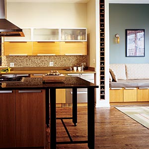 |
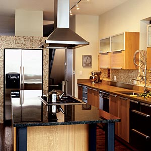
| The Ikea cabinets were originally a concession for Fisher (she had wanted to go with an upscale European line, but for that, she’d have sacrificed a garage, which was out of the question). "In the end, I got exactly the look I wanted for a quarter of the price," she says. "The irony is that people always ask me where I got such great cabinets." She also cut costs by opting against high-end appliances. Her mantra: "Bosch shmosch." The Fishers have a KitchenAid refrigerator, a GE oven, and a Fisher & Paykel stovetop. The Thermador hood was a return at Abt Electronics, "which is a great way to get a good deal." The KWC faucet is a "funky and cheap" alternative to the expensive Dornbracht she coveted. She did splurge on a Franke sink. | Modernists to the core they may be, but Fisher and her business partner are not fans of stark environments. "We love using tile and dark woods in a clean way to create warmth," says Fisher. She sprang for "not inexpensive" concrete countertops-but she balanced that splurge by using less costly dark-green granite on the center island. "Mixing materials is a good way of doing something different without incurring significant cost," she offers. Another clever touch: a section of the island is unattached, which allows Fisher to move it in front of a slightly raised banquette in the adjoining eating area, where her kids like to eat while watching TV. |
 |
 |
| Another cost-saving tip: Situated above the pantry closet, the TV looks like a flat screen, but it’s actually a big old model placed into a cut-out in the wall bank that contains the pantry. |
 |
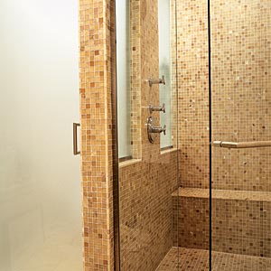 |
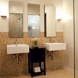
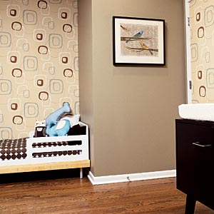
| Fisher and her husband have two young children, a boy and girl, whose bedrooms are more sophisticated than childish. Like the rest of the rooms upstairs, theirs are painted in Benjamin Moore’s Old Salem Gray (a uniform color saved them money on paint) and pepped up with wallpapered accent walls. Shown here, in daughter Parker’s room, Retro Squares wallpaper from Urban Source. | Fisher’s husband had always wanted a "bathroom that made him feel like he was at a luxury hotel," and that’s exactly what he got. The honey onyx tile is a splurge from Tile Gallery, as were the Roburn recessed medicine cabinets ("you just can’t get those unique, narrow-and-tall proportions off the shelf," she explains) and a custom glass shower enclosure. The one thing that was surprisingly inexpensive, despite its indulgent appearance, is a TV hidden behind a two-way "police" mirror that Fisher had custom-cut at LaSalle Glass-it’s mounted on the opposite side of the wall from inside the master bedroom closet. |
Trade Secrets
Choose a dollar amount for your project and stick with it, no matter what. This might mean saving certain projects for later. The Fishers lived without their pricey shower enclosure for six months while saving up money. They also waited to get the built-in shelving in their living room, though it had been in Julie’s plan from the beginning. A deck, too, had to wait.
Use materials creatively and splurge in small, unexpected places. To create texture in her powder room, Fisher covered one wall with floor-to-ceiling slate. "Normally, this kind of tile is used on floors, but I wanted to do something interesting," she says. In the three-by-four-foot entryway near the back door, she put in an expensive stone tile to create a "cute nook for shoes. Sometimes a little bit of something expensive is enough to give you a bang for your buck," she says.
It’s OK to go cheap on well-designed accents-chances are no one will be the wiser. All of the decorative hardware, from cabinet pulls to closet doors, in Fisher’s home is from Ikea; the Schlage door handles are from Home Depot. And the sconces along her stairway were only $2.95 each at Menard’s. "I just put on this big mask and spray-painted them silver," she says.


