|
|
When Virginia Devlin and her husband, Kurt Baldassari, decided to buy a new condo in 2004, no one was more surprised than they. Just the weekend before, they had met with a designer to go over plans to overhaul their kitchen. But then they took a stroll a few blocks over from their downtown condo to have a look at the Montgomery, a modernist tower that formerly housed Montgomery Ward’s headquarters in River North, which was being converted to residences. "We had always loved this building and the architecture of it," Devlin says. "We bought the condo on a whim."
Sealing the deal was the developer’s willingness to allow the couple to alter the standard floor plan. With a south-facing wall of floor-to-ceiling windows running the entire length of the 18th-floor home, it had huge potential for a panoramic, light-drenched view of the city. But various walls abutted the windows, cutting off sightlines and making the place feel chopped up, dark, and cramped.
|
|

To air out the relatively modest 1,650-square-foot home and make it feel larger, the couple brought in interior architect Patrizio Fradiani of Studio F Design. "We moved walls all over the place," recalls Fradiani, adding that his overarching goal was to remove any contact between interior walls and the exterior curtain wall. "It was sort of replanning the whole space."
In Fradiani’s plan, the basic location of rooms remained the same: The main entrance opens near the kitchen, which flows into the dining area and then the living room. Off to the right of this central space is the master suite; to the left is another suite. In the developer’s plan, this second suite was made up of a bedroom, bath, and den. Fradiani knocked out the wall between the bedroom and living room, roughly doubling the size of the living room. With the elimination of additional walls around the kitchen and dining room, the central part of the condo gained an open, loft-like feeling.
The den had been slated to become the couple’s office. But that plan changed when Devlin became pregnant with their daughter, now 3; the office became her bedroom. To counter the claustrophobic feeling one might expect in the relatively small, windowless room, Fradiani called for the solid wall between the bedroom and the kitchen to be constructed of translucent glass panels. The light spilling in from the central living area actually made the room so bright that the couple ended up installing a room-darkening shade that can be lowered at night.
Fradiani used the same glass in a pocket door between the living room and her daughter’s suite. "It’s perfect," Devlin says of the little girl’s space, adding that giving up an office hasn’t been a sacrifice. "We don’t need a huge house. There are a lot of open areas for the family, but then, especially when she gets older, she can shut this off."
In the kitchen, the standard options of white oak cabinetry and soapstone countertops were modern and upscale enough to suit the couple’s taste. Fradiani extended the soapstone up the wall to create a backsplash, and increased storage space by designing a bank of cabinets around two built-in wall ovens and a warming drawer; the original plan had called simply for drywall around a single oven.
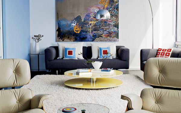
Most of the furnishings in the home are things the couple owned already, including a Knoll dining table and chairs. Suspended above the table, however, is a new light fixture designed by Fradiani, using individually hung, globular lights from Luminaire. "I was really craving a chandelier," Devlin says, "but my husband didn’t quite want to go there." Neither did Fradiani. "The concern I had about a chandelier is that it would block the view if you’re standing in the kitchen," he explains. "These are glass, and you can see through them—they’re more part of the skyline, in a way, than a chandelier would have been."
|
|
Providing a dramatic backdrop is an original piece of art that has hung in all of Devlin’s dining rooms for the past 20 years. Painted by an old friend, it first appears to be entirely abstract but on closer inspection turns out to depict a woman baking blueberry muffins. Is it Devlin?
"That’s something I did often in college, so I think that might have been the inspiration," Devlin acknowledges, adding, "It’s perfect for the space."
The dining room flows into a comfy seating area in the living room, where a pair of classic Eames lounge chairs face the television. Fradiani designed a sleek set of built-in shelves to hold the TV, clusters of books, and objets d’art. An utterly plain white built-in cabinet cleverly hides electronic equipment and the attendant cords and wires.
Next to the media center, a pocket door of translucent glass leads to the master suite, giving the couple the option of privacy while preserving the home’s sense of openness. In the bedroom, a simple floating shelf across from the couple’s sleek Peter Maly bed holds the computer and has become the de facto office. A streamlined run of white cabinets above the computer table holds office detritus and keeps the look clean.
A short hallway with an oversized closet on each side leads to the master bath where, surprisingly, there’s no central door. Just beyond the closet on the left is a nook with the toilet; the original plan called for a door there, but the way it swung open into the space felt clumsy. Fradiani’s "genius solution," as Devlin calls it, was to create a sliding panel from the same translucent glass used throughout the home. Slide it to the left and it covers Kurt’s closet; slide it to the right and it provides total privacy for the commode.
Knocking out the wall around the tub gave the couple room to go big with the light fixture there, a dramatic globe of fiberglass string that replaced a standard can light. Hanging it off center helped ensure no one gets bonked in the head getting out of the bath. Gray-streaked marble floors and counters—another standard option that the couple liked—provide a simple backdrop for something dazzling, a shower wall covered in small stainless steel tiles. "I was obsessed with this tile," Devlin says. "I wanted to use it everywhere. But Patrizio scaled me back, and I’m glad he did; it would have been too much."
Though Devlin is the first to admit that the couple’s plans have a way of changing, they have no intention of leaving the home Fradiani created for them. They may dream of having a second home—they love Palm Springs and Michigan’s Harbor Country—but only, she says, if they can figure out a way to keep the Chicago home, too. "I envision myself growing old in this place," Devlin says.
For resource information, see Resource Guide.
Photography: Andreas Larsson
Styling: Diane Ewing
Related: