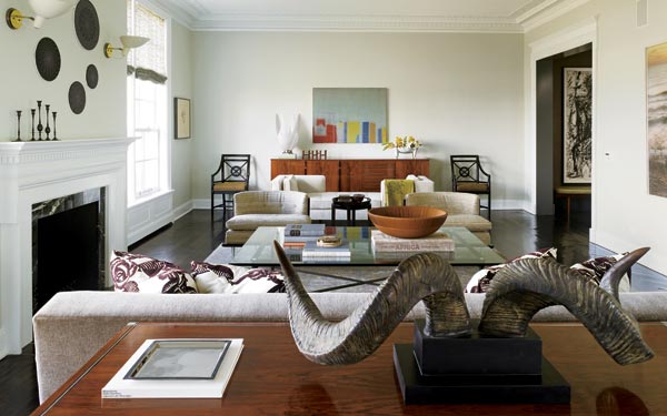
In the living room of this apartment in a 1914 Benjamin Marshall building, modern art and furnishings are elegantly juxtaposed with Beaux Arts architectural details. “Because of the grandeur of the room we segmented the space into small seating groups,” says Steve Bruss, whose firm renovated and designed the interiors. Photo Gallery »
The word "renaissance" gets thrown around a lot (never more terrifyingly than when paired with the dreaded "faire"). But in its most literal meaning of rebirth, there’s no better way to describe what happened to a cultured couple with four grown children last year when a business move forced them to uproot themselves from their small, conservative Midwestern hometown, relocate to Chicago, and shed their old skins.
"We thought we’d done it all. We’d even done the chintz thing," says the wife, reminiscing about the string of suburban homes full of traditional decorating that she’d loved over the years. "We actually thought there wasn’t anything left to do."
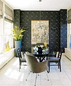
In the dining room, a shiny “sputnik” chandelier is the perfect counterpoint to the owners’ antique Japanese screen beyond. The leafy wallpaper is a nod to the room’s original purpose—it was an orangery. Photo Gallery » |
When she and her husband purchased a graceful but tired pre-war apartment on the Gold Coast, they hired a Chicago design/build firm, Hudson Home, to renovate it, expecting one more variation on a familiar theme. Instead, she says, "They took us to a place we never thought we’d go."
They’re referring not just to the urban comforts of their new, doorman-enhanced life but also to the unexpected peacefulness they’ve found living with great mid-century design. No matter how chaotic the city life outside their windows, the apartment imposes a serenity all its own. "We actually go into the living room to take naps sometimes," admits the wife, pointing out that despite the room’s heady mix of mid-century antiques, edgy art, and Belle Époque architecture, it’s an extraordinarily comfortable space.
Fanciful touches like the ornate plasterwork moldings framing the living room ceiling are hallmarks of the original architect, Benjamin Marshall, who built a series of elegant houses and apartment residences in the city around the turn of the last century. This one is something of a local celebrity; its gleaming white terra-cotta façade at the south end of Lincoln Park has provided an orientation point to generations of picnickers.
So Hudson Home faced an intimidating task. "The building is iconic," says company principal Steve Bruss, who coordinated the project with his associates, architect Joe Trojanowski and interior designer Kory Blosky.
"The renovation needed to respect its Benjamin Marshall genes," Trojanowski says. "It had to respond to the place’s former grandeur." He specifies "former" for a reason. The Hudson Home team had to impose an entirely new order on the 3,800-square-foot apartment, thanks to a callous 1980s renovation.
Next: Family room and Kitchen
Photography: Nathan Kirkman
Styling: Diane Ewing
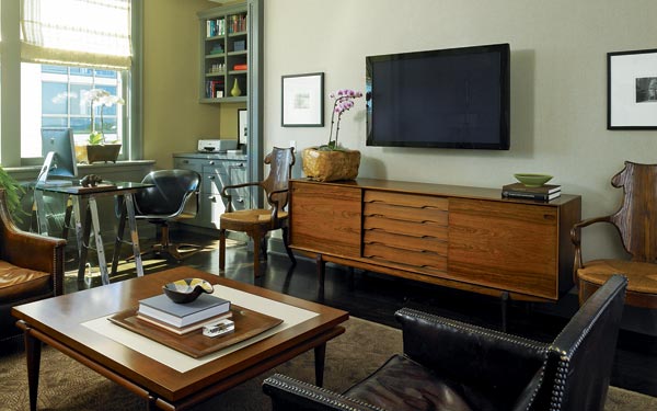
The family room, formerly a bedroom, is where this couple spends most of their time. The husband’s office is in a sunny alcove with wonderful city views. A 1970s sawhorse table takes the place of a traditional desk and a 1970s Danish rosewood sideboard serves as a media unit beneath the flat-screen TV. |
"The back of the apartment was deep and dark, like a cave," says the owner. "And the layout was completely inefficient," says Trojanowski. Executing the light-flooded new plan, says Bruss, required a delicate "surgical renovation" that first did no harm. Completed in a mere eight months, the apartment is sleek, yes, but with an opulent edge. "We introduced a modern aesthetic," says Trojanowski, "but the original moldings, floors, ceilings, and fireplaces lend wonderful historical reference."
And percolating through the furnishings are references from an entirely different era. "It all started with this fabulous 1950s Adnet settee in the living room," says Bruss, referring to the sculptural leather bench at the dining room entrance. He says the French settee, by master furniture designer Jacques Adnet, instigated his clients’ rethinking of their traditional lifestyle when a photo of the piece struck a chord with them at a preliminary design meeting.
After that, the modernist floodgates opened wide, amid growing excitement. With Hudson Home’s help, the couple chose streamlined furnishings like a showstopping 1970s René-Jean Caillette console from Wright Auctions that stands in beautiful counterpoint to the living room’s 1914 Beaux Arts architecture. They went on to add a 1950s Edward Wormley daybed in the living room, a vintage T. H. Robsjohn-Gibbings table paired with velvet-and-chrome Saarinen armchairs in the dining room, and a 1970s Danish sideboard for the family room.
Even the kitchen design got caught up in mid-century mania. "The materials we used in the kitchen mimic the natural tones of the antique European furniture we were loving so much," says Bruss. "The teak cabinets, cream-colored lacquer, and natural Italian porcelain tile floors all work so well with the rest of the apartment."
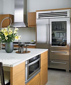
“The teak cabinets, cream stone, and pale tile pull light into the room all day long,” says Bruss. Photo Gallery » |
The owner is thrilled. "This kitchen was a complete departure for us," she says. "I had to take a leap of faith. I couldn’t visualize it—we’ve always had such traditional kitchens. But these days I live at my little desk in that room, there’s just so much light."
All this decorating brio is further enhanced by the owners’ other new passion, their collection of works by emerging local artists. The provocative themes and high-intensity color of the paintings and photographs hung throughout the apartment are startling. But they reach a climax in the living room, where a theatrical seven-foot-long Carrie Schneider photo of a woman on a beach at sunset takes up an entire wall.
Amidst all this modernity, Hudson Home was careful to strike a balance with the apartment’s architectural back-story. Walls in the private areas are embellished by new, handcrafted traditional moldings and set off by a continuous wash of deep gray-green, from foyer to family room and back to the bedroom corridor. The effect lends continuity and spice to those spaces—deferring to the original architecture without replicating it.
Ditto the new floor plan. "It’s modern, but it harks back to the original because it’s not entirely open," says Trojanowski, who acknowledges sneaking in some modern details, like sleek pocket doors. "I have to admit, there aren’t many traditional, hinged doors here."
Not many traditional finishes, either. "We wanted the living room to read crisp and not a bit old-fashioned," says Bruss. So he and Blosky chose a very 21st-century wall color (Benjamin Moore’s Titanium) to subtly play up the room’s elaborate ceiling. "The moldings don’t scream at you the way they would if we’d gone with dark walls," Bruss says. They then chose low-slung furniture to increase the drama of the high ceilings and floated a "plum taupe" mohair sofa from Venu in the center of the room to catch the eye. "It’s the darkest point in the room, so people gravitate to it," says Bruss. "Then the colors purposefully dissipate softly out to the edges to keep things calm."
Calmest of all is the dining room, originally an orangery (a sort of citrus-centric greenhouse in Marshall’s design), where the owners’ dreamy antique Japanese screens pair perfectly with shimmering tropical-leaf wallpaper. Bruss says the room was intended to imbue a "1950s French Deco effect."
The owner says the only effect she gets is "totally happy." She tells of a graduation party she and her husband gave recently for their youngest son. "We sat around that dining table, all different generations, with the twinkling lights of the city and the lake shining around us and I thought, it doesn’t get any better than this."
Photography: Nathan Kirkman
Styling: Diane Ewing