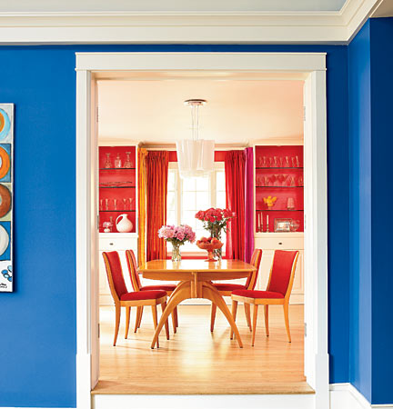
When choosing colors, consider the view from one room to the next and string hues from space to space. In Amy Schneider’s home, multihued raw silk curtain panels in the dining room keep the living room’s blue going with an iridescent combination of turquoise and fuchsia. Living room paint: BENJAMIN MOORE, BIG COUNTRY BLUE, 2066-30; dining room paint: BENJAMIN MOORE, ITALIANO ROSE, 2087-30
Glenview homeowner Amy Schneider was raised in a house decorated in neutrals. “I vowed that when I grew up, I’d have a different color in every room,” she says.
With hot pink, yellow, bright blue, and orange now gracing the walls of the house she shares with her husband and two daughters, Schneider has more than followed through on her promise. And it’s not just the paint on the walls—it’s lively Marimekko fabrics, a cobalt-blue stove, and lime-green mosaic tiles.
How does it all work together? “I went with colors that were equally vibrant and made sure they repeated themselves, without ever perfectly matching,” she says.
Schneider had no help from a designer, but since not all of us are so brave or talented, we asked three pros to give us palettes for a range of different tastes.
Photograph: Werner Straube; Styling: Susan Victoria
You love: BOLD COLORS
ENTRYWAY
“High-gloss black walls in an entryway are like a little black dress for your home—a touch of glamour,” says Michelle Quaranta. “Go with a high-gloss black door and white trim, furniture, and flooring.”

LIVING ROOM
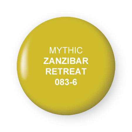
She likes this rich, complex blue because it changes as the light changes. She would pair it with modern white furniture, accented with black and a lime green in the vein of Zanzibar Retreat.

MASTER BEDROOM
Quaranta would use this color for the headboard wall (with a white headboard and gray and white bedding) and paint the rest of the room soft gray (Mythic’s Knights Night 141-1), with a wide horizontal stripe of the yellow running around the room.
KID’S ROOM
“Zanzibar Retreat is a great color for a boy’s room. I would pair it with turquoise and brown accents.”
WHY IT WORKS
“These colors go well together because they are the perfect balance of warm and cool,” says Michelle Quaranta, owner of Colori (colorichicago.com), an eco-friendly paint store in Wicker Park. She recommends Mythic’s bright white (W-01) for trim “to offer some relief for the eye” and suggests using white and natural woods in furniture to keep things from getting too crazy. She also says it’s important to carry colors from one room to the next; she would bring at least three turquoise accents into a pink dining room if it were adjacent to her Under the Sea living room.
You love: SOFT COLORS
This office, designed by Gregga Jordan Smiezny, is filled with shades of celery green, nicely complementing the woods in the room.
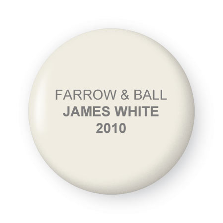
ENTRYWAY
Alex Jordan would put James White on the walls, ceiling, and trim in the entryway and continue it on ceilings and trim throughout the house. Entryway floor tiles would be slate gray, echoed elsewhere in the house by dark gray doors.
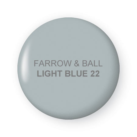
LIVING ROOM
Jordan imagines pairing Light Blue walls with furniture upholstered in ivory linen and leather, dark brown and green accents, and some wood pieces.
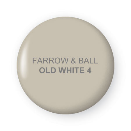
DINING ROOM
“The dining room would be a more monochromatic space, where flowers, candles, and food take center stage.” Jordan imagines polished mahogany furniture with distressed gray leather upholstery on the chairs in this light gray space.
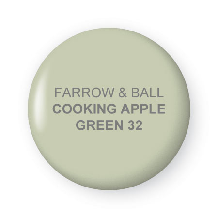
MASTER BEDROOM
Painted white furniture and fabrics in greens and whites (“they can be in a toile or a gingham, something with a Swedish feel”) would play off the apple-green walls and make for a cheerful, inviting space.
WHY IT WORKS
Designer Alex Jordan of Gregga Jordan Smieszny (gjsinc.com) pictures a Scandinavian style in this imaginary house, with natural oak or chestnut floors that have a “raw, dry look to them” playing off the soft palette of ivory, gray-blue, light gray, and sage on the walls. To counter the softness, he would paint all the doors in the same dark gray, Farrow & Ball’s Down Pipe (26). All the moldings, baseboards, and door casings in the house would be the same ivory color as the entryway. With certain elements recurring from space to space (ivory trim, dark gray doors, and other versions of gray, such as the slate tile in the entry and in the leather upholstery in the dining room chairs), the “rooms weave back upon themselves.”
Photograph: Bruce Van Inwegen
You love: WHITES
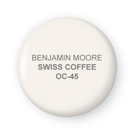
LIVING ROOM
“This is not a cold white but not a buttery one, either. It’s my go-to off-white, a perfect backdrop for interconnected spaces like the living room, hallway, and kitchen,” Arden Nelson says. “It’s also a great backdrop for accents like art or tile in the kitchen.”
DINING ROOM
“For a dining room that’s separate from the rest of the rooms, I’d use the darkest of these colors,” Nelson says. “It’s not really very dark, but this shade makes the room more intimate and beautiful when lit up with candles.”
FAMILY ROOM
Nelson sees the family room as its own space, off the kitchen. “This color complements the Swiss Coffee; it’s slightly deeper, more in the khaki family, but still bright, neutral, and clean.”
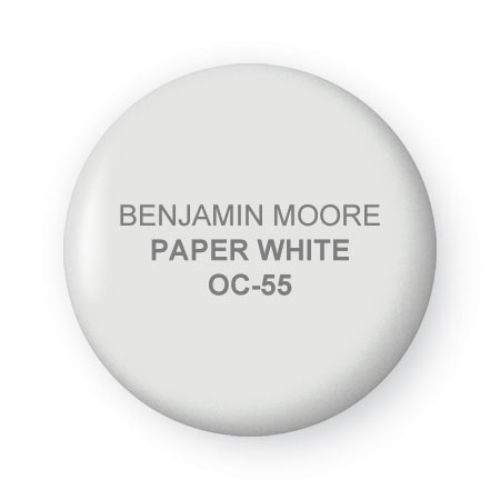
POWDER ROOM
“This is an off-white with a gray tint that looks good with the white porcelain fixtures in a bathroom,” says Nelson, who generally goes for white in a powder room “because it keeps small spaces bright and open.”
WHY IT WORKS
Unlike most people, who can’t differentiate among a bunch of white paint swatches, designer Arden Nelson of ABN Interiors (abninteriors.com) sees a world of nuances. While she has no problem painting a whole house the same white, clients often request variety. Here she offers a nice mix of off-whites (one that leans toward ivory, one that’s more gray, and one that’s got a bit of khaki in it) and combines them with a light gray for the dining room. “White is a great backdrop for antiques, dark things, natural things, and painted white furniture. And you can always redecorate around it,” she says.