Photograph: Katrina Wittkamp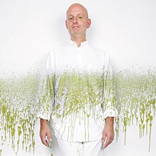 |
| The Vision Thing Ed Mattingly knows what colors we’ll be painting our kitchens-and wearing-next year |
From his LaGrange studio, Ed Mattingly runs Mattingly Custom Finishes, a paint contracting business, while also heading No Limits Paint, a firm that develops specialty-finish products for paint companies, with a client list that includes Ralph Lauren. Mattingly is a member of the Color Marketing Group, the international association of designers and manufacturers who determine the color trends of the future. He could probably predict the colors of our next winter coat, bottle of nail polish, and new car, but we decided to stick to asking him about paint.
When in Doubt, Go Dirty. When it comes to colors that will be hot for 2007 and fashionable in future years, Mattingly says to watch for rich, complex earth tones. The vibe is ’70s, but the colors are more complicated. “The word nobody likes is ‘dirty,'” says Mattingly. “But everything is getting a little mocha to it.” Think of the clear citrus tones we’ve seen for the last few years-and then add a little brown. Lime becomes olive, lemon becomes mustard, and pink grapefruit becomes the cool center of a slice of rare roast beef. The hot metallic color is earthy copper. What else will we want? “The biggest trend that isn’t going away is Tuscany,” says Mattingly. Aged, distressed, textured, warm tan walls are still very popular-and great fun for the do-it-yourselfer. “It’s a bit of a commitment, but it’s so easy to do,” he says. “You put some texture on the wall, paint it, put some glaze over it, and you feel like an Old World artist.”
Trust the Experts. Twice a year, Mattingly joins some 800 other members of the Color Marketing Group to forecast the colors that manufacturers will use to make, well, everything. Paint manufacturers use that information to develop their palettes. Stick to the colors you see marketed at the paint store and you’ll know that your choice will work with what’s happening in countertops and floors, and with the accessories that you might pick up over the next few years. “It’s better to go with one of their taupes or tans than to try pulling one out of thin air,” Mattingly says.
Think Big. You can’t tell what color you’re getting until you see it on the wall. And taping up a little paint chip won’t cut it. Mattingly recommends painting a large piece of poster board and taping it up in the room. “Look at it in the morning, in the afternoon, on a sunny day, on a rainy day,” he says. “It’s just a little paint.” The real mistake is spending all kinds of time and money on a paint job and ending up with colors you don’t like.
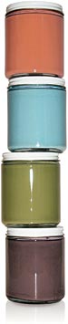
| Ed’s paint picks These colors are going to be big next year, Mattingly says. Like what you see? “Bitter Orange” is available where Ralph Lauren paints are sold. For the other colors, use the codes, which will work with Glidden paints at Home Depot and Dulux paints at ICI stores. |
|
|
Ralph Lauren ICI Color System: ICI Color System: ICI Color System: |
 |
Don’t Paint Yourself into a Corner. Colors don’t stay in one room. Paint choices in one room affect those in the adjoining rooms. Even if you can afford to paint only one room at a time, plan your colors for the entire floor. “Otherwise, you may wind up with one room that your friends think is cool, but you may have locked yourself into a color scheme you regret,” says Mattingly.
Opt for a Vanilla Sky. How do you unify those color changes throughout your house? With a universal color-usually white or off-white-on the ceilings. “It’s most settling to see the same color in every direction,” Mattingly says. Accent colors on ceilings are best for small, well-defined areas, such as a powder room, dining room, or master bedroom. A saturated color overhead will “cocoon” the space and make it cozier.
Keeping molding colors the same throughout a floor also helps visual flow. If you are using whites or soft colors on both ceilings and moldings, it’s important that they be identical. “It’s a big mistake to have an off-white on the ceiling that is warm and an off-white on the trim that is gray or cold,” Mattingly says.
Get Focal. A vibrantly colorful accent wall can be a great way to lead the eye to a particular part of the room, or house. “Some homes here in the southwest suburbs are just vast, and a great impact wall near the front door helps define the space,” says Mattingly. “It draws your attention and lets you enjoy stepping into the home rather than coming in and feeling lost.”
Commit Random Acts of Fun. If you aspire to a perfect finish-especially a perfect glossy one-consider hiring a professional painter. If you’re going to paint it yourself, have fun with creative textures and layered colors, and be more forgiving about the finish. “Amateurs should be irregular and random and sloppy on purpose. It’s like creative noise,” says Mattingly. His sample walls show visible brush strokes and hand-painterly panache, created with sea-sponge rollers, metal combs and brushes, and rags.
Mattingly’s favorite method for the amateur painter? Use a plastic grocery bag to apply translucent glaze over a layer of paint-after practicing on your sample board, of course. “A plastic bag is not absorbent, so it really moves the glaze around,” he says. The added texture and gloss gives depth and visual interest to a wall. “Just remember to turn the bag inside out so the Jewel or Dominick’s logo doesn’t get on the wall,” he adds.