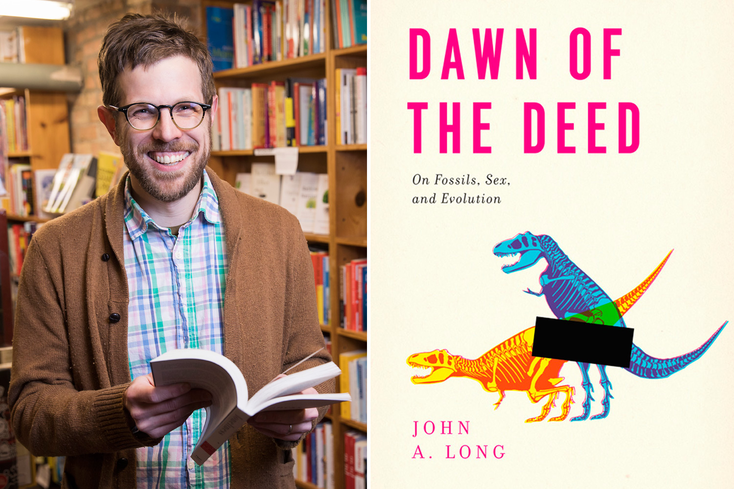
After graduating from the Rhode Island School of Design, Isaac Tobin wasn’t quite ready for a full-time office job. “When my aunt and uncle offered me a place to stay in Buenos Aires, I jumped at the opportunity,” he says, even though it meant leaving his position as a book designer at Beacon Press in Boston. A year later, thanks to a phone booth in a remote Patagonian village, a dream job at the largest university press in the United States—University of Chicago Press—was too tempting to pass up.
Today, Tobin’s one of the most innovative and exciting book designers in the country, up there with Grace Han and Rodrigo Corral. His covers combine striking visuals with smart typography; they always look beautifully simple and effortless, but as any designer can tell you, there’s nothing simple about design, even when it’s minimalist.
I recently spoke with Tobin about his design process and influences—and asked him to walk us through a few of his top hits.
Dawn of the Deed
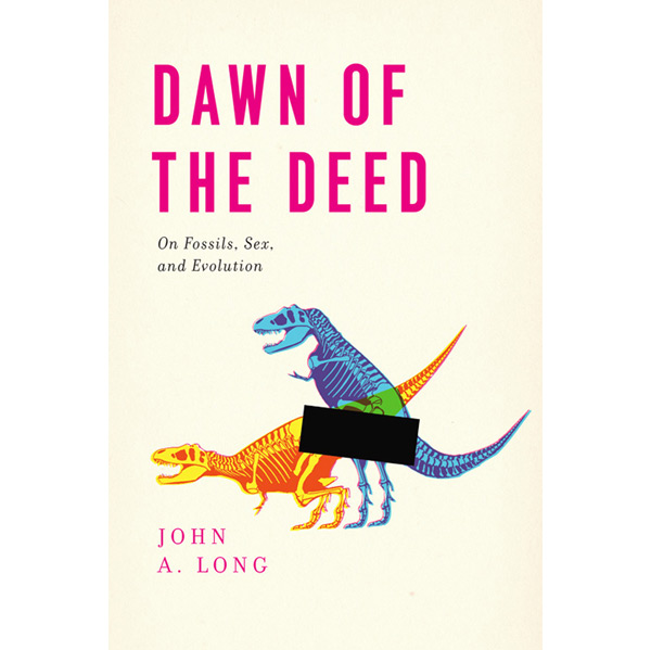
I can’t remember how I came up with the idea of depicting dinosaur sex, but it was my one and only plan for this cover. This is a funny, playful book, so this approach was appropriate. My earliest designs just hinted at the act, with dinosaurs looking at each other suggestively from either side of the page, but that wasn’t direct enough for this book, which is full of very explicit details. The censor bar was a late addition (my wife’s idea) which really makes the cover work — if you want to find out what’s behind that bar you’ll have to read the book.
Piracy
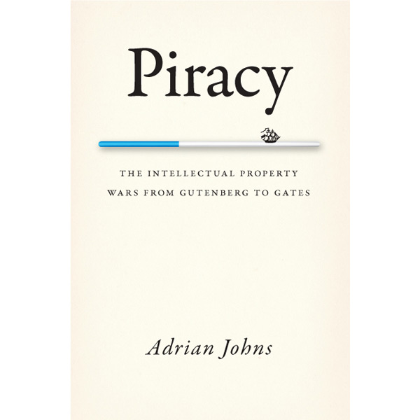
I love working on this type of history-of-a-concept book, especially it has a one-word-title, which opens up so many design possibilities. Because this book spans the idea of intellectual property theft from the first printed books to the modern age, it was tricky hitting the right tone; all my early designs were either too modern or too historical. I had to go through a bunch of versions (including some meta designs that tried to make the book itself looked pirated) before I realized I could just combine the visual pun in my original “modern” design with the look of my “historical” design.
Lolita
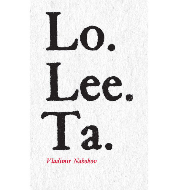
This is a hypothetical cover I created for a group art project and book, where a bunch of book designers were asked to design their own covers for Lolita. Rather than depicting Lolita, Humbert, or alluding to the novel’s subject matter (as is typical for most Lolita covers) I decided to instead focus on the language itself. I’ve always found that opening paragraph, and the “Lo. Li. Ta.” section in particular, so memorable. So I got a paperback copy of Lolita, made a detailed scan of the printed text, and used that as my image.
The Orange Catholic Bible
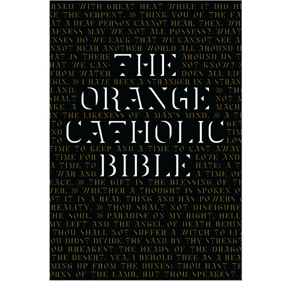
This is another hypothetical cover I did for a freelance group project; a compendium of covers designed for “metafictional books” (that is, books that are mentioned within other books). I’m a big of fan of Dune (particularly Lynch’s much maligned movie version), and Frank Herbert’s universe-building includes lots of excerpts and quotes from metafictional texts, most of all the Orange Catholic Bible, a syncretic future religion composed of ancient teachings put together to make a new whole. So I drew a typeface that attempted to combine various historical references in a futuristic framework, reflecting both the book’s neo-feudal setting, and the recurring theme of Gestalt awareness (i.e. letters made up of multiple separate shapes that are read together to form words).
Class, Race & Marxism
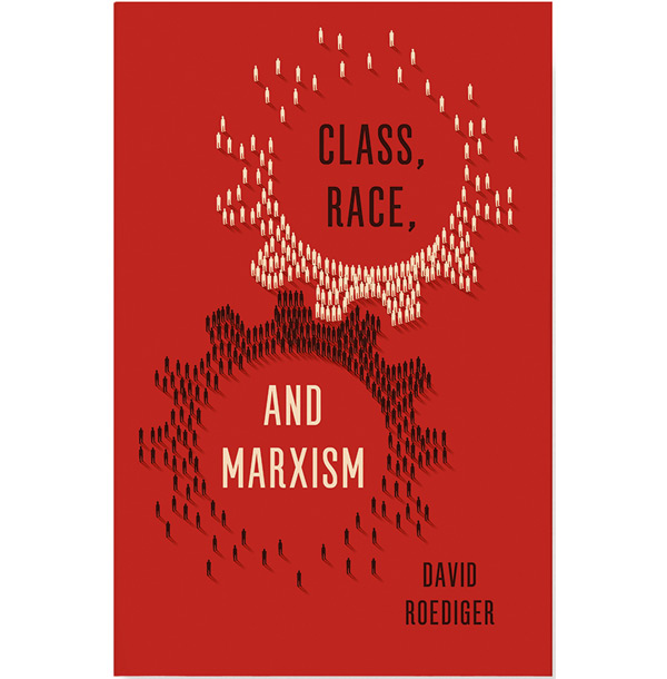
This was a freelance job for Verso Books. I quickly came up with the idea to use gears interacting, but had to go through a lot of different designs before I came up with this image. The most difficult part of the whole process was deciding just how to render the little silhouetted figures. I started with very angular and simple silhouettes, and there was concern that they read as too masculine. So I drew many variations of figures, and ended up with a mix of two different styles, both somewhat androgynous.
What are your biggest design influences? Are you ever inspired by Chicago design?
I’m very influenced by the designer Jan Tschichold, both because of his beautiful typography, and the fascinating arc of his career. He was trained in traditional German calligraphy in the 20s, then became famous as a radical and dogmatic modernist, publishing a manifesto about “the new typography.” He had to flee Germany when the Nazis took over, and eventually renounced dogmatic modernism as being too akin to fascism. He developed a sophisticated neoclassical approach to typography, defining the look of Penguin Books. I find myself equally drawn to both his early and later work, and think it’s so important for designers to think about the political implications of their formal decisions.
Like many graphic designers, I also love vernacular lettering—the type of letters drawn not by graphic designers but by draughtsmen, architects, sign painters, etc. And Chicago is full of amazing vernacular letters that pop up in unexpected places. For example, once I was struggling to come up with a design for a book of aphorisms that reminded me of Ed Ruscha’s word art, and while visiting the Field Museum with an out-of-town friend, I saw some unusual machine-cut vinyl signs in the reptile hall. They were just what I was looking for, and I drew a typeface based on them, which became the core of the book’s design.
Although Chicago doesn’t have a large book publishing scene like New York, we do have a really vibrant and exciting zine, indie-comic book, and poster community. I’m continually inspired by the DIY spirit on display at places like Quimby’s and the Chicago Alternative Comics Expo (C.A.K.E.).
What’s your process like at the University of Chicago Press? How you collaborate and how you engage with the text?
When a book is approved for publication, it is “transmitted” to the “book team,” which is made up of one person from each department. The acquiring editor puts together a really useful summary, and we have a meeting to make sure we all understand the book’s position. Then the designer is given a lot of freedom and autonomy to take creative risks and develop a single, strong design that we route back to the book team for approval. If everyone signs off, the acquiring editor shares it with the author, and we make adjustments as needed. While designers don’t work directly with authors, we work closely with the editors who represent them through the process.