You've probably seen this week’s alarming headlines, such as "CHICAGO TOPS NATION IN POPULATION LOSS,” the Page 1 screamer from today’s print edition of the Tribune.
We don't yet have Census Bureau numbers for Chicago itself, but the raw population decline in the metropolitan statistical area (which stretches from Wisconsin to Indiana) and Cook County are dramatic: "Cook, Ill., had the largest numeric decline among counties at 10,488 people," the Census Bureau reported. "The next largest decline belonged to Wayne, Mich., at 6,673."
Wayne County is where Detroit is. It's not great news. But it's more complex than simply people moving out of Cook County, though that is happening. To begin with, Cook County is really big; it's about three times bigger than Wayne County (5.2 million versus 1.8 million), and the second-biggest county in America. (Only Los Angeles County has more, with 10.1 million people.) So the raw numbers, while important, aren't the whole story.
Part of that story was picked up on by CityLab: the latest Census Bureau numbers are a return to long-term trends, with substantial growth in the Sun Belt. Another part was picked up on by Matt Carmichael at Livability: "Chicago’s Cook County? … The birth/death ratio is pretty tight and certainly not enough to overcome the drain of domestic emigration."
Carmichael's point is significant. Cook County, compared to many of its peers, has an abnormally tight birth/death ratio. If it didn't, the numbers would not be as dire.
I decided to take a look at how Cook County compares to some of its peers in terms of the components of population change—not in terms of raw numbers, but percentages. It's just one year’s data, but it makes clear the breadth of the county's problems.
Let's start with population lost to domestic migration. This just means how many people who lived in the county moved out, to another place in the U.S. In the chart, Cook is compared to several very large counties in and around major population centers, including Kings County (i.e. Brooklyn), New York (i.e. Manhattan) and Fairfax (the big, rather wealthy county that includes many of Washington, D.C.'s suburbs). All of these counties had more people move out than move in from other places in the U.S.
Percent of Population Lost via Domestic Migration
So, yeah, 55,381 more people moved out of Cook County than moved in (within the U.S. borders). It's a lot, but by percentage, it's not abnormal, compared to other large counties that don't have quite as bad a reputation.
Here's where it gets interesting. This is the "natural gain" in population—births versus deaths. Generally speaking, more people are born in an area than die; if not, that's real bad. Here's how much of a percentage gain each county saw from births over deaths.
Percentage of Population Gain from Net Births/Deaths
This looks a lot worse. Miami-Dade and New York County are lower, but the former is a golden-years destination, and the latter is dense, expensive, and not an easy place to raise a family.
Cook County is just old. And we've known this was coming. This is what the Cook County Department of Public Health found in 2010:
The narrowing of the age structure changes showed there was evidence of an aging population in the CCDPH jurisdiction. From the 2005-2009 American Community Survey, there were far fewer people 24-44 age range (-9.9 males and -11.6% females) and the 45-64 age range increased about 12% for both males and females. In addition to the aging population, the narrow structure suggests a fertility decline.
The median age increased 4% in the CCDPH jurisdiction from 37.2 to 38.7, which suggests an older population. There were also increases seen in each district, most notably the Southwest district which increased from 37.8 to 39.4.
When the Chicago Metropolitan Agency for Planning ran the numbers in 2011, it found that virtually all of the increase in the senior population—95 percent—in northeastern Illinois came from minorities: 40 percent from Hispanics, 29 percent from Asians, 26 percent from blacks.
Which brings us to the last component of population change—immigration. Cook County fares poorly there as well.
Percentage of Population Growth from Immigration
And that's pretty dramatic. Cook County was the only one to gain less than half a percent of its population through immigration. But this, too, shouldn't come as a surprise. When Rob Paral looked at 2010 Census data back in 2011, he found that the number of immigrants arriving in metro Chicago every year dropped by half from the 1990s to 2000-2007. The estimated number of undocumented immigrants fell by 70,000 from 2006-2010. And the Hispanic population dispersed outwards into the Cook County suburbs and the collar counties. Last year, Paral told Crain’s Chicago’s Greg Hinz that legal immigration had been holding steady more recently, but the influx of undocumented immigrants had continued to drop, theorizing that federal-government crackdowns were having an effect.
That goes a long way toward explaining the aging of the county. New immigrants are going elsewhere; prior ones are aging in place.
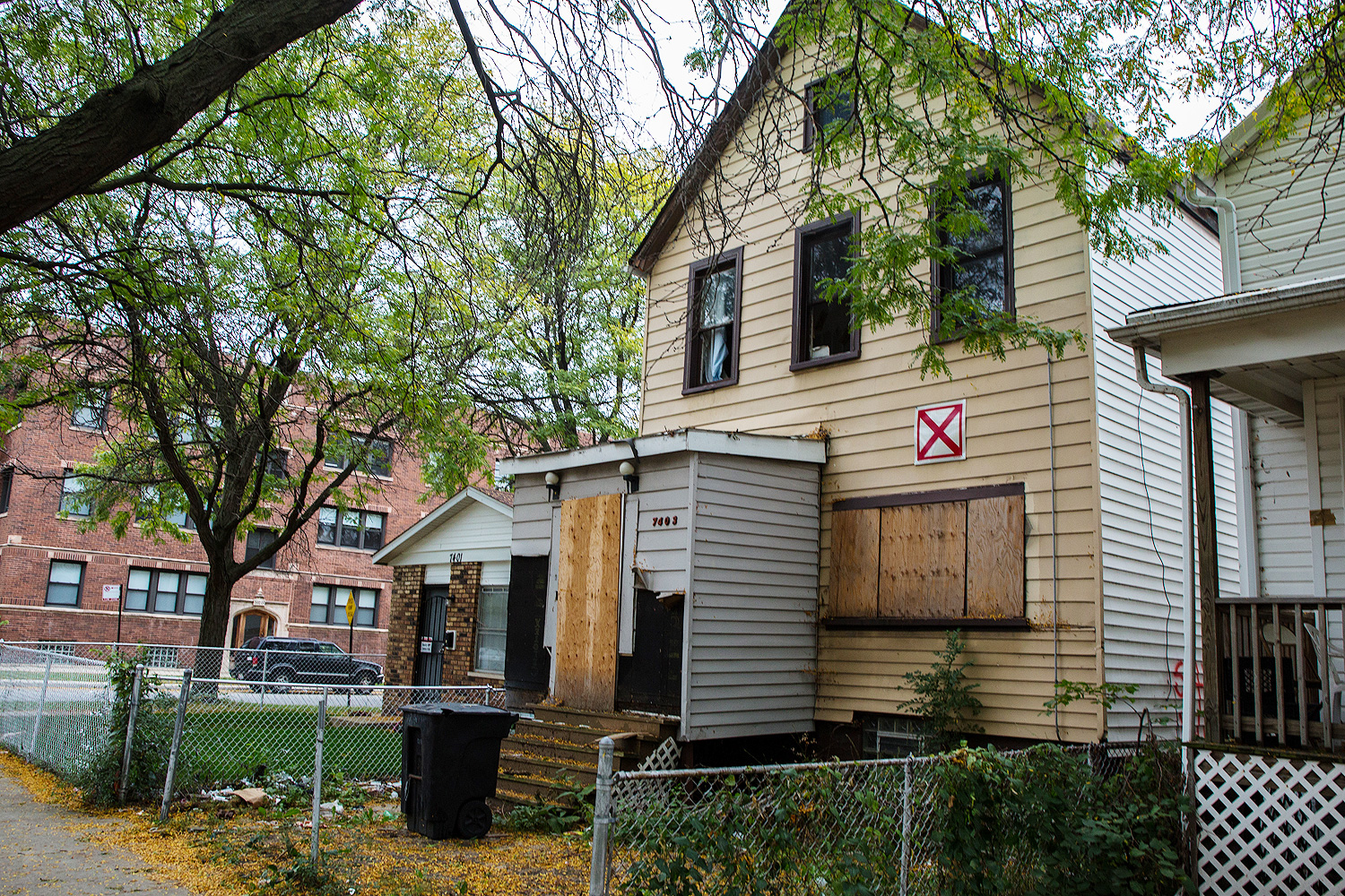
There are certainly other reasons for the broader picture. There's the already well-known decline in the region's black population, as people leave for better job opportunities and safer neighborhoods in other parts of the country. But it's not just the struggling parts of the city that have seen an outflux of residents. As Daniel Kay Hertz has been documenting, some of its thriving neighborhoods have been declining in population as well:
Lincoln Park, Lakeview and North Center all lost population in the 2000s. Logan Square, whose rapid ascent as a "hot" neighborhood picked up steam during that decade, was home to 11 percent fewer people in 2010 compared with 10 years earlier.
The problem, obviously, is not that people don't want to live in these neighborhoods. Home prices and rents have skyrocketed over the last 10 to 20 years; average incomes have climbed with them, as more of the well-to-do decide to live on the North Side.
Why? His theory is a decrease in density. Hertz found that, from 2000 through 2012, Lincoln Park lost as many housing units as Englewood. It might actually be too wealthy, as well-off new residents can afford single-family homes instead of condos. Earlier this year WBEZ's Chris Hagan found that, from 2006 to 2015, West Town, Lake View, Lincoln Park, and North Center were among the city's leaders in both new constructions and demolitions. They had about as many demolitions as Englewood, but about as many new starts as the Loop, the Near West Side, and the Near North Side. Logan Square ranked highly as well. (When I was living in an apartment on the Humboldt Park/Ukrainian Village border last year, we had two conversions of multi-unit buildings into single-family homes going on simultaneously within four doors of our place.)
And as Hagan found, it's easy to lose density but hard to get it back: "The Chicago zoning code allows developers to build single-family homes in any residential area, but adding units requires city approval. That increases costs and complexities for any developer wanting to add density."
Behind the numbers, there are lots of moving pieces. Some are the result of collective failures, such as the conditions that are driving black residents out of the city. Some are the results of policies that are attracting wealthy families to the city and reducing the flow of undocumented immigrants.
There will be more answers when we get more fine-grained data, but we can make good assumptions as to what those will be. Until then, there's a lot of work to be done if we’re to keep up with other growing Midwestern cities.