This month, a totally new form of civic infrastructure, the Array of Things, makes its debut in Hyde Park. In short, it's an array of environmental sensors, a "Fitbit for the city," that monitors basic environmental conditions such as temperature, light, sound, and nitrogen dioxide to assemble a fine-grained timeline of conditions that's uploaded to the web. I've written before about what it does, when it first made the news, and there was a minor panic about the sensors' Bluetooth monitoring, an experiment in determining pedestrian traffic.
But the information it gathers is only half of what the Array of Things does. It will communicate that data in a complete, machine-readable form online, for users to search, analyze, and adapt. The sensors, however, will also communicate the data to passers-by.
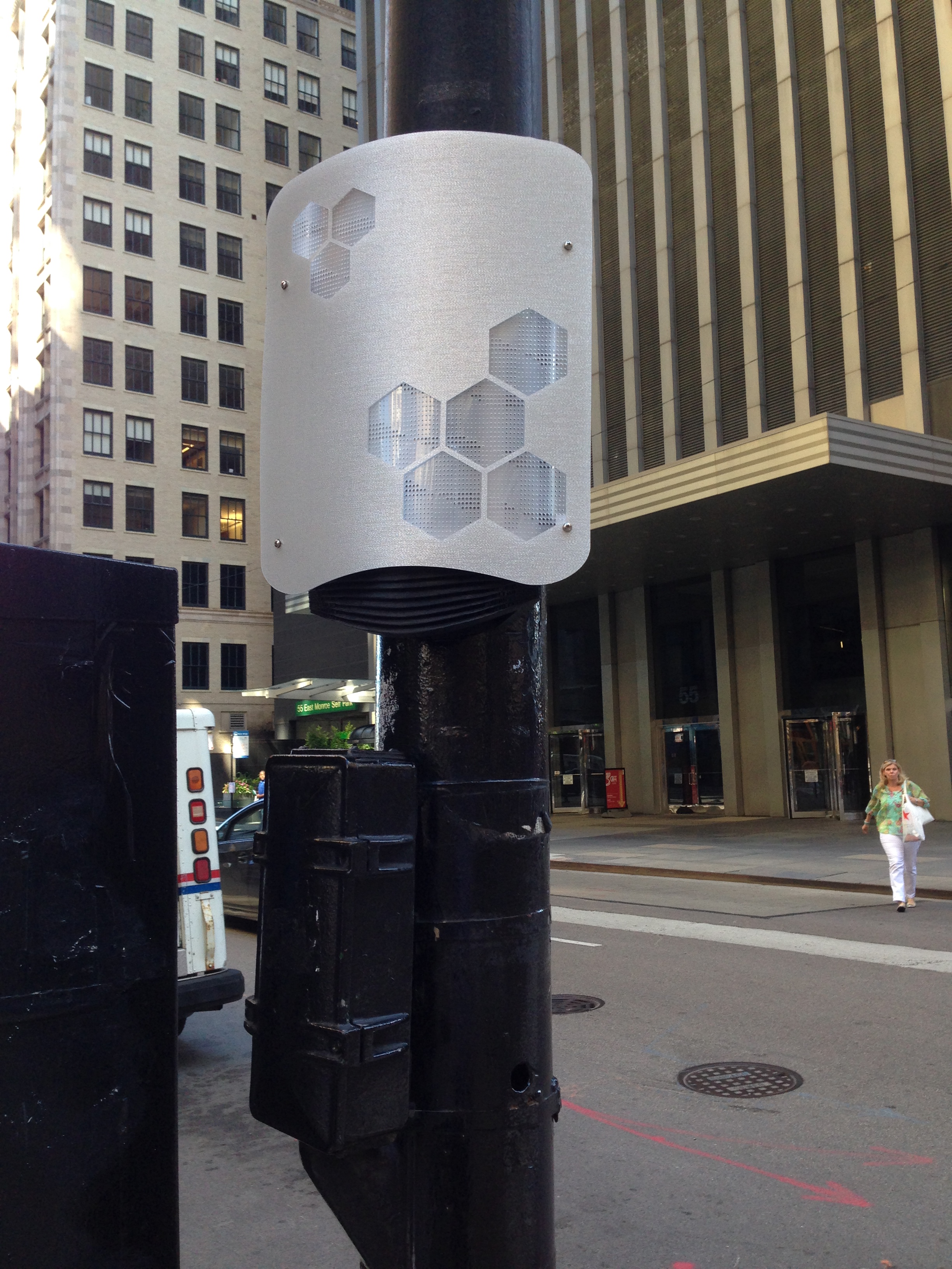
And that presents an interesting design dilemma. Most public signage seems self-evident and intuitive, like stop signs and walk signals, but it tends not to change very much, and when it does, it's iterative. What do you do when you're designing a new form of public signage, on the cheap, and one that has the possibility to communicate a wide range of information? To find out, I spoke with the array's designers, SAIC professor Douglas Pancoast and master's student Satya Batsu.
The obvious approach would be to use a screen. But screens are fragile and expensive. "We knew we didn't want to have screens," says Pancoast. "We wanted it to be visible—it couldn't be too small, it couldn't be too big, and you couldn't mistake it for traffic."
"That eliminates green, yellow, and red as colors you can use," says Batsu.
That also led the designers to the current design of the Array nodes. (Not final, necessarily—the 3D-printed screens are cheap, quickly produced, and replaceable in a few minutes with off-the-shelf hardware.) The hexagonal shape of the lights in a honeycomb pattern is meant to further distinguish the Array nodes from traffic signals—a simple, familiar shape that's still different from the language of signage that will surround it on city streets.
"The perforated patterns with the honeycomb shape give the design depth and accentuate its visibility," Batsu says. But, as Pancoast points out, it narrows down the possible language of communication further: "the perforation pattern is pushing the limits of low-resolution."
From that, Pancoast and Batsu narrowed down the nodes to their current iteration, leaving open the question of what information they'll communicate and how people will recognize it. And that's where the community comes in. The Array of Things is "neighborhood asset mapping," in Pancoast's words; residents are likely to be interested in different data in different places. In one place, they might be interested in air quality, an "asymmetrical" issue across the city. In another, sound or temperature.
The nodes are both literally and figuratively plastic, as the design forms around the community. "It's going to emerge over a long period of time," Pancoast says. "It's an experiment: get feedback, redevelop, and redeploy."