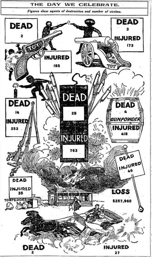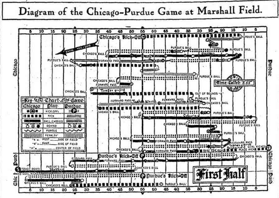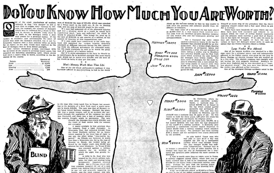
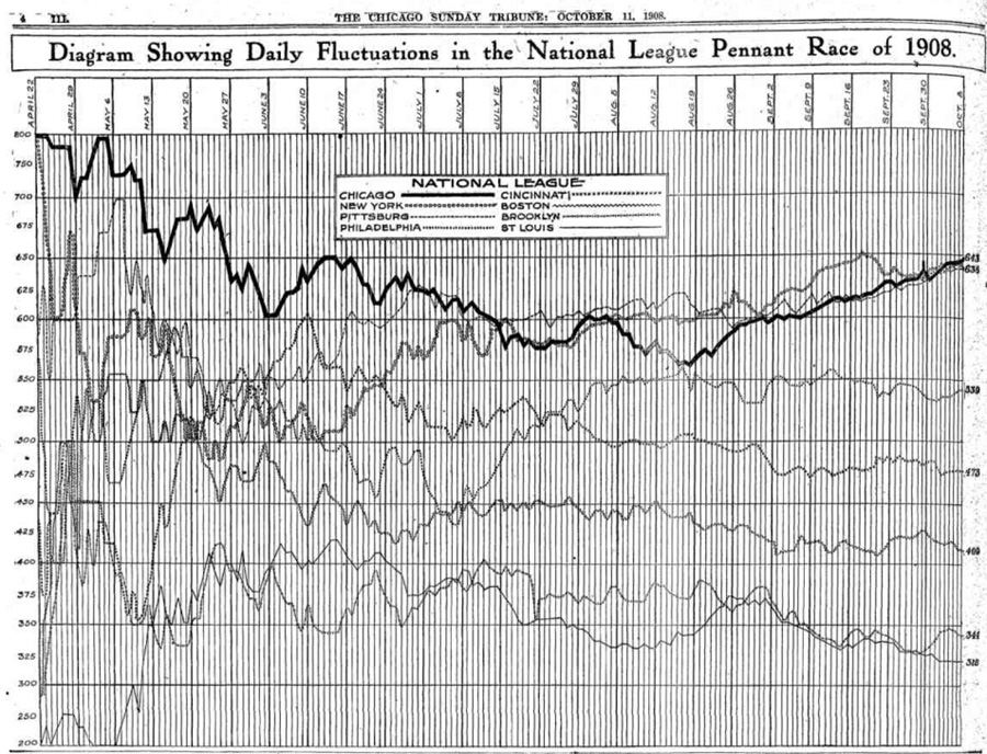
The other day, the New York Times decided to recognize the Cubs' historic season with a throwback—a "classic" Chicago Tribune infographic from the last time they won the World Series.
Cubs graphic in Friday's NYT is a throwback to classic Chicago Tribune graphic from the early 1900s. So awesome. pic.twitter.com/2BGEoxSQEL
— Scott Klein (@kleinmatic) October 23, 2015
I hadn't known it was a classic, but I understand why—published over a century ago, it looks like something you'd see on the baseball statistics site Fangraphs today. And in my trips through the Trib archive, I came across other great infographics from the period, some sophisticated, some zany. (Scott Klein found another one of those as well.)
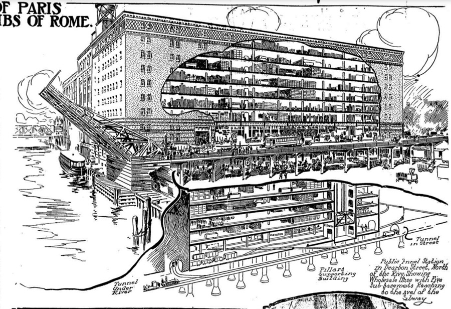
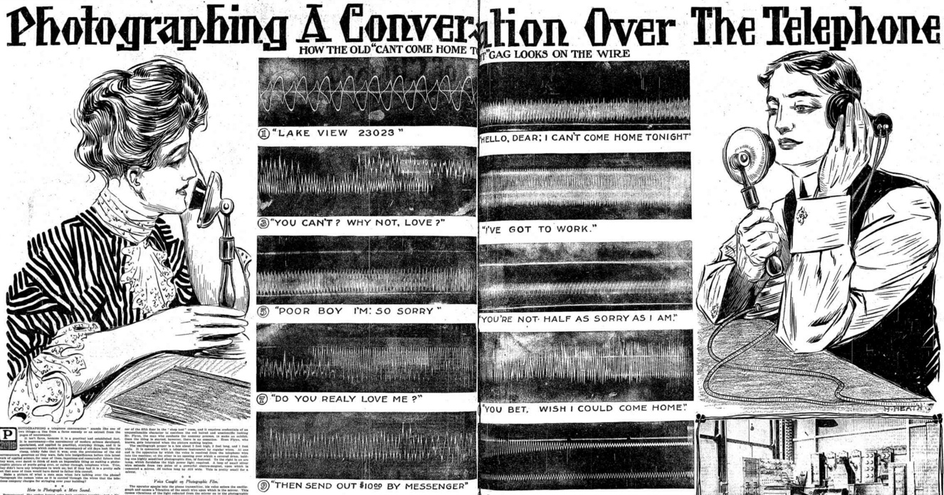
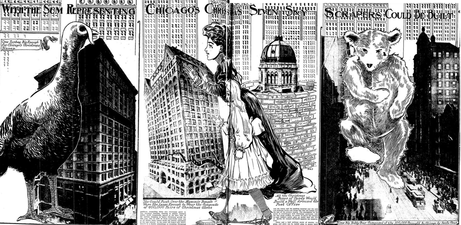
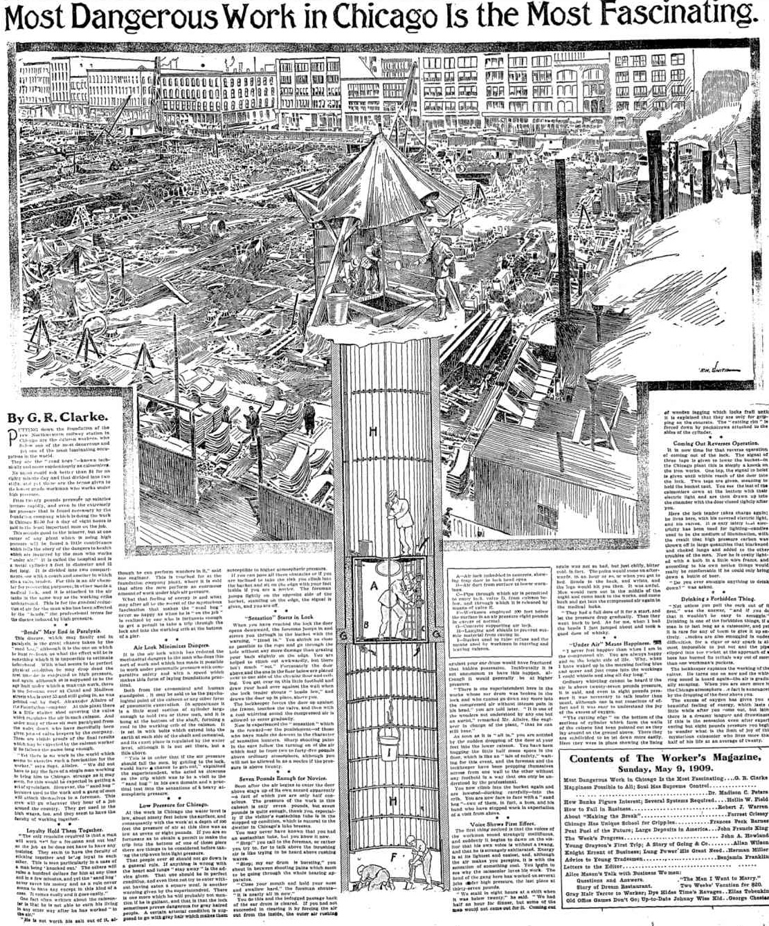
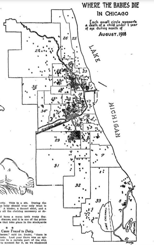
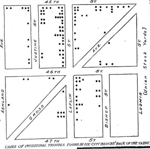
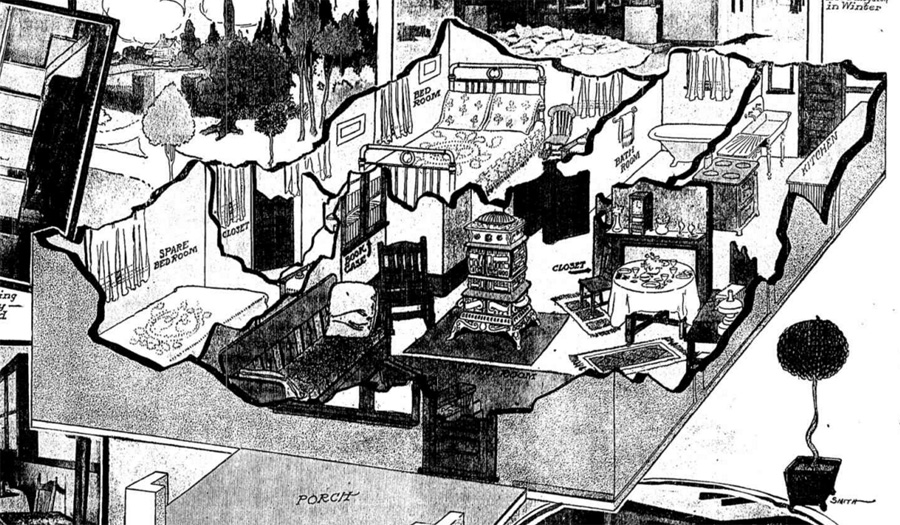
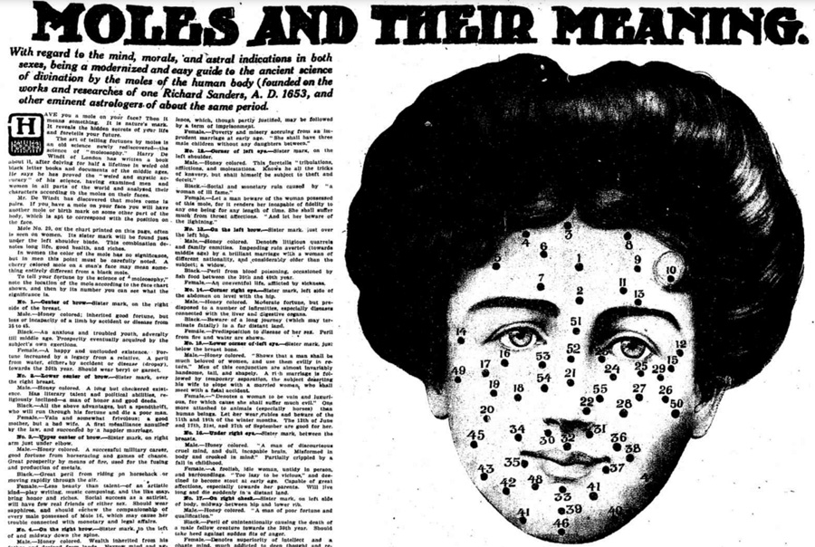
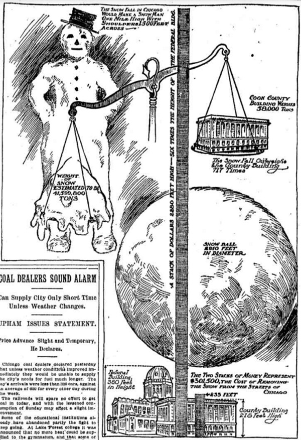
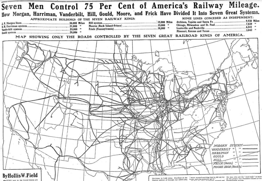
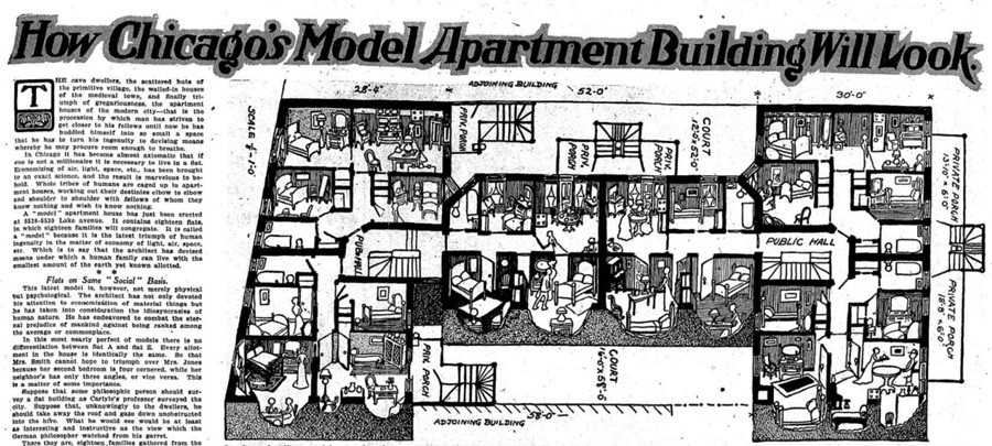
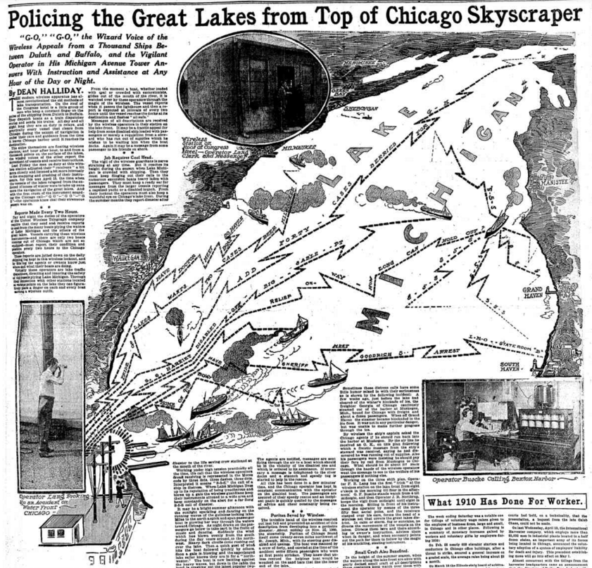
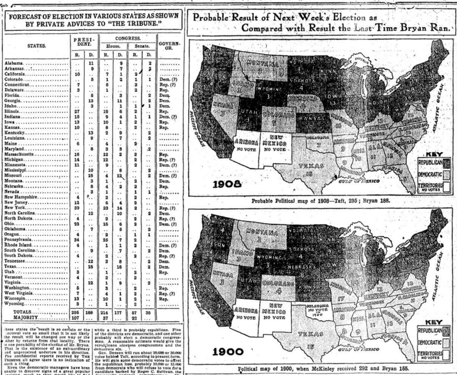
Prior to the invention of the 35mm camera in 1925, photos were of limited use to newspaper designers because of the technical constraints on photographers. So the Tribune relied heavily on illustrators. The most famous of them was the legendary John T. McCutcheon, whose "Injun Summer," published in 1907, is still among the most famous newspaper cartoons. With McCutcheon on staff, the Trib was more likely to run a cartoon on the front page than a photo. When Sundays called for more, and more elaborate, content, the newspaper relied on some remarkable infographics, like the one referenced by the New York Times. They could be charts; infotoons; complex technical cutaways of structures; or mapping in the style of the burgeoning practice of sociology. All were forward-thinking, towards an era where the vanguard in journalism is the presentation of data.