The other day, Bing Bai and Taz George of the Urban Institute published a remarkable national map of the country during the housing boom and through the housing bust. They analyze four cities—Detroit is particularly striking for the lack of mortgage originations in the central city—but Chicago isn't one of them. So I decided to roll my own map.
It revealed something I didn't quite grasp. Certain things are evident: lots of lending was done as prices spiked; the bubble popped very quickly; the recovery on the city's south and west sides has been particularly slow compared to the suburbs and especially slow compared to the near-north side.
What I hadn't appreciated was how the patterns were timed. Mortgage starts tail off before the 2007 peak in the suburbs, and to a lesser extent on the near-north side. But lending was slower to take off on the south and west sides of the city, and more persistent into the teeth of the bust.
There's a stark contrast in mortgage starts from 2003-2004 in the suburbs. On the south and west sides of the city, it's more like substantial steps down from 2005-2007. What it means is that lending remained intense in those neighborhoods, many of which are quite poor, as housing prices were peaking. Then, after the 2007 bust, mortgage starts in the suburbs increase a bit as they continue to disappear on the south and west sides—increasing at the bottom of the market, when housing is more affordable.
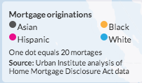
Since animated GIFs can be a bit tough to digest, here are some key years. For reference, here is the key that the Urban Institute uses for mortgage originations by race.
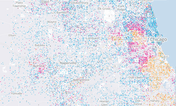
2003
The boom really starts in the Chicago area, especially in the suburbs.
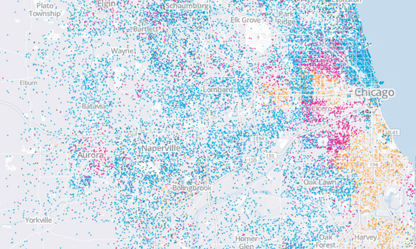
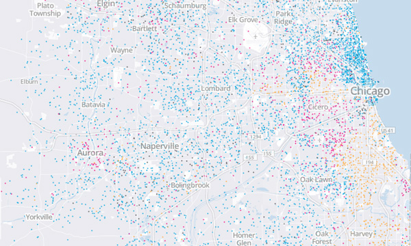
2005
Two years later, starts have dropped precipitously in the suburbs, and to a certain extent on the near-north side. But there are still many on the south and west sides.
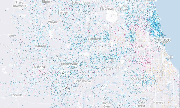
2006
In 2006, housing prices peak. Nationwide, there are actually fewer mortgage originations than in 2001, but the percentage to minority borrowers has grown by 11 percentage points.
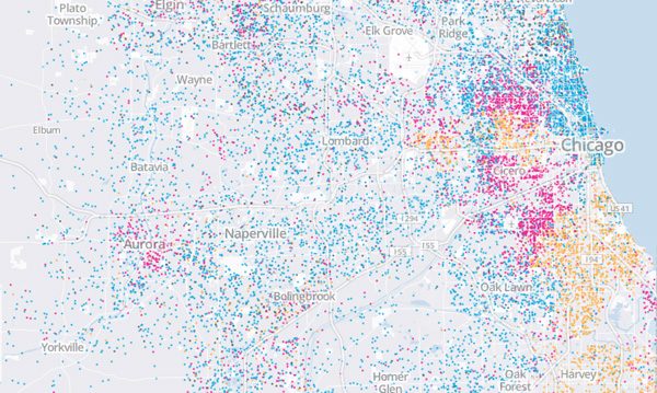
2008
The bubble has popped, and originations are pretty low everywhere. There are still a lot on the near-north side, but it's a dense area generally.
2010
Originations are in a holding pattern or mild recovery on the near-north side and the suburbs as the market hits bottom. But they continue to fall on the south and west sides. The west side, in particular, has been denuded of new mortgages.
Another way of looking at it, via DePaul's Institute of Housing Studies—how the pattern inverts after the bust:
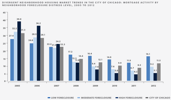
The effects of the boom and bust weren't just spread unevenly across space. They were spread unevenly over time as well—making it yet more difficult, as Amir Sufi and Atif Mian have shown, for the areas at the end of the cycle to be resilient.