|
illustration by Mark Matcho
 |
The past five years in Chicago real estate were like the love affair in the Cole Porter song “Just One of Those Things”: too hot not to cool down. And like the exhilarating early stages of most every romance, it was thrilling while it lasted. Now the city and suburbs appear to be segueing into a new phase of the relationship-the one called reality.
But reality is not such a bad place to be, as countless happily married couples can attest. It’s steady, grounded, and eyes wide open.
On Chicago’s annual chart of local real-estate prices (which begins on page 104), you will see the signs of a good, solid market. Home values rose at a healthy but not exaggerated rate in most city neighborhoods and suburban towns during the 12-month period that ended June 30th. But behind the data is another layer of information that shows clouds gathering: the number of homes sold during the year has dipped, and in many parts of the region, homes are taking longer to sell. This is no doomsday scenario, but everything indicates that the market has cooled-and that it may cool further.
The number of homes sold in the 77 city neighborhoods and 204 suburbs on the chart dropped 2.3 percent during the year. The hardest-hit category of housing was detached (or single-family) homes in the city, where there was a nearly 7 percent drop in number of sales. Because a larger number of attached homes (condos and townhouses) in the city sold this year than last (almost 3.5 percent more), the total drop for the city was less than 1 percent. In the suburbs, sales in both categories fell by more than 3 percent.
The time it took to sell a house lengthened in 60 percent of the neighborhoods and towns on our chart. The slowdown isn’t severe, rarely adding more than 20 percent to the length of time a property spends on the market, but the fact that slowing is evident in so many locations on the Chicago area map is a sure sign sellers need to count on seeing their properties take longer to sell.
Other studies confirm the data in our charts. This summer, at the behest of Rubloff Residential, Susanne Cannon and Jonathan Dombrow of the DePaul University Real Estate Center studied ten years of real-estate transactions in 25 Chicago community areas along the lakefront and a few steps inland. “We see a steady, pleasant upward sloping graph for all those years,” Cannon says, “and then beginning in the end of 2005, a bit of flattening.”
And in July, the Chicago Tribune reported that single-family home sales in Chicago and the surrounding metropolitan area had dropped 15.1 percent in June from the same month in 2005. The condo figure was a 7 percent drop.
What does it all mean? “We’re getting back to normal,” says Alex Chaparro, the incoming president of the Chicago Association of Realtors and the broker-owner at Hudson Street Realty. “People forgot what normal is when everything was going so fast.”
With this return to normalcy, sellers need to adopt new strategies when they put a for-sale sign out front. “You don’t put your house on the market with a price that is 10 or 12 percent above last year’s price and expect it to move right away,” says Cannon. “You price it tight, and you plan to wait.”
The continuing popularity of tearing down older houses in upscale neighborhoods and replacing them with large, expensive new ones may be affecting the average sale prices in some areas. In Lake Bluff, for example, sales data show that prices rose more than 27 percent over the past year. But in that same period, the proportion of $1-million-plus homes sold there nearly doubled. Each high-end home helps pull the average price a little higher, which means that the average price for a location where lots of new homes have replaced old ones might be slightly illusory. In Glencoe, for instance, million-dollar homes accounted for 57 percent of everything sold during the year; in the prior year, it was 49 percent.
In the city, Lincoln Square experienced the greatest increase-a rise of 65.62 percent-as the average sale price of houses there jumped more than $400,000 to top the $1-million mark for the first time. Driven by the sales of condos and townhouses, the boom continued in the Loop and on the South Side, especially in the Douglas and Woodlawn neighborhoods. On the Northwest Side, the Jefferson Park neighborhood showed a significant increase in the average sale price of attached homes.
In the suburbs, Richmond (near the Wisconsin border) led all towns with a 46.25 percent increase. But even in a cooling market, regional house prices generally maintained a steady upward course, with notable increases at all points of the compass: in Northfield (32.04 percent); on the southern fringe of Cook County, along the Indiana border, in Lynwood (22.43); and, to the west, in the up-and-coming suburb of Forest Park (18.49).
But vital housing markets can’t be gauged by sale prices alone. Given their extremely high volume of sales and better-than-modest gains, there are clearly some thriving pockets on the perimeter of the metro region in the towns of Joliet, where sales volume is up 4.9 percent over last year, and Plainfield, which is up 6.1 percent.
There’s one city you won’t see on our chart: Las Vegas. That onetime hotbed of real-estate insanity has become the poster child for a bursting bubble, with more than $4.3 billion in new residential construction called off in the past year. There are so many ways Chicago is not like Vegas, and in the realm of real estate, it is good to remember that, in the Midwest, prices don’t go up very fast or very high. So when the romance does cool off, we don’t have far to fall.
 |
 |
Methods and Sources
These charts were prepared using data supplied by the Multiple Listing Service of Northern Illinois (MLSNI), which annually lists about 90 percent of the houses and condominiums put up for sale in the Chicago area. In addition to charting home prices in the 77 Chicago community areas recognized by the U.S. Census Bureau, we have also tracked sales in most towns in Cook, DuPage, and Lake counties where figures were available. For the outlying counties-Kane, McHenry, and Will-we have listed a number of representative towns. There are two anomalies: In Cook County, the town listed as Barrington on the chart also includes Barrington Hills, Deer Park, Lake Barrington, North Barrington, South Barrington, and Tower Lake. In Lake County, the town listed as Round Lake also includes Round Lake Beach, Round Lake Heights, and Round Lake Park.
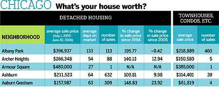
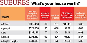
The first column on each chart lists the average sale price for all the houses sold in each neighborhood or suburb from July 1, 2005, to June 30, 2006. (Obviously, if only a handful of houses were sold in a particular community, the average sale price risks being unrepresentative.) Average sale prices for the Chicago suburbs are based upon the sales of single-family homes, what the MLSNI classifies as “detached” housing. For Chicago, where a sizable portion of the housing stock is composed of townhouses, condos, and lofts-“attached” housing-we have also included average sale prices and number of sales for attached homes during the same period.
The second column reports the average number of days that houses remained on the market before they were sold, which can be an indicator of an area’s desirability. The third column lists the number of house sales within each community from July 1, 2005, to June 30, 2006.
The fourth column reports the percentage of increase or decrease in average sale price since the 12-month period beginning July 1, 1993, and ending June 30, 1994, the earliest date for which the MLSNI has comprehensive data available for most of the city neighborhoods and suburbs. In Albany Park, for example, the average sale price 12 years ago was $134,203; this past year, it was $396,937, an increase of 195.77 percent.
The fifth column represents the percentage of increase or decrease in average sale price since the 12-month period beginning July 1, 2004, and ending June 30, 2005. In Chicago, we list the percentages for detached homes only. The percentages of increases in sale prices since June 30, 2005, for townhouses and condos in neighborhoods with sales of 100 or more attached homes are:
Albany Park –1.60, Avondale 9.11, Douglas 7.06, Dunning 14.98, Edgewater 8.29, Grand Boulevard 9.61, Hyde Park 9.16, Irving Park –4.37, Jefferson Park 26.38, Kenwood 5.48, Lake View –2.25, Lincoln Park 2.67, Lincoln Square 3.38, Logan Square 8.76, Loop 15.11, Near North Side –4.12, Near South Side 2.42, Near West Side 0.85, North Center 4.16, Norwood Park 12.42, O’Hare 2.86, Rogers Park 6.05, South Shore 18.56, Uptown 8.98, Washington Park 1.68, West Ridge 13.66, West Town 6.62, & Woodlawn 10.26
In some instances, where data was insufficient or unavailable, we have inserted the symbol “N/A” (not available, or not applicable). Specifically, for city neighborhoods and suburbs-such as Armour Square and Mettawa-that had fewer than ten house sales during the 2005-06 time period, we have listed no percentage change since 1994 or 2005 because the available data provided an insufficient basis for comparison between past and present sales.
About the Multiple Listing Service of Northern Illinois
Established in 1989, the Multiple Listing Service of Northern Illinois is one of the largest multiple listing services in the world, with more than 90,000 active real-estate listings, two million off-market listings, nearly 500,000 photo files, and four million tax records for eight northern Illinois counties (the six counties in our article plus Grundy and Kendall counties). Owned by ten local real-estate associations and made up of 50,000 subscribers in the real-estate industry, MLSNI and its computerized database help real-estate agents and brokers better serve their clients, whether they are buying or selling a home.