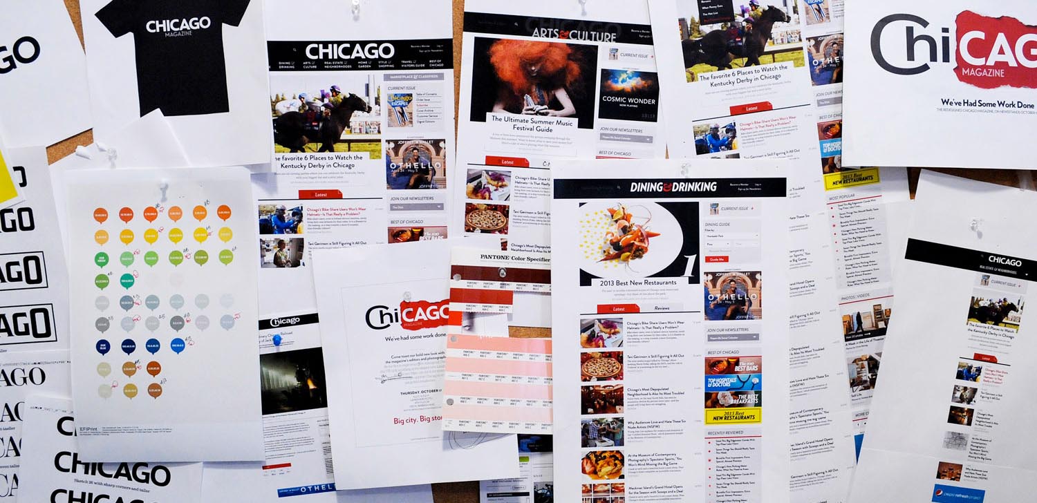
This is an exciting time for Chicago magazine.
With the November issue, on newsstands this week, our print edition introduces a major redesign, including a brand-new logo. The result is fantastic.
Meanwhile, our website also celebrates a top-to-bottom reboot more than a year in the making. No pixel has been left unturned in our effort to deliver a website that reflects the best that Chicago—and Chicago magazine—has to offer.
Chicago, you’re going to love it.
What’s new online?
1 A cleaner design
It’s been more than five years since our last redesign. The Web has changed a lot in that time, so we started over from scratch. The result is a crisp, unified, and fast-performance design that showcases the best we have to offer and employs current best practices.
2 Great on mobile
More of you are reading on phones and tablets every day, and until now that meant a lot of pinching and zooming. Sorry about that. We’re now employing a technique known as “responsive” design. Pages should work great whether you’re reading in the office or on the train.
3 Great typography
If you’re a type geek, you know that Hoefler & Frere-Jones is one of the world’s most revered type foundries. Until recently, however, H&F-J’s typefaces were not available as Web fonts. That changed in July. As a result, we’re thrilled to have both our print and online editions using the versatile, modern Verlag as its primary sans serif and Landmark Inline as a section flag. Meanwhile, we’re making our online copy more readable by turning to 16-pixel Georgia, almost 50 percent bigger than our previous style.

4 Bigger photography
It’s clear that you love photo galleries as much as we do, whether it’s 100 style photos from Lollapalooza or 10 photos of Jay Cutler getting sacked. We’re excited to present our galleries in a format that is user-friendly and puts the proper focus on the great photography.
5 More videos
Video is going to be a bigger part of Chicagomag.com. You’ve always enjoyed Dennis Rodkin’s unique tours of Chicago real estate. Now we’re expanding into Chicago’s cutting-edge dining scene, starting with this tour of L20, a three-star restaurant in Lincoln Park.
6 More maps
Location, location, location. For a city magazine like Chicago, where we are defines who we are. So we’ll be including more maps, and they’ll be bigger and better than ever. Check them out in the Dining Guide, but expect them to pop up any time it’s relevant to the story you’re reading.

7 Special treatment for special stories
Chicago has always celebrated stories that go outside the box, and these stories demand design that also goes outside the box—literally. We’ve created a new format that strips away everything but the words, pictures, and graphics, and gives the story room to breathe, beginning with Bryan Smith’s profile of Sun-Times owner Michael Ferro. Internally we call these stories “super articles.” We hope you find them super as well.
8 All the same great content
Do you remember blogs? So do we. They were big in the aughts. But now it’s 2013, and sometimes the blog metaphor just gets in the reader’s way. No longer will we distinguish between stories that originate in print and stories that originate online. That means saying good-bye to our friends like “The 312” and “Style Sheet.” Look for the same great stories from all your favorite writers, now organized by subject areas that you’ll find in the top navigation. You won’t miss a thing.
9 More special offers
We’ve made partnerships with a selected handful of companies that will help you get the most out of your city, including Table Savvy for dining, Goldstar for theater and Krrb for second-hand treasures. Find these deals and more in our Marketplace.
10 We’re locally sourced
When we needed help for this project, we turned to some of Chicago’s young rising stars. First, author and interaction designer Nick Disabato worked with us to create our plan of attack. Once we were ready for the design phase, we collaborated with Kyle Fletcher, Alison Medland, Jon Shaft, and Derek Moore of Simplify, Advance. They helped us find our aesthetic vision and created a framework that we think will serve us—and you—for years to come.
I hope you’re as happy with our new website as I am. Good redesigns are never just about new fonts or colors, so I hope you agree with me the site not only looks great but, more important, works great. That said, I can’t rule out the occasional hiccup. If you find errors, please contact me personally at lseemann@chicagomag.com.
Finally, I want to thank all my colleagues here at Chicago magazine, but especially executive digital editor Jennifer Tanaka and design director Bryan Erickson. This project required help from all quarters, and I’m proud to work with such a great team that cares so much about this city.