Photo: DS Shin
Sometime in the later years of the previous decade, I entered a contest from a local company, Coudal Partners, and won. The contest was something like "what's the weirdest cover of a hip-hop song." My entry was Nina Gordon's deeply uncomfortable version of "Straight Outta Compton," and my prize was a pack of slim little paper-bag-brown notebooks called Field Notes.
I used them for story ideas, sketching out a wireframe for a website, shopping lists, apartment-hunt addresses, and directions. This was before I had a proper smartphone—the iPhone would have been released not long before that—and had a need to write down turn-by-turn directions sometimes. Soon after those notes were taken, I didn't need them anymore, but those notebooks are still floating around my house somewhere.
Part of it was that it was a little bit of excitement to win a Coudal contest—when I came to Chicago as a college student, pre-Tumblr or Twitter, the way to find cool stuff online was to go directly to webpages that were known to have cool stuff, and Coudal Partners had (and still has) a "Fresh Signals" feed that had some of the coolest stuff on the web. It was (and still is) an ongoing cabinet of curiosities. Just from the past few days, they've linked to schematic railway maps, a video on how road grids change because of the curvature of the earth, and an incredible post on Apple Maps vs. Google Maps.
Coudal Partners also came up with the Museum of Online Museums (I'm a benefactor from I can't remember when), and Layer Tennis, in which designers trade an image back and forth, getting 15 minutes to add on to it, with commentary provided by someone interesting, like this Chicago-centric one featuring Phineas X. Jones, Dan Grzeca, and Kevin Guilfoile. They did advertising and branding: Lettuce Entertain You, the White Sox ("Good Guys Wear Black"), the Blackhawks, the Houston Astros, the Baseball Hall of Fame. They created The Deck, a not-irritating ad network that ran for over a decade as ad networks got increasingly irritating. But more importantly for people like me—I did layout and design for my college paper, though not well—coudal.com was an introduction to some of the best things and people on the web.
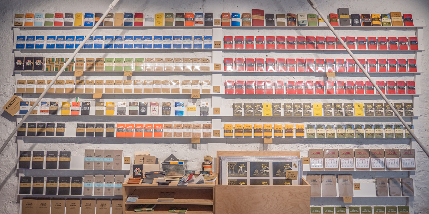
Coudal doesn't really do advertising or branding anymore. They make Field Notes notebooks and sell them, for the most part, three for $9.95 or $12.95, made in the U.S. They (almost) all have the same basic form factor and all are based around the clean Futura font, and there they work their variations: the Ambition edition has gilding done by an Indianapolis Bible maker; the Snowblind edition has a custom-mixed ink that changes from colorless to blue in UV light; the Cherry Graph has a thin cherry-wood veneer; the Lunacy edition (30,000 made, sold out) has full, half, and crescent die-cut covers showing through to the moon; the Two Rivers edition (40,000 made, sold out) were hand-set and printed at the Hamilton Wood Type and Printing Museum in Two Rivers, Wisconsin.
Just looking through the limited editions that I didn't buy, or didn't buy enough of, is a bit painful. They're a bit addictive; they sell millions of them every year. So where did they come from, and why did they take off? It started, just a little more than ten years ago, with holiday gift from a Portland-based designer named Aaron Draplin.
"Aaron, in 2006 or 2007, made about 200 Field Notes. He made them on a Gocco press, a little Japanese toy press, cut the corners round, and they look pretty similar to what they look like now," says Jim Coudal, president of Coudal Partners. "He sent them to some of his friends; I happened to be one. He'd played Layer Tennis, we'd worked on a bunch of things together. I called him, and he said, 'How do you like my stupid notebooks?' And I said, 'I don't think maybe it's so stupid. I think maybe we should make a company of this.' He said OK, we registered the domain, made five thousand three-packs of them, and got the site up and running in a couple months. The first day we made 13 sales. That was through blogging it on Fresh Signals and Aaron putting it on the DDC [Draplin Design Corporation] site."
Aaron Draplin was born in Detroit and grew up in Northern Michigan, the son of a tool salesman. He moved out to Oregon to snowboard, launched his design career with a snowboard design, moved to Minneapolis for design school, moved to "Shithole, Southern California" for a job as art director for Snowboarder magazine, then Portland, Oregon for a job at Cinco Design, where he did work for design-forward sport brands like Gravis and Nixon. Then he broke out on his own at DDC. He's got feet in a couple worlds: the au courant West Coast design scene and the deceptively simple design history of the Midwest.
"I came into a world where you have a million typefaces, a million colors, a million things, and you didn't even really need it. And yet we were all pushing ourselves to explore those things, and, I don't know, out-postmodern the next knucklehead grad," Draplin says. "You remember the '90s, all that bullshit that came in the '90s, masturbatory, all over the place; yes, people were getting grad degrees in it and shit. It had to go there. Design had to go there, and get weird, but it didn't work. It wasn't about communication, it was about damaging things.
"The more I look at that stuff and think about being a kid at that time, there's a reason I love Chuck Anderson, House Industries, things I've found in a flea market. They reminded me of home; they worked; there was a, dare I say, an unfuckwithable quality to it. There was something blue-collar and cool about it. In the wrong context it's like an embarrassing thing for someone growing up in that. You know, I grew up around a dad who had tools everywhere; it was cool. My dad was a tool salesman," he says. "I grew up around packaging, and this appreciation for, you know, shit working—and I'm really thankful. It definitely informs why I like the stuff I grew up to like. I saw that stuff up close and understood that industrial functionality of things just having to be easily read."

There's a lot going on here that's worth, well, unpackaging. Take packaging: one of the people most responsible for bringing European modernist design to the United States was Walter Paepcke, whom I wrote about in 2012.
Paepcke was the son of an immigrant lumberman, but one who died very wealthy building the Chicago Mill and Lumber Company. Paepcke started his own company, the Container Corporation of America and married into Chicago high society; his wife Elizabeth, sister of the famous diplomat Paul Nitze, was an Art Institute grad and theater designer who cultivated his aesthetic sense. He helped bring New Bauhaus founder Laszlo Moholy-Nagy to the Unites States, and using his wife's idea for a "Great Ideas of Western Man" brand-building ad campaign, he hired designers like Milton Glaser, Saul Bass, John Massey, and Leo Lionni (whose children's book Little Blue and Little Yellow is a masterpiece of modern design) to create a watershed moment in commercial design. One of CCA's promotional items was the World Geo-Graphic Atlas, a monumental work by the Bauhaus designer Herbert Bayer. Massey, who was diverted from a career as an editorial cartoonist after he fell in love with modernist design, pioneered the role of design in large industrial companies with CCA's in-house firm, the Center for Advanced Research in Design.
All that came from an empire built on cardboard boxes. And it makes a certain kind of sense.
"The lettering on the side of a cardboard box, underneath, where it just says the weight and the edge crush, that is perfectly functional," Draplin says. "And there's something beautiful about that to me… there was something about it not having to compete with whatever is cool or ironic. It was just meant to work. Something about having limitations—it only needed one typeface."
Every Field Notes notebook lists out its specifications in its one typeface, Futura—the creation of a German designer, Paul Renner, who "wanted something industrial and universal; something that could be mechanized and standardized" with "an emphasis on rationality and functionality, an interest in mass production, and an optimism for the future."
The philosophically similar Bauhaus school seized on it; stateside, it was adopted by artists from Stanley Kubrick and Wes Anderson to Barbara Krueger and Jenny Holzer. (And, via Krueger, the streetwear titan Supreme.) Futura carries all of that aesthetic history with it.
There are those seeds of the Bauhaus in Field Notes. More directly, there's Charles Anderson, like Draplin a fellow graduate of the Minneapolis College of Art and Design. He's a major influence on Draplin, and Anderson is another exemplar of this regional design sensibility. Here's how his AIGA Medal note describes his work:
Anderson graduated from Minneapolis College of Art and Design in 1981. By 1985 he had joined the edgy Duffy Design Group, where he ultimately became a partner. Influenced by a curious mixture of mid-century New Bauhaus Modernism, which he was exposed to through his teacher and first employer, Peter Seitz, and carnivalesque pop culture, which he learned through studying design history, Anderson exemplified a Minneapolis style. He further placed the Midwest on the design map, blending nostalgic pastiche with contemporary aesthetics of color and form.
Anderson—who grew up in an Iowa farm town and whose dad was a railroad engineer, and who studied under the New Bauhaus-educated designer Peter Seitz—found his first client as an independent designer in the Niles, Michigan-based French Paper Company, part of a design-oriented industrial cluster in Western Michigan that includes Herman Miller and a couple Knoll factories. Much like CCA did with its designers, the French Paper Company hired Anderson for a design-focused brand-building campaign. Anderson had fallen in love with a paper called French Speckletone, a recycled paper with embedded woodchips, for this reason:
Back in the mid 1980s. At the time most paper being used by designers was the slick, shiny, clay-coated variety. I preferred real, uncoated paper and was looking for some authentic newsprint and brown Kraft papers that could be offset printed. At the time these industrial grade papers were only available in giant half-ton rolls and couldn’t be printed.
One day a paper distributor named Lamar Lundell, a local Minneapolis paper legend who has brought designers and paper mills together for the past 50 years, showed me some swatchbooks from French Paper. When I opened up the French Speckletone swatchbook I saw all of these incredible papers that I had been looking for. I started using Speckletone for my printed projects and I sent samples to French.
They hired Anderson to make promo books with it; the rough paper went from their worst-selling line to their best. And the design circle is easily completed with Field Notes: the cover of the Original Kraft edition is French Dur-O-Tone 80#C "Packing Brown Wrap" from the French Paper Company.
All this comes together in Field Notes: the European design utopianism of the Bauhaus (inspired by industry and agriculture), the agricultural and industrial confidence of the postwar Midwest (influenced by the Bauhaus), and the embrace of that regional legacy by rural-kids-turned-designers like Anderson and Draplin.

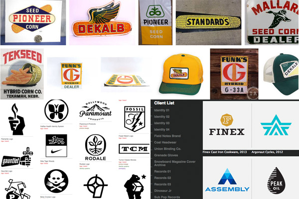
The form factor of Field Notes comes directly from the agricultural Midwest. They're based off of promotional notebooks distributed by seed and farm-equipment that Draplin began collecting on drives through the Midwest, some of which are documented on the Field Notes website: DeKalb, Funk's, Federal Graduated Fertilizer, the Future Farmers of America. (The most famous of these, the DeKalb logo, was the work of Arlie Pearce, a Joliet native who trained at the Chicago Academy of Arts.) And it, too, came from Draplin revisiting the Midwest of his childhood.
"You go 30 miles from where you're at, due west, and you get to a cornfield, and chances are, a good chance, on the edge of that cornfield is a fence or a post with a little sign on it. That sign might have this loopy, thick-lined logo that says, these are the sorts of seeds we use in this field. Perfect to me," Draplin says. "The logo works from 50 feet away; you can see it. That's graphic design too. You'd see these agricultural tracts and calendars, and they'd be set in Spartan or Futura Bold, and it was one typeface, and that's really the spirit of this thing."
"They were in the pockets of the old-timers around me. It would have been 1985. You just saw people using little spiral notebooks and pieces of paper in their pocket, and also in their pocket would be a pencil, a ruler, maybe chewing tobacco and glasses," Draplin says. "Everything they needed would be in their vest pocket. I saw that as a kid, and when I'd get a chest-pocket T-shirt, I would fill it up with stuff.
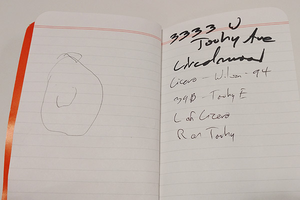
"I would have been 24, 25, I was going back to school and started to get into ephemera, digging around, hitting junk sales. I'd go to a farm sale—one of the saddest things you'll ever see—just by happenstance," he says. "I bought a box of almanacs; this was out of a junk drawer. There were keychains, and goodies, just a junk drawer full of stuff for $10 bucks or something. And there were a bunch of these agricultural notebooks, but they were written in. It was, like, someone's life had taken place on these pages. And it kind of blew me away."
That genesis—"everything they needed would be in their vest pocket"—echoes a curious internet trend that might have something to do with the persistence of Field Notes: Everyday Carry, or EDC. It's a Thing. It's just people showing other people the stuff they pack every day, but it's enough of an internet cult to sustain a site devoted solely to EDC, a Reddit group, a Wikipedia entry, and innumerable store verticals.
When Hypebeast covered everydaycarry.com in 2014, hey, there's Field Notes. When Adam Savage, the internet-beloved Mythbusters co-host gave in to his viewers' demands, "rigorously requested, every single video," to display his EDC, there's Field Notes again. "This has become an absolutely vital part of my everyday carry," Savage told Tested. There are long Reddit threads in the EDC group about Field Notes.
EDC overlaps with bullet journaling, which is another internet thing that involves a lot of sharing of methods. It's just a system of keeping physical lists in a notebook, but its more obsessive fans give it lavish customizations that they share on Instagram. Field Notes have a lot of fans among bullet journalers.
It might seem like a backlash to the digital age, but the makers of the popular Moleskine journals found the opposite when looking into the success of their brand: "a direct correlation between sales of its little black notebooks and proximity to an Apple store." That may be because a small notebook works better for certain tasks than its digital counterpart: taking notes longhand means processing, rather than recording, information.
"The tagline of the brand is 'I'm not writing it down to remember it later, I'm writing it down to remember it now,'" Jim Coudal says. "That comes from my grandfather, Nels Coudal. I lived with him for a while after my grandmother died. He would always be writing scraps on little scraps of the Tribune. Finally, I was like, Grandpa, why don't you get a notebook? Why are you writing them there, you know you're going to lose that piece of paper. He said, 'I'm not writing it down to remember it later, I'm writing it down to remember it now.' Meaning, the physical act of writing ingrained something in your brain much more than flipping it into an app.
"People who are typing on their computer are transcribing. That's not taking notes. Transcribing's just listening and typing," he says. "It's just going in your ears and out your fingers and you never hold onto it at all. When you write it, you have to condense what somebody's saying; what you're writing is a way to access your hard drive upstairs."

Coudal Partners' presence on the web meant that it first went into the hands of digital obsessives, but in particular, those with analog interests. They didn't have a business plan for Field Notes so much as a sense such a market existed. "We figured there must be a lot of people like us, because we have thousands of people coming to the website every day, reading this crazy drivel," Coudal says. "We're posting archaic design links and crazy typographical links. and people are clicking the links, and not only that, they're coming back tomorrow to see what's coming next. Maybe we got lucky and the market moved to us."
Out in meatspace, Field Notes's big break came from J. Crew. In 2008, not long after Field Notes launched, the clothing company turned an old bar into a menswear store. As a 2013 GQ piece describes, it was a turning point in retail, putting the weight of a major retailer behind a particular trend. "The new store and the new clothing in it were traditional without being derivative, fashionable without being fashiony, timely without being trendy," writes Ryan D'Agostino. "In 2009, during and after the recession, many men took to wearing older brands known for authenticity and heritage, and J. Crew was there, having already partnered with Red Wing (boots), Alden (shoes), Ray-Ban (sunglasses), and other labels that had some history behind them."
J. Crew "curated" a handful of these brands alongside their own clothing in the Liquor Store. One of those was Field Notes.
Coudal calls it a "really big moment for us." He adds, "That sort of symbolized this mainstreaming of this artisanal fashion, whatever you call it. That immediately got us into lots of those kind of stores. Stores that were selling sweaters that were made in the USA, or a shoemaker, all these different companies. The good thing about that for us is that tastemakers were seeing us. These were fairly high-end stores. We were in stores that had no other paper products, so we didn't have to fight the Moleskine train coming down the tracks. If anything, we were at that wave, or a little ahead of it, but then when the wave came along, it just took Field Notes with it. So I'm not complaining."
The brand, of course, didn't have much of a history or heritage behind it—but its design did, so it slotted well next to Red Wing boots and the like.
That Americana trend got inevitable blowback for popularizing blue-collar vernacular practicality with affluent New Economy creative types, but the design heritage of Field Notes is more complicated than that. It's the CCA, one generation out from an immigrant lumberman, bringing high European modernism to America, which found its way into those agricultural memo books—which, given the philosophy of the Bauhaus, was exactly what it was supposed to do. The Bauhaus modernists were inspired by American agricultural and industrial design; Americans were inspired to put those lessons back to work in the same fields of industry. Designers like Draplin and Charles S. Anderson grew up in both worlds, absorbed this history, and put it back together—like their design forefathers had—for a new time and a new economy.
Field Notes has a resonance for me. One grandfather was a newspaper pressman, who taught me to read on the papers he printed. (In another moment of European design meeting American mass production, his brother worked at Fieldcrest Mills, which had an American license for Marimekko, which meant I was using Marimekko towels long before I knew what design was, much less their particular significance.) The other came from a furniture family and made handcrafted Southern drawing-room furniture. His son—my father—was a purchasing agent for a furniture factory, meaning he dealt with the furniture equivalent of Draplin's father. That's why I got the Shelterwood edition of Field Notes. It's nostalgia, but the wood veneer is a very personal and vivid nostalgia. I got the Shenandoah edition for my mother because she was born near there. It's past, but it's also present; Field Notes wouldn't exist if the printers and paper mills didn't. They're still doing that work, and Field Notes, in the way of all design, builds something new off it.
"We don't want to make a book that looks like it was made in 1935, we want to make a book the way they made the book in 1935," Coudal says. "That's a real distinction. we're not trying to be retro; we're trying to reproduce previous techniques because we like the results these techniques came up with."