Of all the 21st century smart-city data we have, virtually none of it directly answers one of the most important questions about a city: Where are people going?
If you think about it, we regularly count where people are at a certain point. There's data for what bus stops and train stations people use. There's data for vehicle traffic throughout the city, taken at specific points. Sometimes we do pedestrian and bicycle counts, which are laborious. In short, we have a lot of Point As, but virtually no Point Bs. With one exception: Divvy, the city's bike-share system.
To use a Divvy bike, you have to check it out from a dock and return it to a dock. As such, it measures not just traffic, but trips. While its usage is extremely limited compared to every other mode of transportation, the data about transportation that it generates is, in that sense, much more intriguing.
"That's what makes it such a rich data set," says Gabriel Gaster, a data scientist at Datascope Analytics. "It's not just where you are; people get on and off." When Divvy put out a call for visualizations of the system's data, Gaster created a map that shows where users go from particular stations, with a typical walking radius around those destinations—a reasonable estimation for a full journey.
"It's neighborhood traffic," says Gaster. "It lets the neighborhoods emerge organically. What can we learn about the neighborhoods from this data?"
What did Gaster learn? A number of things. For instance, two observations on Hyde Park, both of which are stereotypical and both of which I can confirm to be true:
- "As you can see, the most common trip from Jimmy’s Tap goes straight to the University of Chicago library."
- "[T]here is very little traffic to the rest of Hyde Park. This then would seem to confirm Cottage Grove as a border — which is probably expected by people who live in the area."
As an alumnus who has lived more years in the HPK than any other neighborhood, I can say with some authority that Jimmy's and the library are probably the two most common in-neighborhood destinations, and that Cottage Grove is basically the western border in terms of where students live and travel.
What struck me was how much Divvy traffic seemed to be shaped by the city's interstates, as point-to-point journeys were constrained in wide, pie-shaped swaths by the immense roadways. This is both intuitive and not. On one hand, there are plenty of ways to get over and under the interstate; on the other, we know from years of history that interstates divide sections of the city from one another.
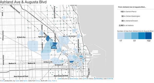
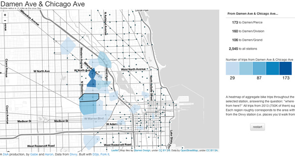
First, here are all the trips taken in 2013 from some of the most heavily-used Divvy stations in the Wicker Park/Bucktown/West Town area.


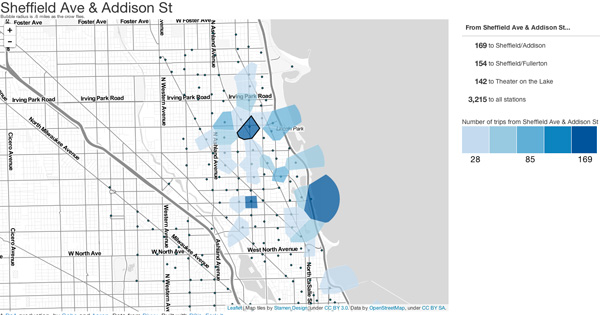
Now, the Near North/Lincoln Park/Wrigleyville area:


And the South Loop area:
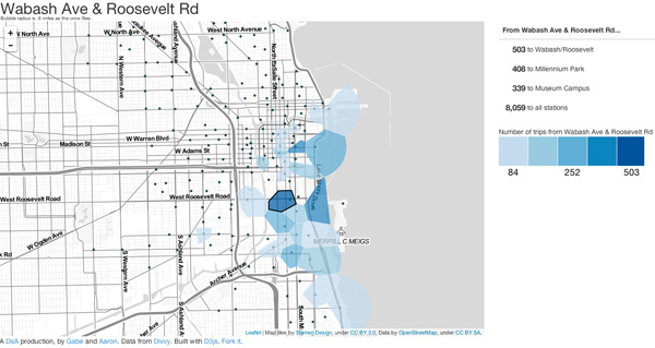

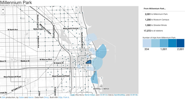
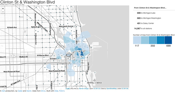
And the three big stations downtown:

It's just an inference from the visualizations, not proof. As Gaster put it, the visualization is a good starting point to generate hypotheses; it's not, in and of itself, a statistical test.
And while the interstates aren't impenetrable, they do seem to shape Divvy traffic, concentrating station-to-station trips within areas bounded by them. It's a reminder that modes of transportation do more than take us from Point A to Point B—they shape cities, visibly and invisibly, guiding other modes of transit in their paths.