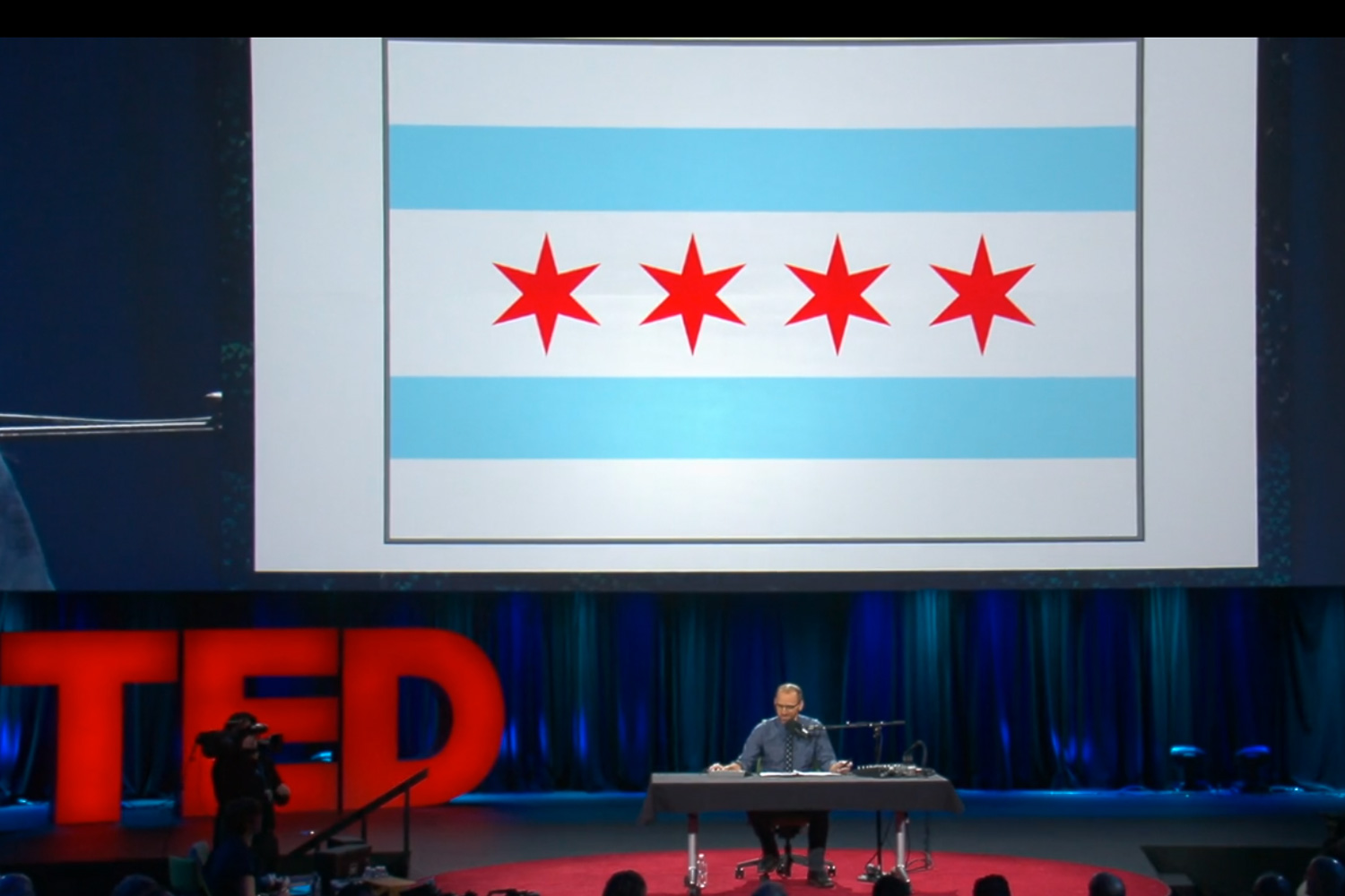
Roman Mars—former WBEZ producer, host of my favorite podcast, and creator of the wonderful Radiotopia podcast network (check out Criminal, my second-favorite podcast)—recently gave a TED talk about great flags, terrible flags, and how to make the latter the former.
During his time here, Mars noticed that the Chicago flag was both awesome and ubiquitous; he then moved to San Francisco, and was disappointed to find that the San Francisco flag is terrible, and that as a result no one flies it or cares about it. For someone who hosts a radio show about design and loves flag design in particular, this was an unfortunate state of affairs. So he's on a mission to improve city flags throughout the country, following the basic rules of vexillology. (I make a brief appearance.)
A couple notes:
1) My favorite rule of flag design that Mars mentions is this: if you have to label your flag, it's a failure. This is why Illinois's state flag is a failure. It didn't always say "Illinois" (in a crap font) on it. The state name was specifically added in 1969 because no one could tell it was the flag of Illinois, because it is hopelessly generic. As opposed to the Chicago flag, the stars on which were designed to look like no star that had ever appeared on a flag before, by an expert in the history of flags.
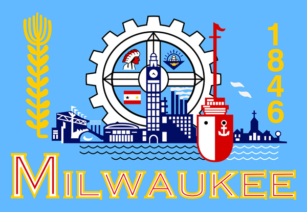
2) One place where I disagree somewhat with Mars is in his contempt for the Milwaukee flag. In fairness to Mars, this means I also depart with the vexillological community generally. They hate it. I kind of like it. It's got spirit, unlike the Illinois flag; it just has too much spirit.

I get where they're coming from. The font is bad. It's a mess of elements. It looks like it was designed by committee, because… it was designed by committee. But I like the color scheme, and the elements themselves are not terrible. It actually looks surprisingly contemporary for a flag designed in 1955.
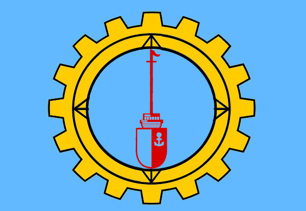
So I tried my hand at a redesign.

Or why not just the… whatever it is that almost looks like a Marimekko design?

It follows what could be another principle of flag design: would it make an awesome tattoo? No? Ok, it's 10 minutes in Photoshop. But you get the idea: trying not remotely hard enough can be better than trying way, way too hard.


