My favorite example of how to do a podcast well is Roman Mars's 99% Invisible, 15 or 20 minutes a week on design. (It's sufficiently beloved that Mars just completed a Kickstarter for over $620,000, more than twice its goal, to support his show and several others as part of PRX's Raditopia.)
Their most recent episode is "Vexillionaire," a pun on vexillology, or the study of flags, and it's a typical 99% Invisible story: how do you design a good flag? And if you're a Chicagoan, you won't be surprised that the show leads with our own "kick-ass" flag, by way of tracing how Portland struggled to get one. (And they did a pretty good job.) The very basics of it are this:
Here’s a trick: if you want to design a kickass flag, start by drawing a one-by-one-and-a half inch rectangle on a piece of paper.
A design at these dimensions held 15 inches from your eye looks about the same as a three-by-five foot flag on a flagpole a hundred feet away.
Your design has to work within that tiny rectangle, because unlike other designed objects, a flag is usually seen at a distance. It is also often in motion and partially obscured.
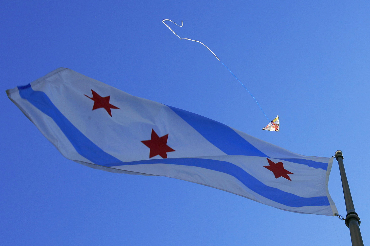
So, duh, it should be simple and bold. Simple and bold works at a distance; it works in the wind; and, as Robert Loerzel noted last year, it works on tattoos.
And it works because it was designed that way. In 1915, Mayor Harrison assembled a committee to design a municipal flag, so that the boisterous city would keep pace with the 40-some other American cities that had adopted one. The secretary of the committee was Frederic Rex, head of the city's municipal reference library.
The city put out an open competition; it would take two years to settle on a flag. Rex was inundated with awful designs, as the Trib reported in 1921.
Not more than three or four of the total number, exceeding a thousand, showed any perception of the prime fact that flags are intended to fly in the air…. Many of them looked pretty well on paper… but would not have shown to any advantage dancing in a variable breeze, which is the only test of a flag. This may be termed the literary fallacy, the unconsciousness on the part of the inexperienced that the chief value of any flag lies next to the staff, that the middle third of it is far less visible, and that the outer third is of least consequence.
The unbeloved Illinois state flag fails this test: its boilerplate symbolism is dropped, perhaps for the best, into the middle of the flag itself.
Then there's the matter of content.
One indignant competitor, when asked by the commission if his design, borrowed from the Y-shaped device which The Tribune had adopted just before the World's Columbian exposition, indicated that such a stream as ours is exclusively significant of Chicago…. As a matter of fact, almost his identical design had been made the flag of Fort Wayne in the summer of 1916, commemorating the geographical fact that the St. Joseph and St. Mary rivers united in the center of that city…. [Ed. note: St. Louis would later adopt a river-confluence theme for its flag.]
The question of putting old Fort Dearborn on the flag was raised by the commission itself. Apart from putting anything implying the stability of fortifications on a flowing, dancing bit of bunting, just such a blockhouse as Chicago's old fort was built in almost every frontier village across the American continent…. Furthermore, Toledo had just adopted a city flag, which showed such a blockhouse, shared in common with a thousand other places in the country.
By contrast, do you know why the state flag of Illinois says "Illinois" on it? It's because a Vietnam vet was frustrated that his fellow service-members didn't even know it was the state flag. So in 1969 the state had to label its own flag to make sure it wasn't confused with the other states whose symbol is an eagle holding a banner.
The Chicago flag's designer, Wallace Rice, was a classic turn-of-the-century polymath—he was a lawyer, a reporter, and a poet, who edited an anthology for agnostics in collaboration with Clarence Darrow—and was chosen for the municipal-flag commission because he lectured "on heraldry and flag designing at the Art Institute." Rice sought a symbol that would not only distinguish Chicago from its peers, but also from any nation, state, or any flag ever designed:
The five-pointed star, symbol of a sovereign State, was also considered out of place, for reasons which I hope have been made equally obvious here. Chicago is a city.
After more than four hundred designs had been made by me, I finally struck upon such a six-pointed star as had never appeared in any flag before, peculiarly and singularly a Chicago star, made by a Chicagoan for his greatly loved city, by an American in the tenth generation in this country, whose ancestors had fought against Great Britain, for the most American of American cities. It differs from all other stars in use in European heraldry and in State and National flags and coats-of-arms, and is specifically for and of Chicago and nowhere else on earth because its points are straight and not like the usual heraldric etoile curved like flames [ed. note: like this], and because these points subtend an angle of only thirty degrees, instead of the sixty degrees subtended in the star made by superimposing a triangle.
Why 30 degrees? Because if you just stick a triangle on it, you get a Star of David, and religious symbols were nixed by the rules Rice set up (though depending on how the star is rendered, it looks a lot like a Marian star, which is featured on the Great Seal of the United States). Following a sensible set of design restrictions led Rice to the heart of the flag, its graceful heraldic stars.
Rice also designed a centennial flag for the state of Illinois. It's not quite the masterpiece that's his Chicago flag, but a better state flag is a pretty low bar.

Per the guidelines of the Chicago contest, you can see Rice emphasizing that "the chief value of any flag lies next to the staff."
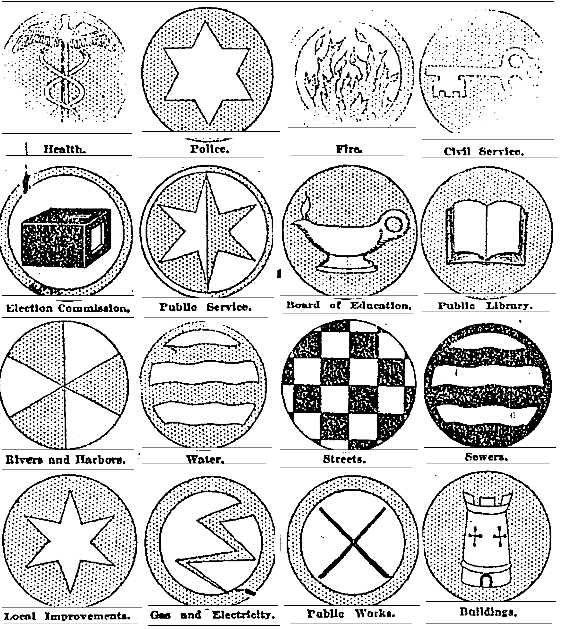
And Rice's original design for the Chicago flag had only two stars, leaving plenty of room for the city to meddle with. So, at the time, the city included twenty-seven separate insignias for the various city departments and branches of government, to be added onto the far edge of the flag, between the stripes, where appropriate.
They were… less inspired.
Let's give this a shot.
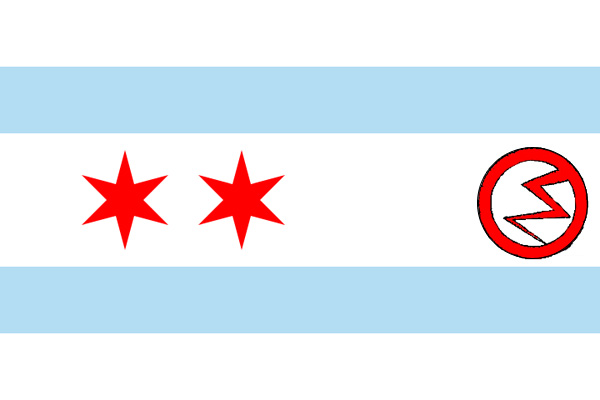
Huh. Kind of metal. I can see why it didn't catch on.
What also didn't catch on was a prohibition on the use of the Chicago flag for commercial purposes (obviously):
The ordinance adopting the flag and these devices… forbids the use of the flag for advertising purposes…. For commercial and all similar use the Y-shaped figure adopted through the Tribune's efforts in 1892 is officially made the city device and still serves for all unofficial purposes.
That 1892 design was the first run at a Chicago flag, led by the Trib to accompany the Columbian Exposition, and it's where the city got its cultishly beloved municipal device. It was designed by Alfred Roewad, a Danish immigrant, architect, and engineer who was working for the World's Fair Bureau of Construction. Roewad conceived the now-familiar three-pronged band representing the geographical division of the city by the river, placing it on a red background.
The paper's committee—led by the Exposition's decoration director Francis David Millet, arguably the inventor of spray paint—tweaked Roewad's design from red to terra cotta to match the decor of the Fair, an aesthetic decision that reflected not just the fair but the material's historic importance to the city and state.
It didn't last as a city flag, or as the city colors. But thanks to the miracle of modern technology, we can surmise what it looked like.
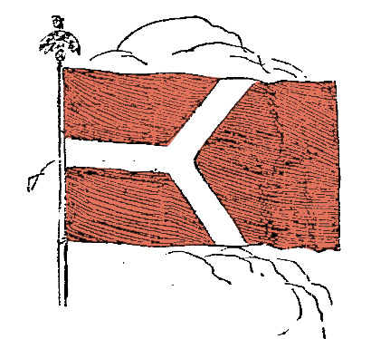
It's not bad—dignified and simple, following the rules of the genre, and the terra cotta color is, at least, unusual in the history of vexillology.
But it was apparently not well received, judging by the Tribune's pissy, defensive editorial about it. Noting that a "Chicago contemporary" denounced the color as "akin to that which predominates at the slaughter-houses near the stockyards," and the design "'good enough' for a brazen-looking female figure in a cartoon," the editors blamed jealousy while charging that "no one else has suggested anything so handsome," and that "the general opinion among artists and other intelligent persons… is that the new flag is fine in color and appropriate in design."
Which is about right. It's fine. It's appropriate. It's tasteful. Roewad's riverine design concept was flexible enough to stick as the city's municipal device, where it's found on bridges, buildings, and the legendary Chicago Theater sign. People like it; I agree with Andrew Gill that more people should have it as a tattoo.
But it's not the Chicago flag. Rice and his fellow committee members realized that the confluence of rivers was not remotely unique to the city, nor even unique to flags, so they pushed the design further, while staying within the bounds of good design for the medium. Unusual, perhaps, for design-by-bureaucracy, but the committee was led by a notable painter, Lawton Parker; a flag expert, Rice, selected by Parker; and Rex, a municipal reference librarian. (The Illinois state flag came out of a design competition sponsored by the Daughters of the American Revolution, and it looks like it.)
Instead of the usual overstuffed cornucopia gifted to cities by overzealous councilmen, which is how Milwaukee got its famously awful flag, Rice went through hundreds of variations, finding a way to stamp a traditional and traditionally effective design with something subtle but undeniably distinctive. It worked—and would evolve into something distinctively Chicago.