Photography by Alan Shortall
Styling by Diane Ewing
 |
The lawyers had a problem with their condo.
It was a problem many people would envy, given that the apartment is on a high floor of a 1920s-era East Lake Shore Drive building-but still.
The lawyers, a married couple, felt their three-bedroom home wasn’t aging gracefully. Despite its splendid northern, eastern, and southern exposures, it felt dark. When they had moved in 20 years ago they had parts of it redecorated in a style its original residents might have chosen-heavily stained wood, a traditional library. There were long, narrow hallways and an underused servants’ area (no servants). The kitchen was from the 1950s. There was no powder room for guests.
The couple’s extensive collection of 20th-century fine art, furniture, and decorative objects, including many gorgeous French Deco and Viennese Secessionist pieces, seemed lost amid their dim surroundings. There wasn’t even a wall big enough for one of the couple’s favorite paintings, a striking abstract by British artist Ian McKeever. Finally, even though the lake was directly outside their living room window, they’d never managed to rig up a comfortable place to sit and enjoy the view.
What to do? The couple considered a scorched-earth scenario. “When we first started to think of redoing the apartment, we thought at one point we would sell all our furniture,” the wife remembers. “I don’t know what we were thinking. But fortunately, when somebody looked at it, they didn’t give us a very high estimate.”
And if they did sell their furniture, then what? They’d be putting new things into the same, problematic apartment. Stepping back from the brink, the couple decided an architectural solution was in order. They would create a showcase for their beautiful things and get a powder room in the bargain. The lawyers scooped up their belongings, moved to temporary quarters, and arranged to have the apartment gutted.
Paul Florian, the architect they hired, listened to their requests. They wanted more light and openness, they said. They wanted a design that was simple and clean, modern but not stark. They wanted warmth and softness. And they wanted to be able to see their art in a different way.
In response, Florian produced a scheme involving what he describes as “a series of asymmetrical linear shifts”-an exercise in classic modernism. The phrase is poetic; its practical application is dazzling.
Florian’s design retains the basic layout of the original 3,100-square-foot apartment, with the public rooms in front and the bedroom and library/sitting rooms in back, but every space has been opened or expanded to let in light. He enlarged the foyer, incorporating space from the former service areas. He created a study, a new laundry room, and a powder room.
Florian turned the kitchen, formerly two dark little rooms, into one big bright one. He changed the flow between the dining and living rooms to bring more light into the living room. He brightened and widened the hall leading to the back of the apartment, dropping the ceiling to create a sense of progression. He combined the two back bedrooms into a sleek, bright, two-room suite that can be closed off from the rest of the apartment. Finally, he created a master bedroom with two new bathrooms and a smashing, custom-designed bed.
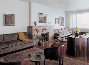
The result is an unmistakably contemporary space with openness aplenty but with some drama, too, starting with the foyer, which wraps visitors in a smoky gray embrace that says, “Be calm. Get ready for something special.”
Florian’s rectilinears are everywhere-framing views, announcing transitions from one space to another, defining some areas and obscuring others.
Opposite the front door, for example, on the other side of the foyer, is a glowing, frosted glass door. It could be just an art-for-art’s-sake lighting effect, but, in fact, the panel is the door to the laundry room, letting light from that room’s east window reach the center of the apartment.
Interior designer Julie Thoma Wright, cofounder (with her husband, Richard) of Wright auction house and a specialist in 20th-century design, worked with Florian and the owners almost from the beginning of the project. She had the walls and ceiling throughout the space painted the same intriguing shade of gray with a satiny finish.
“I always thought [color] was an incidental detail,” admits the husband, who says he now knows different. Wright says she likes that the gray has a richness and yet doesn’t add color.
“The apartment has a lot of natural light,” she says. “The gray tones down its brightness and makes the environment more comfortable.” She also likes the way the color and finish blend with the glass, stainless steel, and stone in Florian’s design and make a strong neutral background for the couple’s art collection.
“I wanted to see everything integrated in a way it hadn’t been, so you don’t so much make the distinction between furniture and apartment,” Florian says. To that end, he and Wright designed some of the furniture themselves.
That bed, for instance. One of Florian’s pieces, it sits in the middle of the room, the back of its headboard facing the room’s entry. Mounted on top of the headboard (which has built-in lighting and also incorporates storage) is a glorious piece of art glass that rises to the ceiling, providing privacy and separating the dressing and bath area from the sleeping area.
Wright designed many of the upholstered pieces to be a softened extension of the architecture. They include two gray suede couches (Florian did the millwork) built into the library wall and three couches for the living room. Two of those are a matched pair, covered in greenish-taupe ruched velvet; flanking the fireplace, they look built-in but are freestanding. The third couch, in plain taupe velvet, faces the fireplace. Surrounding it like a shawl is another of Wright’s creations-a low, folding, French Deco–style zebrawood screen. Wright’s furniture blends seamlessly with the couple’s own collection.
A unifying feature of modernist design, Florian says, is the pairing of simple lines with materials that have strong surface patterns or reflect light. He and Wright applied this idea to striking effect throughout the apartment. Clear glass tiles, which reflect light and create depth, line the bathroom walls and seem to dematerialize them. Honey onyx on the floors and in the showers provides a warm glow.
The kitchen, outfitted with Bulthaup cabinets and limestone countertops, also has glass tiles on its walls. The kitchen floors are paved with the same warm taupe French limestone as the foyer floor.
Against the softly shimmering gray walls and ceilings and architectural furnishings, the couple’s classic modernist furniture looks both dignified and comfortable. Their paintings and other artworks pop out.
“The background is almost museum-like,” Wright says, pointing out that it will adapt easily to new pieces the couple might acquire. “They can still go out and select things to add to their collection.”
But for all its polished new look, the apartment is still a warm, inviting home. And with luxurious new sofas strategically placed in the living room, it’s now also a home with a spectacular view of the lake that can be enjoyed in complete comfort.