I went to the DreamHome press preview yesterday at the Mart and, as usual, much creativity by local interior designers was on display. Here’s what I took away from the viewing.
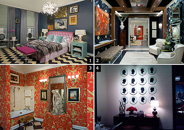
1. Anne Coyle designed a bedroom that felt like a London club. What a concept. She told me that clients often come to her and request a sanctuary of tranquility for a bedroom, a serene, calming place that will whisk them away from reality. Coyle pointed out that her own bedroom is constantly being trampled by her two sons and realities like a child being sick and needing to lounge around in mom’s bed all day while watching TV often trump the need to escape. So she created almost a hotel suite where one could hang out all day. There’s a sitting area in one corner with a wrap-around banquette and coffee table; a nice-sized flat-screen TV surrounded by pictures facing a big luxurious, fur-throw-covered bed (which feels almost like a sofa, with its curvy pink-velvet tufted headboard from George Smith); and the color of the room is not the least bit serene: Benjamin Moore’s Racoon Fur, which is almost black in person. Against this color, the accessories and furniture in Coyle’s signature lavenders, pinks, and pale greens popped like nobody’s business, and the mix of modern and traditional was just right. Ooh, almost forgot the black and white leather chevron floor tiles from Edelman—stunning, and apparently crazy expensive!
2. Erik Kolacz and Keitha Brathwaite created an impressive entryway that Apartment Therapy blogger Janel Laban pointed out really could be used as a room, with two comfortable yet elegant chairs and a bench for hanging out. The mohair and pony skin on the walls, and the python upholstery (“like a man’s belt,” said Kolacz) on the bench where all part of the “men’s fashion” theme that the duo chose as their inspiration (the show’s tagline was “Fashion at Home”). A big red painting above the bench acted as a sort of pocket square. Crystal 1920s sconces were the jewelry, lending a little femininity to the space.
3. I really adored Sanjay Singhal’s over-the-top bathroom, inspired by Coco Chanel’s loo and Belle Epoque Paris. The red and beige wallpaper and upholstery, the big pillow-covered ottoman in the middle, the massive statue on the table. Mon dieu! What a fantasy. I particularly loved the squared-off-style toilet and bidet from Duravit’s 1930s Paris collection. I’m a sucker for anything that reminds me of Gay Paree!
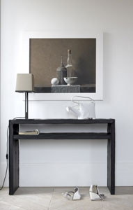
4. Joan Craig’s kitchen was also a highlight for me. I don’t have photos handy of the table right now, and will try to get some later, but I loved how it was set up in the limited space available: against the wall opposite the center island, there was a banquette punched up with red and white throw pillows (above it, there was beautiful hand-painted gray and white wallpaper, almost like subtle modern art), and a big table in the foreground, set with my favorite red and white Hermès china. Another wall, show here, had a charming display of hanging plates inspired by Craig’s 17-year-old daughter’s visit to a country home in France, where the owners had each of the family members’ plates hanging up similarly (they would take them down and actually eat on them). The actual functional kitchen portion was gorgeous, too, but I was so swept away by the non-utilitarian stuff.
So many great ideas at this show. Check it out Sept .25-Dec. 20 on the first floor of the Mart.
—Gina Bazer
Photos 1, 2, & 3, courtesy Merchandise Mart; photo 3, Barri Leiner