The magazine House Beautiful hosted a “Color Institute” last week at the Mart. It featured a panel with HB’s editor, Stephen Drucker, local design maven Alessandra Branca and Windsor Smith, a designer from Los Angeles. Here’s what I learned about color from each:
Stephen Drucker on color trends:
- “The new femininity.” Pretty, flirty colors such as apple green and pink, especially used on strong shapes.
- ”The new globalism.” Lots of rich colors that reflect homeowners’ travels.
- Neutrals. “A lot of people talk color but only use neutrals.” The today factor: lots of distressing and metallics.
- Tropical greens and browns.
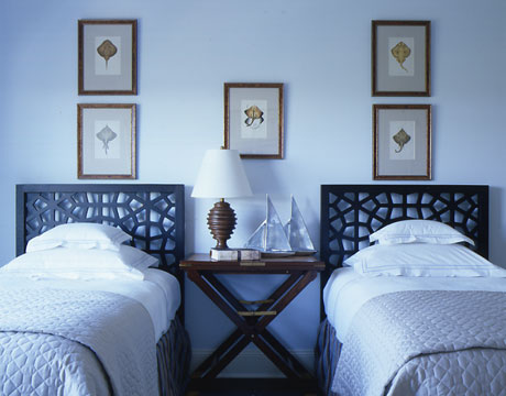
- Water and sky blue colors brought to life with metallic shimmer, texture, and mixed with greys (see photo above).
Windsor Smith’s tips and observations:
- She loves dark, dark brown—nearly charcoal black, with light salmon
- Acknowledge the landscape. If your home has a lot of art, you need to create a neutral backdrop for it.
- When you paint windows dark, what’s beyond it (trees, shrub, flowers) pops. If you paint them white, your eye stops at the white.
- Teenagers inexplicably love purple. Naturally, this very strong color is hard to work with (and isn’t everything hard with teenagers?).
- Go-to Colors: Benjamin Moore Rock Harbor Violet, Benjamin Moore Decorator’s White
Alessandra Branca’s observations:
- She wakes up to “spring every day” in a room that’s apple green and white
- Black balances… it’s as much a color as any other.
- No color is bad unless it’s overused.
Find lots of other great color tips from House Beautiful here:
—JAN PARR
Photo courtesy House Beautiful