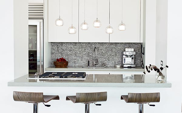
Simon used concrete countertops, stainless appliances, and a pebbled backsplash in the new kitchen. Photo Gallery »
A good interior designer takes on many roles, from creative artist to numbers-cruncher to therapist. But a designer’s most crucial talent may be that of psychic, with an ability to look at dated, uninspiring decor and see the future.
|
|
"As soon as I saw this space, I knew exactly what I wanted to do," says designer Sowsan Simon of the Lake Shore Drive apartment she overhauled for her client, a busy business owner. Faced with the home’s dark, ’70s- and ’80s-era scheme, she envisioned a bright, open space that would soothe her hard-working client. "I wanted her to come home and de-stress," says Simon. "Getting her to understand the art of minimizing was like therapy."
The client in question admits to a tendency toward clutter, a legacy of growing up as one of eight children in a lively suburban house. "I know what I’m good at, and it’s not decorating," she says. "Sowsan and I had a great friendship, and it made sense to follow her direction."
The challenge for Simon was to take a fairly compact public area, encompassing a living room, dining area, and kitchen, and make it feel spacious, while also enhancing the view of Lincoln Park and the lake. "I wanted it very light and airy," says Simon. "The more different materials you use, the more cluttered the space looks."
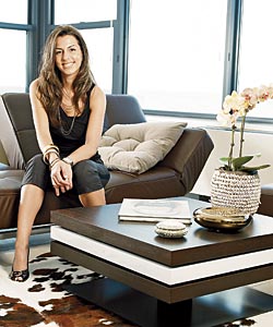
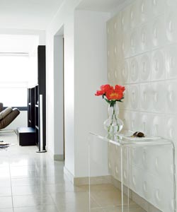
Installing the same Italian limestone flooring throughout the apartment allowed the rooms to flow into each other, making the home look bigger. To balance the cool tone of the tiled floors, warm colors and materials were chosen for the living room furniture, including espresso-brown leather couches and a cowhide rug. Because the homeowner often invites her nieces and nephews to visit, the pieces had to be durable and kid-friendly (the couches fold down flat for sleepovers).
The same colors continue in the dining area, where white leather-covered chairs surround a dark wood table. Against the wall at one end sits a massive mirror, which creates the illusion of more space. "It also reflects the view for people sitting with their backs to the windows," says Simon. The mirror’s faux-alligator frame and a sparkling modern chandelier by Foscarini add texture that keeps the room from looking sterile.
The galley kitchen was a trouble spot: Simon thought the space above the counter with the stovetop should be open to the living room; the client wanted it closed off. Eventually, the client agreed to the open kitchen, resulting in a space that blends naturally with the living room, while showcasing dramatic design elements of its own.
The kitchen’s overall look is contemporary and neutral, with lacquered white Poliform cabinets, stainless appliances, and concrete countertops. But what immediately draws the eye is the backsplash: a knobby arrangement of pebbles that adds an organic contrast to the sleek look.
|
|
Simon was inspired by the Ann Sacks tile and stone showroom in the Merchandise Mart, which has a wall with a similar pebble treatment at its entrance. "I knew I wanted to use it somewhere," Simon says. "Because the kitchen is so simple, I knew it would work perfectly." The Bali pebbles had to be installed painstakingly, one at a time, but their particular shade of light gray turned out to be the perfect middle ground between the gray of the countertops and the white of the cabinets.
Another striking kitchen element is the lighting, a series of hanging glass globes visible from both the kitchen and the living room. "They were originally supposed to be hung at the same level," says Simon. "They were packed separately, and as they were being hung and we saw them at different lengths, we decided to keep them that way. It breaks up the straight lines in the rest of the room."
When it came to the bathrooms, "they all needed help," says Simon, since they featured non-desirable vintage touches such as pink toilets and sinks. To give the guest bathroom a contemporary focal point, Simon designed a custom zebrawood vanity. "It’s risky, because it becomes the main piece in the bathroom," she says. "Everything else—the paint, the tile—has to work with it." Simon chose a square washbasin and square faucet to reflect the shape of the vanity.
Whether she’s chasing after her nieces and nephews or waking up to see the sun rise over the lake, the homeowner says her new place is everything she had hoped for. "It’s a completely stress-free environment," she says. "I look forward to coming home."
Photography: Andreas Larsson
Related:


