Is that table in front of your couch a flatland of remote controls, coasters, and magazines? Does it need hills and valleys? Wildlife? Life? We recently gathered some of the best-styled coffee tables we’ve shown in our magazine and talked to the people who made them look so good. A consensus seems to be that fresh flowers are a plus (though, as you see here, not required), unexpectedly large objects lend personality, and, generally speaking, it’s hard to go wrong with books (unless they are too small). Playing with heights and scale is encouraged. From there on out, it’s all about being true to yourself. Are you a minimalist in the rest of your house? If so, keep the coffee table spare, too. Love collections? Let’s see them front and center. And by all means, switch things up from time to time. All we ask is: Keep your remotes elsewhere.
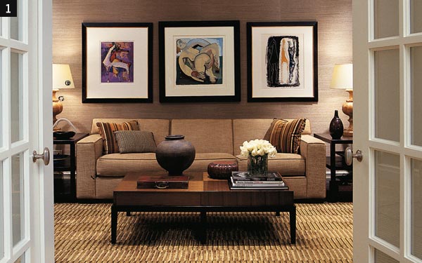 |
1. When interior designer Bruce Fox of Heather Wells Ltd. arranges a coffee table, he keeps in mind the bird’s-eye view. That means tops of things—the cover of a book, the lid on a container, such as the Asian red-lacquered box shown here—should be beautiful. He also likes to play with scale; the water jug here might seem a little big, but as far as Fox is concerned, that’s the point. Like many other designers, he is a fan of low coffee tables. "Lower than seating height looks more modern," he says.
 |
 |
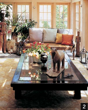
2. These homeowners are avid collectors of ethnographic art, so Chicago Home + Garden stylist and decorator Arden Nelson (773-251-9510) made sure the coffee table showed the goods. Yet if you look closely, you will see that there are actually only three major objects on the table—the flower-filled vase and two sculptural pieces—plus some very cool old keys. "Just because you have a big table doesn’t mean you should cover it with stuff," Nelson says. Instead, use a few objects that have lots of presence.
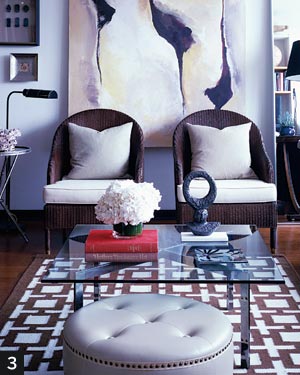
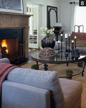
3. In keeping with the bold, modern feeling of the room, architect David Ries (a former Chicagoan now in New York) chose a cool palette—with a splash of red—for the objects on the table. Stacked books make an effective pedestal for other things; a gentle arrangement of white flowers balances the hard edges. Two see-through elements here—the sculpture and the glass tabletop.
Photography: (1,2) Kate Roth; (3) Nathan Kirkman
 |
 |
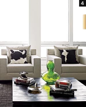
4. A large-and-low square table allowed ample space for interior designer Joseph Sacco of JS Interiors Group (312-404-4665) and our contributing editor Barri Leiner—but they were careful not to crowd it. They arranged items simply and casually, forgoing evenly stacked books in favor of staggered piles ("people are more likely to pick them up that way," says Leiner). Instead of flowers, they used a big lime-green glass vase as a centerpiece.
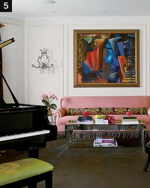
5. In keeping with the overall design of this sitting room, Chicago Home + Garden stylist Diane Ewing kept a low, even profile on the cocktail table, and made sure the items she put on it enhanced the rest of the decor (notice how the pinks and yellows on the table relate to similar shades on the sofa). "I kept the flowers very simple because the objects had interesting shapes, and the pillow spanning the length of the couch had a pretty print," she says.
 |
 |
6. A tray is a great companion for a coffee table, especially when the latter is actually an ottoman. The tray’s biggest advantage: It’s easily removed when no longer needed (best not to overload it with heavy stuff for this reason). This vignette, also styled by Nelson, is a telling lesson in how to group small things on a large surface to create visual interest and show your personality.
7. A tray serves a different function in this arrangement by Nelson. "It adds another layer," she says. Putting the chunky vase directly on the clear glass would have felt too heavy, she says; the gold tray softens the look. The peaceful, elegant color palette goes beautifully with the rest of the room. It’s the same table as #3, but a completely different look.
Photography: (4,6) Nathan Kirkman; (5) Alan Shortall; (7) Kate Roth
 |
 |
8. Decorator Laura Soskin (847-525-9955) likes the objects on her coffee table to have "strength and texture, and to be unexpected." Her table, its base adorned with small pots of moss, is meant to go in a garden. On top, she has an architectural element—a carved wood decoration from an Asian temple—sitting next to an oversized vase and a grouping of candlesticks that stand tall and proud, as opposed to the low grouping of chunky candles on a platter more typically found on a coffee table.
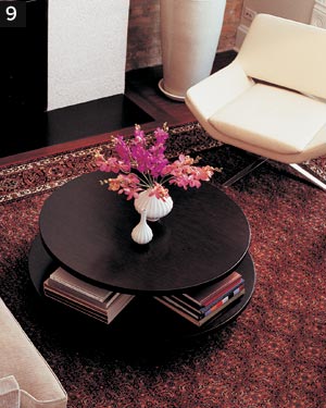
9. Nelson made this coffee table consistent with the room around it: minimalist. She’s a believer in the strength of beautiful flowers to hold their own. The books on the lower tier are neatly stacked, reflecting the owners’ proclivity for order.
Photography: (8) Nathan Kirkman; (9) Kate Roth