Nearly 40 years after he designed his first kitchen (while working for his father’s cabinetry firm in Dearborn, Michigan), Mick De Giulio is still at it, still passionate about his work, and still looking forward. His showrooms in the Mart and in Wilmette, where he started his firm in 1984, draw upscale clients who widely consider him Chicago’s preeminent independent kitchen designer. With a sensibility heavily influenced by his travels in Europe (mainly Italy, Germany, England, and Holland), he is a master of sophisticated modern design that mixes materials and vocabularies.
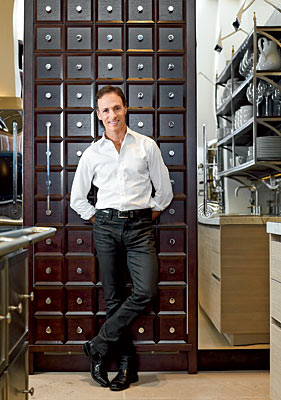
When De Giulio can’t find products he wants, he designs them himself—stone sinks inspired by a trip to Verona, Italy; a modern take on the appliance garage, with a motorized sash; rectangular sinks with sliding cutting boards and other accessories; recessed spice racks hidden by sliding wall panels, for near the range; refrigerator cabinetry that looks like apothecary drawers (shown at right); custom range hoods; light fixtures. In 1994 he started designing cabinetry collections for Sie- Matic (the latest of the four, BeauxArts, reflects his fondness for mixing styles, periods, and materials). And as of this fall he has a book, written with Karen Klages Grace—Kitchen Centric (Balcony Press). We recently sat down with De Giulio to talk about it
How have kitchens changed in the years you’ve been designing them?
There’s now a realization—or acceptance—of the fact that people live in their kitchens. People don’t just look at it as a space they have to buy cabinets for. They’re more kitchen-centric—starting with the kitchen and going from there. A number of homeowners are getting rid of dining rooms. We’re seeing kitchens that incorporate formal dining.
How do you hide the mess of cooking from a formal eating area?
Ideally you have a scullery kitchen or a butler’s pantry. The butler’s pantry is such a magical space. It can feel like a passageway or become a little room. Or you could combine the scullery and butler’s pantry in a highly functional space.
How do you create kitchens that are timeless rather than trendy?
Things that make sense don’t go out of style. Stainless steel makes sense because it’s burn proof, wipes clean, and pairs beautifully with wood and stone. Fresh and clean never goes out of style. The essence of white is fresh and clean. Granite—people say they are sick of it, but there are ways to work with it to make it different.
What’s looking dated now?
Overarticulated brackets, cornices, crowns, glazing. Too much of anything that is the same. The strong thematic kitchen that was so popular for so long.
What technological innovations have changed kitchen design?
The 700 series by SubZero—perfect integration. Dividing a refrigerator into separate, function-specific components and putting them where they’re most useful makes sense—an easily accessible refrigerator drawer, for example, enables kids to have a place for drinks and allows them to make their own breakfast. But the best ideas are low-tech—like my cutting board. It’s handy, it’s always there. Or a little message center.
What are some easy ways to update a kitchen?
We just did a project where we did the kitchen almost 25 years ago and all they wanted to do was replace the Corian countertops. We put in granite. They had German laminate cabinets—simple, flat-panel—that were fairly inexpensive for the day. We replaced some solid cabinet doors with framed glass doors. We’ll sometimes do a signature piece such as a blue top on a small section of island. Or we’ll replace some cabinet doors with stainless steel or glass, or change the countertops. One of the best ways to change the style of a kitchen is with proportion. For years an inch and a half was the standard thickness for countertops. Then they got thicker. Now they’re back to thin.
Any suggestions for people on a limited budget?
Most of what we do is hand-scraped walnut, but an oak floor, stained a few times to bring out different colors in the wood, also looks great and is less expensive. Use thinner material for countertops instead of building up edges—thick material takes a lot of machinery and costs more to transport. One-centimeter stainless steel is extraordinary. Buy the best quality products but the most simple. Instead of a door that is high-gloss lacquer, do something simpler, like a laminate, which can be beautiful.
What’s the biggest misconception people have about kitchen design?
It’s not all about the cabinets. It’s really about the space.
NEXT: De Giulio’s Tenets of Good Design »
Photograph: Andreas E. G. Larsson
Related:
De Giulio’s Tenets of Good Design
Space and Light
I try not to put cabinets too close to windows. I also like to lower the height of windowsills to make them even or continuous with the countertop. The resulting view outside and the light streaming in feel so much bigger. I may give an island legs to make it appear lighter. I rarely install cabinets all the way up to the ceiling, which also allows for some nice uplighting. Clear or opaque glass-fronted doors on cabinets are possibilities.
Fresh and Clean
Natural wood finishes have a brightness about them, and when combined with other elements that convey purity (stainless steel, glass, lighter-valued natural stones, and tiles), a lovely clarity can be achieved. White is classic for kitchens. It will never be passé. Varying the shades of white gives depth and richness.
Mixing: Visual Texture and Counterpoints
It is not about mixing for the sake of mixing. It is about creating visual texture, and there is no right formula, but rather a right feeling. I like to put man and machine in the same room—something with a strong handcrafted quality and its counterpoint, something highly engineered like a velvet-brushed stainless steel refrigerator with hand-scraped maple floors. A hundred-year-old English bookcase with splits in the wood is stunning among cabinets with a finish of high-gloss white lacquer.
Proportion and Scale
Standard proportions have to be challenged. Adding or subtracting from standard measures sets the tone. I design countertops that range from three-eighths of an inch to six inches thick—and often mix several thicknesses in the same kitchen. I like to de-mass the refrigerator by semi-recessing it. Without that massive appliance immediately grabbing the eye, the kitchen feels more like a living space.
Composition vs. Continuum
Traditional design says cabinets run continuously and dominate a kitchen. I find a compositional approach more pleasing and artful. A custom-designed range hood is a relatively small financial investment compared to the visual return it can provide.
Essence
Quirks are good. Personality is good. The kitchen can be the link between people and the architecture of the house. Architecture and the kitchen do not have to match. Some of the most beautiful modern kitchens I have seen are in very old European houses and villas.
Excerpted from Kitchen Centric
Related: