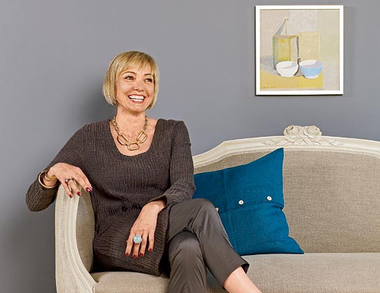
The designer sits on one of her own reupholstered creations at her shop in Libertyville—with a shot of color, naturally.
When it comes to using bold colors and patterns, designers are typically divided into two camps: those who do and those who don’t. Interior designer Annika Christensen, owner of the Libertyville-based Swedish antiques shop Midnight Sun, is of both minds. “I love color. I love shape. I love form. I love patterns,” she says. “And I love solid plain linens with bone buttons. I just love it all.”
We talked to Christensen recently about her design for a sitting room at the Lake Forest Showhouse, where her bold side was on full view, about other memorable spins of the color wheel, and about her undying love of good old neutrals.
Under what circumstances do you like to use color? Being Swedish and of the Swedish school originally [Christensen immigrated to the U.S. in 1980], you would expect me to gravitate toward white, cream, gray, and soft blues. Those are colors, too, obviously. But I love really strong color in any space. And if a client is so inclined, my mouth starts watering.
What are your favorite strong colors and which ones do you think go together well? Get me one to start with and I’ll tell you all the others that go with it. For example, if you like a really dark hot pink, I like to bring in burgundies with it. I also like to offset the pink with citrusy yellows. You can bring in teals, or soft aquas. I tend to put together unexpected colors from both sides of the spectrum.
What is a general rule of thumb for working with colors? Try to repeat a color at least three times in a room. Don’t get me wrong—it doesn’t have to be the exact shade. You can be off or somewhere in between any given shade—that’s what makes the room come alive. But you need to be repetitive. You can even have the whole room all one color!
Other guidelines? If you have a lot of different colors in your house, there has to be some kind of string. You have to be strung along from one area to another, whether it’s in a room or in a house. You can’t just have one orange thing and then not see orange again anywhere. I find that unsettling.
How would this stringing-along concept work in multiple rooms of a color-filled house? If the walls are red in one room, you add red fabric and a red lampshade, and you’re done. And then you move to a gray room, and you don’t have any red in there, but you should have some of the green that was in the fabric in the red room. And in the next room, I would have green walls, and a lot of reds and grays mixed in there, as well.
How can you use muted colors and bright colors together to create a more sophisticated look, like your room in the Showhouse? To mix muted and bright, it helps to play off a complex pattern that has both clear and subdued colors in it. Let’s say you pick a two-toned toile—it would be very hard to bring in a muddy taupe or a muddy gray.
How would you use an orange and gray toile in a room? Toile is lovely. In a room with a lot of angles, I would use it everywhere. I would use it in the wallpaper and the fabrics and break it all up with one color: white. All the furniture would be white and the moldings would be white. This would make the toile feel more modern.
The biggest color trend of the past several years has been light blue and brown—are you sick of it? I’m not necessarily sick of it. I think it’s a lovely combination. I think it’s that we don’t want to see it in all the fabrics all the time. Maybe just let it be the natural browns of the furniture and a blue on the wall and leave it at that.
You also love to use neutrals. Any guidelines there? In the absence of color, you have to have different textures. Combine velvet, linen, and wool. Add sheen with golds and silvers.
What is your own home like? I have a very small home that’s on a little lake. It’s like a cottage. So I don’t have anything real formal and I have a lot of soft natural linens and creams and warm painted furniture. My living room sofa is an old red-linen Ralph Lauren, worn to pieces. Every time I suggest slipcovering it in a natural linen, my kids say No, we love the red sofa!
Photograph: Andreas Larsson
IDEAFILE: Bold color scheme
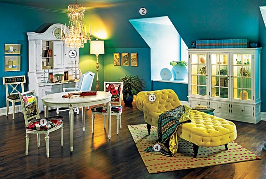
Far right: Painting the insides of the cabinet teal was another way for Christensen to continue the color story in her room.
When Christensen was assigned her room at the Lake Forest Showhouse, she assessed the situation quickly: “It was a dreary second-floor room with small windows, cream-colored walls, and all brown woodwork that I knew off the bat was never going to be bright. So I decided I would make the room feel cozy, like a jewel box,” she says. “People always think they need to use white to brighten up a room, but I don’t believe that for a second.”
1. Christensen’s starting point was “that crazy pattern on the dining chairs, Chiang Mai from F. Schumacher and Co.” This sophisticated pattern, with dozens of colors in it, both clear and muddy, allowed her plenty of room to play.
2. Next came the wall and ceiling color—the same, to lend continuity in a space with a slanted ceiling and lack of consistent moldings—which is in the teal family, but in a different value than the other teals and blues that appear in the Chiang Mai. “That’s what makes it interesting,” says Christensen. She custom-mixed her own color combining Benjamin Moore’s Salzburg Blue, Baltimore Sky, and Santa Clara.
3. The citrusy chaise made for a striking main character. Again, it’s not an exact color in the Chiang Mai fabric, “but there are hints of these acidy greens in there.” A new texture—velvet—adds depth. To give the piece even more drama, she served it up on a platter: a bold rug that, too, referenced the Chiang Mai.
4. Christensen introduced an Osborne & Little pattern in the throw on the chaise, which reappears in the chair next to the cabinet with the built-in clock. Why does it work? “The shape of the leaves in the Osborne & Little fabric complements the gray flowers in the Chiang Mai, and the brown in it mimics the branches in the Chiang Mai.”
5. She tied it all together with white furniture and added a bit of shimmer in the form of a chandelier, some silver frames, and a gold-leafed lamp in the corner.
Resources See Buy Guide.
CONTACT Midnight Sun Swedish Antiques & Design, 110 W. Lake St., Libertyville, 847-362-5240; midnightsunantiques.com
Photograph: Nathan Kirkman