Nearly everyone agrees: Our 104-year-old state flag is a mess. Seriously, what is this thing?
To address the issue, we asked four local designers to mock up alternatives. Behold:
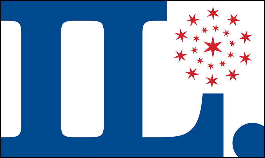
JNL Graphic Design
“Our proposed redesign comes from the abbreviation ‘IL,’ contracted into a graphic form that alludes to both the railroad tracks that connected Chicago to the rest of the country and the steel I-beam, that architectural element that raised Chicago out of the swamp. The round cluster of stars numbers 21, acknowledging that Illinois was the 21st state.”
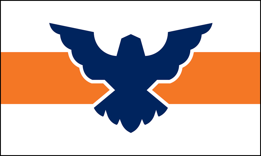
Anthony Guagliardo
Chicago Red Stars creative manager
“Focusing on the eagle associates my design with a main aspect of the current flag, but I’ve made it a symbol that can stand by itself and be easily reproduced, just like the stars in the Chicago flag. The eagle is blue to nod to Lake Michigan. Behind it is an orange stripe to signify that Illinois is by far the highest pumpkin-producing state.”
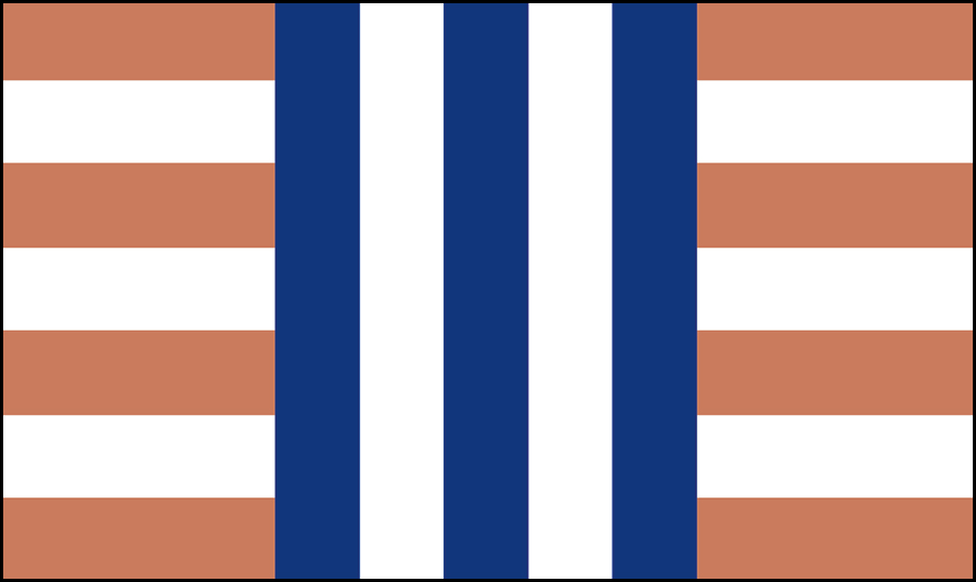
Grip
“The three blue stripes form, as a whole, the letter I for the state’s name and represent its three major bodies of water: the Mississippi River to the west, the Illinois River through the center, and Lake Michigan to the east. The stripes’ verticality references the state’s largest city, Chicago, birthplace of the skyscraper. The brown horizontal stripes reflect the rows of fields downstate. The overall crosshatch feel pays tribute to the woven baskets of the tribes of the Illinois Confederation.”
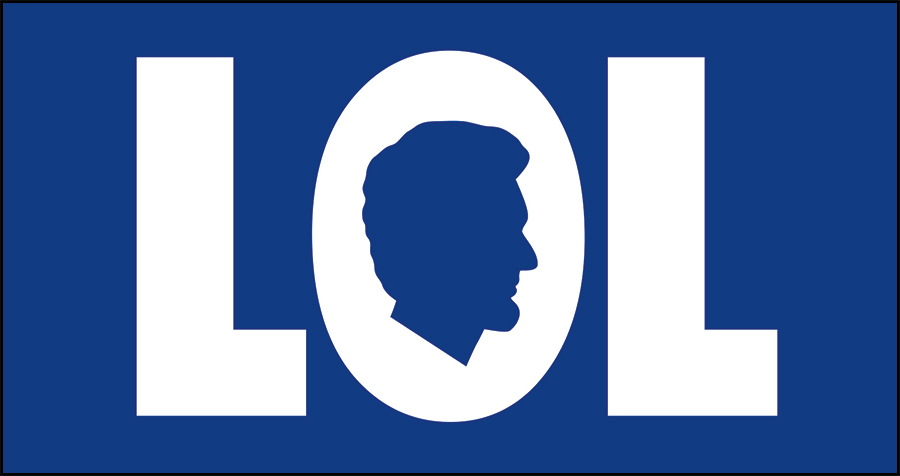
Leo Burnett
“The letters stand for ‘Land of Lincoln,’ paying homage to the state’s most important citizen, the great Abraham Lincoln. It’s also a happy coincidence that one of our state’s chief exports is funny people: Bob Newhart, Robin Williams, Bill Murray, Richard Pryor, Melissa McCarthy, and so many others. In a time when we need to honor both equality and joy, this design feels right.”