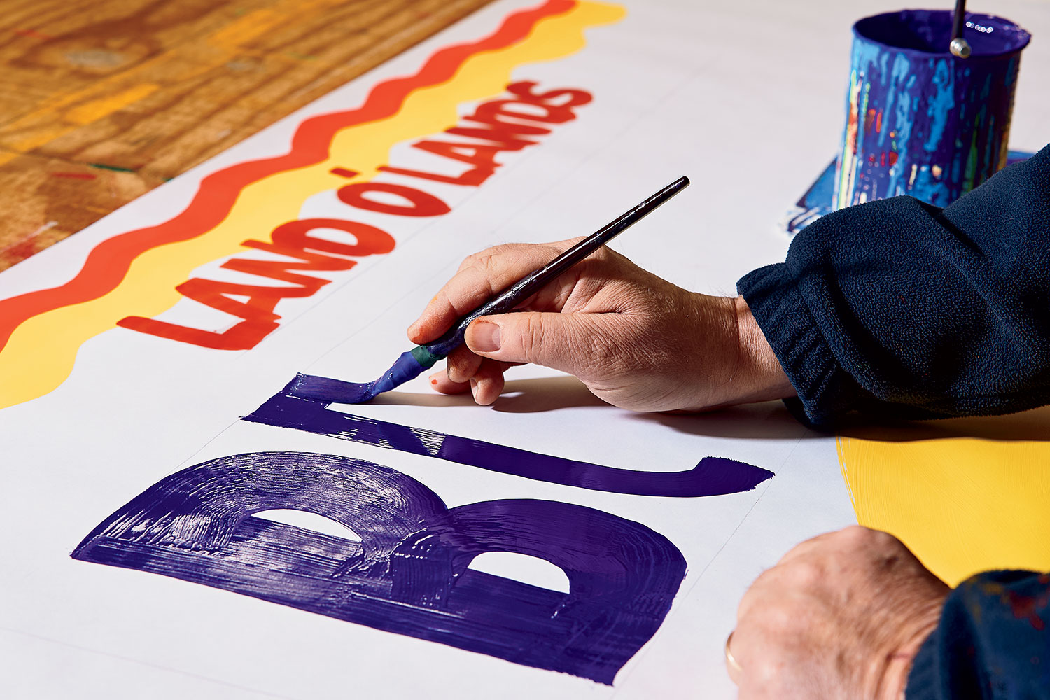
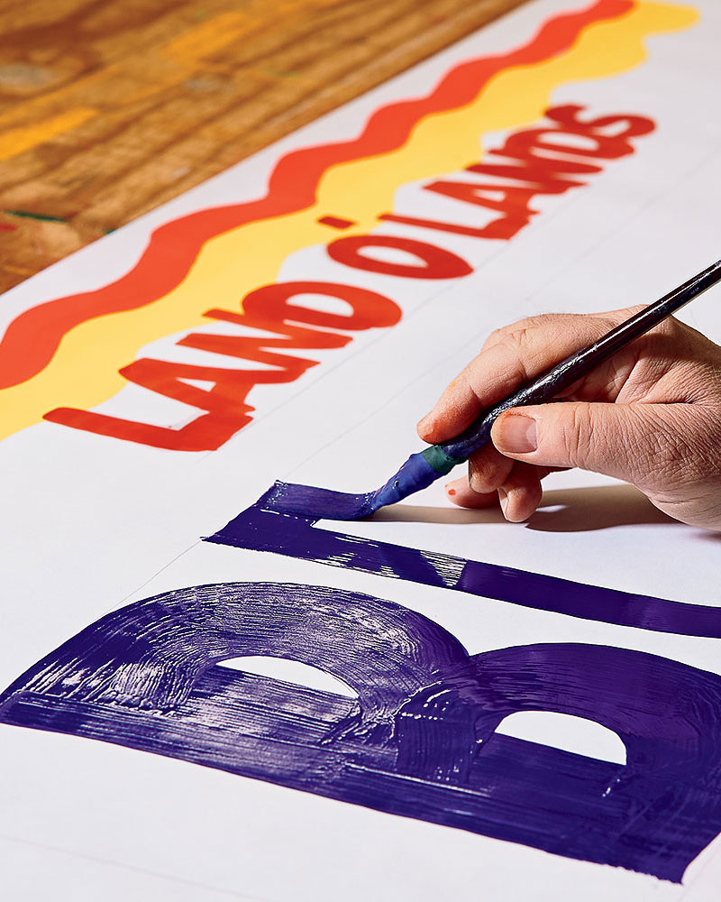
A plane takes off at Midway Airport, kitty-corner from the light-filled studio where Chuck Wilmarth picks up his cup filled with poster paint and dips in his flat brush. He works quickly without sacrificing precision, moving across the canvas, bright white paper that comes in big rolls. For the detail work, he rests his right hand on his left, steadying a much smaller brush as he deftly curves the bristles into an almost perfect circle that punctuates the tableau.
Chuck paints in large scale, gliding along the perimeter of the 30-foot table, wasting little time while imbuing a sense of thoughtfulness that makes the final product clean in its exactness, compelling in its magnitude. His technique is specific, eschewing the easel for a flat surface, which allows the paint to dry rapidly and drip-free.
That paint is also specific: an oil-based poster variety so that the paper doesn’t wrinkle (water-based paint causes unsightly ripples). “It’s very high in pigment,” Chuck’s business partner, Dan Kamba, says. “That’s why, even though it’s on paper, you don’t really see through it.” This is important.
After Chuck completes the final flick of the brush, he steps back to observe his handiwork, a 30-foot banner displaying numbers and letters.
Organic Kiwi, 4 for $1.00
Sweet Tangerines, 2 for $3.00
Green Peppers, 49¢
La Preferida Hominy, $2.99
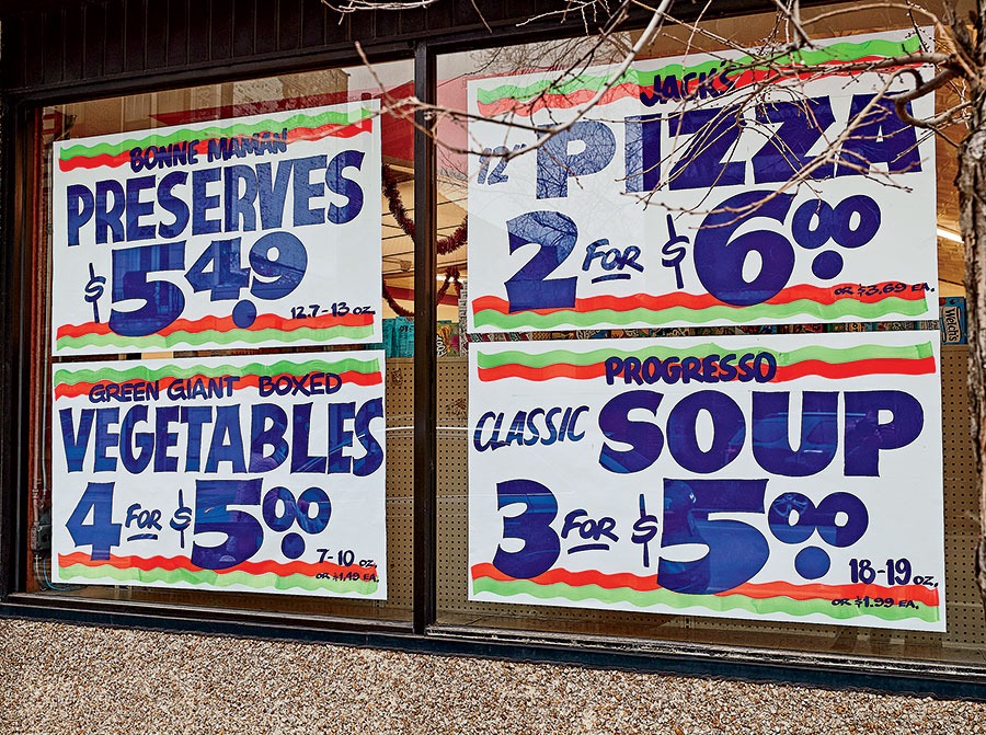
High pigmentation is what makes Southwest Signs’ signs pop, what makes them shout the necessary information to passersby, who may not realize they need to know that today center-cut beef shanks are $1.59 a pound.
The banner will be cut into individual signs that are themselves big enough to cover the large windows at the corner grocery. Block lettering announces what’s on sale, with price and product in some combination of vibrant colors.
“They need to see Milk, $2.99 a Gallon, ” Dan says. “That’s what has to stand out, no matter what.”
The letters are made with thick strokes by a hand that knows what it’s doing. The confidence in these signs speaks to decades of experience. Even up close, you barely notice the trace amounts of graphite, a light swish of pencil ensuring each letter is the same size so there’s no bunching on either side, like you’d see in a poorly executed homemade lemonade-stand sign (speaking from experience).
These grocery store signs, crafted at Southwest Signs’ studio in Clearing, were the first things my husband and I noticed when we moved from central Ohio to Andersonville in the middle of the pandemic. Perhaps it was the result of being strangers in a strange land during lockdown with nothing to do but walk the neighborhood, simultaneously steering clear of neighbors and desperately looking for any signs of life. In between curt but friendly nods with the man who smoked outside the building across the street, we found ourselves delighted by the offerings of the Old World Market at the end of our block, by way of these signs.
“They sell oxtail,” I told my husband one afternoon.
“A bag of Cara Cara oranges for $3.99 isn’t a bad deal,” my husband said to me after one of his morning walks.
Each week, the signs would change, announcing new deals and new products: Pork Neck Bones, 89¢/lb. Stewing Chicken, $1.29/lb. End-Cut Pork Chops, $1.29/lb. Depending on the holiday, the orange, red, and black motif would be swapped out for red, white, and blue (Fourth of July) or green and red (Christmas). Reading the signs felt more like a conversation than marketing. Or at the very least, it seemed to be a stand-in for human interaction when Instacart and Grubhub had made it too easy to live without that.
In August 2021, as we approached our first wedding anniversary, I wondered if I could get my hands on one of those signs. I figured we’d frame it in our kitchen — a kind of cool pop-art/found-art piece to make our guests think we were the clever, creative types. I debated calling Old World Market to see about acquiring one to give as a surprise gift.
Instead, I decided to figure out who made them. A few clicks on Google led me to Carol Kamba, Dan’s wife, who is the receptionist and office manager at Southwest Signs.
“Oh yeah, we could make you a sign,” Carol said. In fact, they’d make pretty much anything I wanted for $18. I emailed back with my desired phrase (something sweet, albeit cheesy, involving our anniversary date), and within an hour, she had responded: “Yes! happy to do it! We usually use Chicago colors shown below. Blue, red, chrome, okay?”
Of course Chicago colors were OK. I wanted this sign to be the most Chicago, the most grocery store–esque that a fake Chicago grocery store sign could be.
But … Chicago colors? In general, I’d noticed that this town had a penchant for assuming its own brand of everything: Chicago-style pizza, Chicago-style hot dogs, Chicago-style close-up magic. Why wouldn’t there be Chicago colors?
I soon realized that this patented palette (“inspired by Vienna Beef,” Chuck would later tell me) is a mainstay for Southwest Signs because it works. It works because it doesn’t. The colors vibrate against each other like a neon sign. The company’s clients often buy digital signs that flash their daily specials with flair and embellishment, only to discover that Chuck and Dan’s paper signs work better.
Years of signs and hundreds of combinations of prices and items have made Southwest Signs an ad hoc market research operation. The sign painters know what makes a product sell. They know that no one cares what the brand name is. They know that customers only want to see the price in bright, bold color as they walk the neighborhood.
“They don’t consider themselves fine artists at all. They’re serving a purpose,” Chicago artist Alberto Aguilar says. Alberto has worked with Chuck and Dan for years, commissioning them to paint signs for his installations (one says Hey You, Yeah You). “The data says that these kinds of signs really speak to people.”
What data exactly? It’s hard to say. Alberto, Chuck, and Dan all express this idea anecdotally, pointing to repeat customers and the random people who call the shop looking for hand-painted signs, myself included.
“I think there is an interest. There’s a fascination,” says Chuck. “People have an event in their life and they want a Happy Anniversary sign or something, and for a while there we were just doing them printed, but now they’re coming back to say, ‘No, I wanted them hand-painted. I wanted something special.’ ”
Of course Chicago colors were OK. I wanted this sign to be the most Chicago, the most grocery store–esque that a fake Chicago grocery store sign could be.
Most of Chuck and Dan’s signs, though, indicate who has the best deal on cantaloupe. The clients, usually mom-and-pop grocery store owners, give their sign orders with an implied confidentiality — when price is the focal point of your marketing, price is king — and they’re willing to scrap at the last minute what the guys have been working on if they can price their bananas a few cents cheaper than the store across the street.
“There have been stores that call us and say, ‘Did you tell so-and-so?’ ” Chuck says. “Nobody sees your prices, and to tell you the truth, I come home and my wife will ask for the price of something and I can’t remember because I’m honestly not focusing on the item. I can’t tell her what the price of pork chops is.”
Instead, he’s focusing on making the letters precise. Crisp. Letters that don’t drip or wobble. When Dan paints, his lettering is the same. Dan and Chuck pride themselves on shaping nearly indistinguishable characters.
“If they split up painting the signs for one store, the goal is that no one knows that two different painters painted them,” Carol said when I picked up the sign I’d ordered.
“I can always tell,” Dan tells me later. “I look for the S. We each do it a little differently. It’s in how you end the letter.”
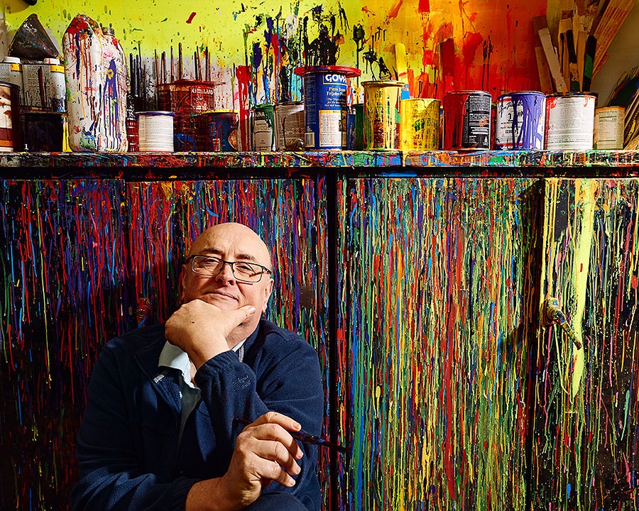
Southwest Signs was started in 1962 by South Side sign painter Bob Petrizzo in his garage. When Chuck was a senior in high school, Bob asked if he wanted to make some money cleaning up the shop, doing a few odd jobs. And then he asked Chuck if he wanted to learn how to paint signs.
“It took me a while to feel comfortable, to feel like I was doing it right,” Chuck says. “But then we’re doing a project at White Sox Park and we had to knock out a bunch of signs quick, just temporarily, and it was like all of a sudden it felt right.”
A few years later, Chuck and Dan, who is Chuck’s brother-in-law, went into business doing janitorial work, until Bob reached out asking Chuck if he’d come back to paint signs.
“So I went back,” says Chuck, “and I got Danny in on it.”
At their peak, Bob, Chuck, and Danny turned out 200 signs a day, each 12 by four feet. With supermarket signs, they make their money based on quantity, so they learned to move swiftly, sketching top and bottom guides in pencil. One guy would move down the table and paint the name of the product, while the other followed with prices. “I think it helped us get better quickly when we knew our work was being sent out,” Dan says. “Because when you see it on the street, you want to say, ‘That’s mine,’ and you want to be proud of it.”
Chuck and Dan estimate that 20 years ago, when they bought the business from Bob, about 80 percent of their work was hand-painted signs. Now 80 percent of their work is digitally designed signs and banners that they make for grocery stores as well as car washes and other small businesses around the city. But they’re still best known for their handcrafted work.
In many ways, hand-painted grocery store signs are rooted in a bygone era, when independently owned meat markets and wholesale fruit and vegetable sellers were still commonplace in the city, and shop owners would place weekly orders for signs. Today, for the chains, the prices are set weeks in advance and the emphasis of the shopping experience is on aesthetics; gone are the days of trying to price out the guys across the street. “The architecture of these new Mariano’s with the glass front, they don’t really want signs in their windows,” says Chuck. “They want that light to come in.”
I recall the signs announcing oxtails on sale at the Old World Market, how on a whim I looked up oxtail recipes. I don’t think I’ve ever felt similarly inspired by a glossy supermarket circular or the Weekly Ad section on Jewel-Osco’s website. “It has the feeling of immediacy,” Chuck says. “This is something that someone just put up.”
And with that immediacy, there’s dynamism, each sign layers of paint and remnants of pencil. Even if 15 signs advertise eggs for $1.99, each is a little different — imperfect, but also impressive in its precision. The moment we realize these signs were made by humans and not a computer, we trust them just a little more.
Honestly, I don’t need much more to trust that the eggs are $1.99, but in an age of screens and bots and instant add-to-cart and the prospect of Amazon drone deliveries, a hand-painted sign tells me that someone on the other side of the window wants me to buy these eggs. Someone — a person, not a corporate entity — placed the order, received the delivery, added them to the refrigerator case next to the yogurt, and will use my buck 99 to buy more eggs or yogurt or whatever the neighborhood needs. Maybe even another hand-painted sign.
If the appeal of hand-painted signs is human connection, the color red is critical to their mission. And there’s a problem.
“We can’t get red paint,” Danny says incredulously. “Can you believe it? It’s one of our core colors.”
Chuck sighs. “I even called Canada.”
It’s February 2022, and 1 Shot ZZ3005 Bright Red poster paint is impossible to find. On Facebook, the shop spirals.
The first post sets the stage: “What do you do when the paint industry for sign makers can’t supply red paint. … Weird, right? Well it happened without warning. Sign paint hit the fan in the supply chain. So until it gets rectified … here is our solution: SOUTHWEST SIGNS
HAS THE BLUES.”
In the accompanying photo, Cheeseburger Special with … Fries & Pop $8.99 + tax appears in a monochromatic spectrum of blues with a pop of chartreuse.
A few months later, an update in all-caps: “NO RED … NO PROBLEM. WE CAN STILL MAKE BRIGHT COLORS SIGNS. ORANGE PINK CHARTREUSE BLUE.”
Best Choice Easy Peel Raw Shrimp $5.99 is framed in bubblegum pink and Boca Raton tangerine.
Sure, it’s just a color, it’s just red, it’s just the price per pound of peel-and-eat shrimp, but Chuck and Dan know that it’s not just about that. It’s proof of their innate understanding of what makes people do what they do and buy what they buy. Red plays a big role in that. (And red is playing a big role once again: 1 Shot poster paint is no longer in production, but Southwest Signs found another formula to replace it, albeit at a higher cost.)
Even if 15 signs advertise eggs for $1.99, each is a little different — imperfect, but also impressive in its precision. The moment we realize these signs were made by humans and not a computer, we trust them just a little more.
Chuck and Dan know instinctively what branding experts study methodically: that a few block letters in red, on a swish of chrome yellow, compels people to stop in to buy apples that are on sale, or to make a dish with chicken thighs because they are 50 cents a pound cheaper than chuck roast this week.
To make a crisp letter, you also need brushes, the kind that’ll cost you upward of $95 and wear out after three months. Driving around town, I notice other grocery store signs, and at this point I can tell which ones are Southwest Signs. On the others, the letter forms are block, too, but almost bulbous. Vibrant, but not as bright. Most sign painters these days don’t want to invest in quality brushes, so they fall back on foam ones. Foam brushes will get the job done, but those signs lack the artistry, the technique, the Delta Rice 25 lbs for $14.99 applied with an effortless but precise swish of the wrist.
“It’s gotta be a little more loose, you know,” says Dan. “You gotta be more fluid with your hand.”
Just like the Factory employees who helped Warhol with his mass-produced silk-screen images and the workshop pupils who answered to Rembrandt, Chuck and Dan are willing executors of others’ ideas in their signature style.
Their clients run the gamut: the indie filmmaker who needed signs for a film about a carnival (“We had to make them look old,” says Dan), the Disney movie filmed in Chicago (“We made a bunch of signs that would be in a diner”), a German architecture firm’s international exhibition installation (“I had to copy language in Arabic and Afrikaans. I didn’t even know what I was writing”). Years ago, Alberto, the South Side artist, cut up discarded grocery store signs and collaged them onto the exterior of his house to confuse his neighbors. (“Confusing people is a form of communication,” he quips.) When he figured out the signs were Dan and Chuck’s handiwork, he contacted them directly to procure more.
That isn’t to say they see themselves as painters in the traditional sense. “I had no artistic ability. I don’t even consider myself an artist, what I do,” Chuck says. “But Dan comes from an artistic family, so maybe he can.”
Dan smiles. He shrugs a little, as if he doesn’t want to betray his hunch that he might be an artist. They’re just sign painters, after all. Their success is predicated on efficiency. And their subject is entirely commercial: Milk, $2.99/gallon is marketing at its most salient.
Paul Hirsch, a Chicago adman who hired Southwest Signs to make signs for his new agency in the Bay Area, disagrees. “It’s the antithesis of advertising,” he says. “It’s the way they do their signs that say, ‘Look at me!’” The signs he commissioned still charm and bewilder Dan and Chuck over 10 years later.
“He made up things like, you know, Rancid Beef, ” says Chuck.
“It was like some of the most bizarre things, but it was to get attention,” says Dan. “And he got attention.”
Advertising or art, these signs are both something and nothing. Each has a beautiful balance of precision and technique, but also, they’re just paint on paper. Thousands of the signs get hung for a week or two before getting thrown out. Some don’t even make the window before they’re scrapped entirely.
On a cloudy Friday morning, the studio is quiet except for the rumble of jets at Midway. Bob’s grandson is in the back, practicing how to paint an S. Dan and Chuck are rolling out paper on their work table, filling cups with oil-based poster paint.
The signs they make here are an attempt to shout across four lanes of traffic that Cara Cara oranges are now $4.59, still a few cents cheaper than the Cara Cara oranges being sold down the street. Each declaration is bold, even braggadocious, for Midwestern sensibilities, but it is also an invitation, an acknowledgment of a deal. A splash of color against uninspired concrete. A suggestion that perhaps today there’s something else to consider.
Dan and Chuck no longer notice the sour smell of the paint, just like they don’t notice the prices. Their focus is only on the letterforms. In these moments, there’s only paint, white paper, a flick of the wrist, and a swirl of blue, large and crisp, vibrating against chrome yellow.