On the southeast corner of the five-way intersection of Fuller and Loomis Streets and Archer Avenue in Bridgeport is a prototypical Chicago apartment building. The three-story structure is modest in scale, its bricks various shades of sandy brown and reddish orange, with a series of helix-shaped accents crowning the façade. Today, the structure is nondescript, unassuming: a Chicago apartment complex, nothing more, nothing less.
When I first saw the building in August 2020, after my partner and I moved to Bridgeport from the North Side, there was more. On the ground floor, storefront signage — maroon lettering on creamy peach tiles — promised passersby “Ice Cream” and “Drugs,” offerings once made by R.V. Kunka Pharmacy, a neighborhood drugstore. Even though the shop no longer existed, that distinctive lettering — asymmetrical and curvy, the K’s formed by a thick stem, a squat lower arm, and a slender, almost half-U-shaped upper arm — was a welcome sight in my new neighborhood, a reminder that I had moved to a place with real history.
Yet it was not long for the world: By that October, the display had been painted over, and soon any indication of the building’s history had been stripped bare, the exterior made generic for whatever new business might wish to move in. The loss of the R.V. Kunka storefront is one of countless stories we could tell about how the city changes; whether you’ve called Chicago home for five years or 50, you’ve seen things come and go, from single buildings to entire blocks. But still, seeing that signage removed, leaving behind only some tan-colored bricks that were beneath it, left me with an unexpected feeling of mournfulness.
So I was delighted when I discovered that some tangible form of the old sign lived on, at least in the creative imagination of artist Steve Shanabruch. For Shanabruch, best known for the series of Chicago neighborhood prints he began in 2013, that kind of cultural memory has always been important. Today, his prints — faux tourism placards for dozens of neighborhoods and Chicago landmarks, inspired by WPA-style travel posters — are beloved around the city, with nearly 70 available for purchase. But that is only a part of the work Shanabruch has undertaken to celebrate Chicago and its inhabitants. To honor places like R.V. Kunka and other idiosyncratic pieces of the city’s fabric, Shanabruch has turned to an underappreciated facet of Chicago’s history for inspiration: typography.
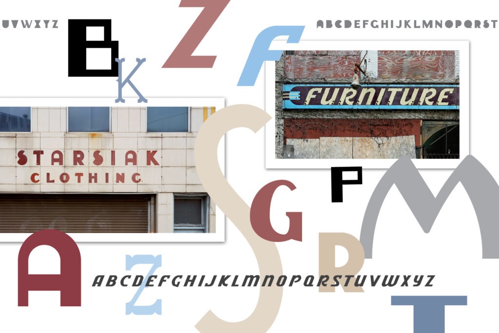
The storefront that first caught Shanabruch’s eye was once lost to history. Starsiak Clothing, a humble suit shop that opened in 1916 at the Polish Triangle on Milwaukee Avenue, at Division Street and Ashland Avenue, lasted for 65 years, run by two generations of Starsiaks who made clothing for the Polish population once prevalent in the neighborhood. In 2005, the storefront was rented out to Espace, an athletic shoe store, and when it went out of business in 2018, the removal of its metallic sign revealed the original Starsiak logo underneath.
Shanabruch, an illustrator with no formal typographic training, was one of many people captivated by the rediscovered sign, with its heavy rounded type. So he decided to re-create it. Armed with a handful of new digital brushes and textures he’d bought on Adobe Illustrator, he started playing around with lettering, teasing the idea of building a full-fledged typeface based on the sign. The words “Starsiak Clothing” contain just a dozen letters of the alphabet (including the all-important S, probably the logo’s most memorable letter, which looks like a circle sliced at an upward 45-degree angle), so designing an entire font required Shanabruch to improvise the remaining characters. But he enjoyed the challenge, and his typeface, simply and fittingly named Starsiak, came together over the next few months, comprising 91 different glyphs, or unique characters, including 12 alternate letters (mostly letters like A, B, D, and others with the white space filled in), and 38 punctuation marks.
Shanabruch released Starsiak in the summer of 2019. A year later, he released another typeface, Carbit, inspired by a Carbit Paints sign on a demolished building in Humboldt Park. Since then, he’s released 11 more fonts, all of them sourced from typography around Chicago — and painstakingly designed one character at a time.
It’s an iterative, intuitive undertaking, Shanabruch says. He chops up different letters into new combinations, with the letters A, O, H, and R proving especially useful for disassembly. His process happens exclusively on Adobe Illustrator, and if you look at his digital workbook for the Starsiak font, you see that some characters emerged in one or two attempts, while the letter G took 10 tries.
Shanabruch, 42, was born in Beverly and has been in Chicago his whole life, except for the three and a half years he lived on the West Coast after graduating from St. Xavier University in Mount Greenwood. He and his wife moved back to Chicago in 2008 and now call Portage Park home. His fonts project has become a pleasant diversion when he needs a respite from his day job creating designs for local nonprofits — it offers a different sort of mental challenge.
Art deco logos like Starsiak work well in this exercise. “It’s my favorite kind of style — it’s pretty geometric, and you see a lot of repetitive shapes,” Shanabruch says. And that repetition offers lots of stylistic handholds to build on in creating a full font. “It’s kind of guesswork and how you think things will look, and if they’re not perfect, I don’t really care. If everything looks fine together, I’m happy.”
The fonts are a way to rekindle a spark of community memory, preserving the small flash of recognition that can bring a place back in the mind’s eye, if not in brick and steel.
Shanabruch takes his inspiration from photographs, both archival and contemporary. Several designs started with suggestions by fellow Chicago history enthusiasts on Twitter. Of the 13 fonts he has completed so far, which are free to download from his website (thechicagoneighborhoods.com), all but two were drawn from text at a specific place. One of those two, Park District, is a nod to the midcentury green entrance signs in many of the city’s parks; the other, Snickers, a design based on a vintage advertisement for the candy bar, is a tribute to the recently shuttered Mars Wrigley factory in Galewood, a Spanish Revival–style structure built in 1929 that may soon become a city landmark.
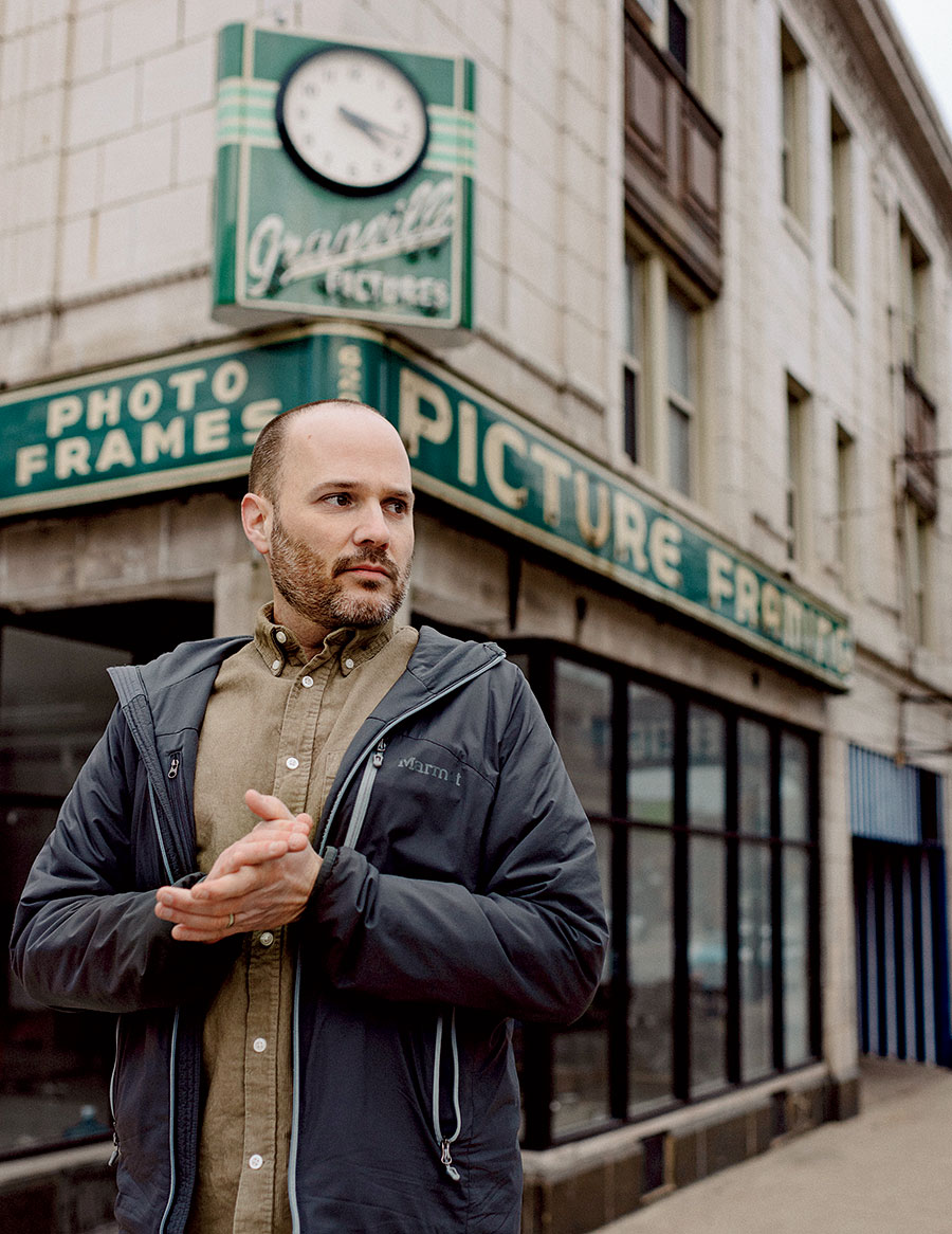
As for the 11 other fonts, many can still be found in the wild, making for a fun game of city observation; just a few weeks back, on my way from Humboldt Park to Rogers Park, I spotted Shanabruch’s latest source, the Western Automatic Music building at Berteau and Western Avenues, which informed a font, Automatic, that he released last June. But the city can change quickly. Many of the fonts capture endangered signage promoting long-gone businesses like Granville Picture Framing and Gallery Arts, which closed in 2017 after almost 90 years, a place that anchored the community for generations. The fate of its last vestige is unclear.
“I assume somebody’s going to move in there at some point and take the sign down, because why do they want a picture framing name on their building when they’re not a picture frame place?” Shanabruch says. “Especially in this day and age, a lot of people don’t appreciate the history, but 20 years from now, maybe the next person in that space would be like, ‘Oh man, that would have been so cool to still have it on the spot.’ ”
If you’re not a city nostalgist, you might be wondering, What’s the big fuss? Shanabruch admits his obsessive interest in Chicago history, laser-focused on decades-old typographic details that many people would hardly give a second glance, is not widely shared. But for those with the same passion for the city’s design history, there’s an appreciation for what he’s created and a recognition that proliferating these bits of Chicago lore is a worthy task.
As the author Alexandra Horowitz writes in her book On Looking, which explores different ways we can see anew city blocks that have become too familiar: “Just as architectural styles identify a city, so too is a city recognizable by the type of lettering that predominates. Putting aside the rash of newer, computer-font signs now topping identical cell-phone stores and delis, the lettering that exists and remains on buildings represents when a city was built, how it has evolved, and whether that evolution involved destruction or restoration.”
Learning to read and appreciate storefront signs, registering their unique properties and what they might say about the city’s past, allows us to dig a level deeper, conferring unexpected insight. For those who use Shanabruch’s fonts, as I’ve done in zines, on invites, and even on my business card, his work honors a changing city, showing appreciation for Chicago’s singular charm. While the neighborhood prints have gathered more attention, his typefaces are a way to capture the city despite its ephemeral nature, a way to rekindle a spark of community memory, preserving the small flash of recognition that can bring a place back in the mind’s eye, if not in brick and steel.
“Growing up, you take things for granted, and then one day they’re gone,” Shanabruch says. “You remember that cool sign, that cool restaurant, and even if it wasn’t anything of great value or whatever in your life, at least you could go by it and see it, and it would be part of your existence.”
The R.V. Kunka Pharmacy served its last customer in 2009, as the neighborhood establishment was crowded out by CVS and Walgreens. Shanabruch almost scrapped the font honoring the store, shelving it for six months as he struggled to re-create its intricacies to his liking before he figured out a workable design, which he released in June 2021. And while I caught only a glimpse of the storefront in 2020, a welcoming neighborhood presence now lost to history, I know its legacy is just a few clicks away, there to help conjure whatever city tale might come next.