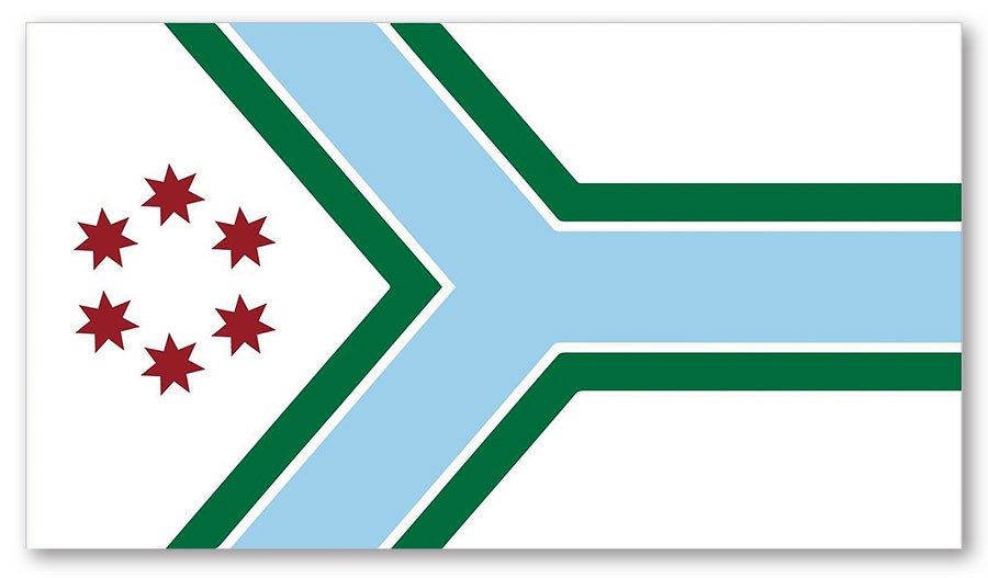

Its origins date back more than a hundred years, to the creation of a different flag. In 1892, the Chicago Daily Tribune held a contest to design a city flag. The winner was architect Alfred J. Roewad’s entry, with its Y-shaped emblem representing the confluence of the North and South Branches of the Chicago River at Wolf Point. Though the city eventually went with blue stripes and red stars, Roewad’s emblem became what’s known as the municipal device, one required by local code to be displayed on all city vehicles.
So why isn’t that enforced today? According to the city’s website, “Hippies doomed the municipal device with their peace symbol,” which was a little too close in appearance for some. “It was hated by Chicago police in the 1960s.”
The emblem, which used to appear on the Chicago Public Library’s logo (and can still be seen on a mosaic inside the Chicago Cultural Center’s Preston Bradley Hall), was largely abandoned for official use. But look closely around town — say, at the ceiling mosaics on the first floor of City Hall, the Chicago Theatre marquee, and traffic control boxes — and you’ll spot it. It’s even making something of a comeback: In addition to being featured on the county flag, it was incorporated into the Bulls’ City Edition jersey last year.
Email your questions about the Chicago area to emcclelland@chicagomag.com.