In 2009, Chicago's Jennifer Wehunt wrote a lengthy piece on food deserts, outlining the terms of a debate that's touched everything from Wal-Mart to Mayor Emanuel to Michelle Obama:
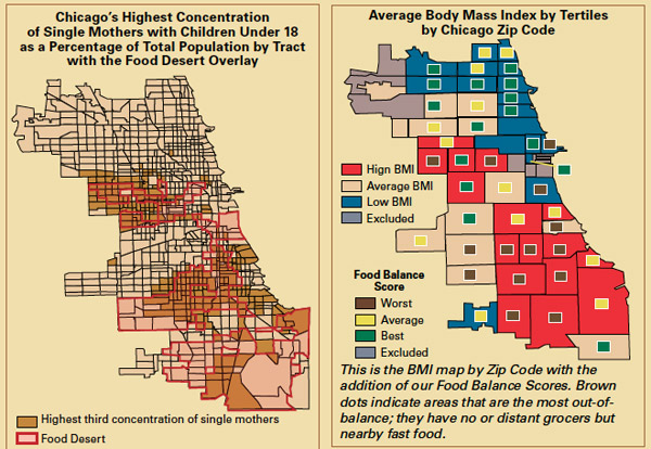
Chicago’s food desert lies entirely below Division Street, affecting a population that is overwhelmingly African American: about 478,000 blacks, compared with some 78,000 whites and 57,000 Latinos, according to Gallagher’s calculations. For her 2006 report, Gallagher measured the distance from the geographic center of each of the city’s 18,888 inhabited blocks and found that not only do residents living in majority African American blocks travel the farthest on average to reach any type of grocery store—0.59 miles as opposed to 0.39 miles for majority-white blocks or 0.36 miles for Latinos—but they must travel twice as far to reach a grocery store as a fast-food restaurant.
Chicago's food desert seems to be in decline, and the city kicked off a pilot program to get more healthy food in corner stores. But now there's some pushback on the concept, the New York Times's Gina Kolata reports. Does access actually help?
[T]wo new studies have found something unexpected. Such neighborhoods not only have more fast food restaurants and convenience stores than more affluent ones, but more grocery stores, supermarkets and full-service restaurants, too. And there is no relationship between the type of food being sold in a neighborhood and obesity among its children and adolescents.
Within a couple of miles of almost any urban neighborhood, “you can get basically any type of food,” said Roland Sturm of the RAND Corporation, lead author of one of the studies. “Maybe we should call it a food swamp rather than a desert,” he said.
The findings of the studies Kolata reports on and that of Mari Gallagher may not be as far off as they appear. Sturm looked at food within a mile and a half; a second looks at food options by square miles. Gallagher, meanwhile, looked at distance, finding a high average of just over half a mile to the nearest grocery store from majority African-American blocks. And when it comes to pedestrian traffic, seemingly small distances can make a difference:
The majority of walking studies are for and about commuters. Broadly speaking, they indicate that most people are only willing to walk a quarter-mile as part of a commute. A New York Regional Plan Association study, for example, found that residents within a quarter-mile of a transit facility are 5 to 7 times more likely to walk to the station than other passengers.
[snip]
A 1976 study of the Bay Area transit system found that only 50 percent of riders who walked to the facility came from within a six-minute walk, but 80 percent came from within ten minutes, or approximately a half-mile.[4] This data supports cities that set a standard of a half-mile (and in some cases, more) as a reasonable distance to walk to a park.
But the evidence that access to grocery stores and obesity don't necessarily correlate is compelling. Barry Popkin of the University of North Carolina led a study of 5,000 people over 15 years in five cities, including Chicago:
While the study confirmed conventional wisdom that increased proximity to fast food restaurants makes for more consumption of fatty foods, it challenged popular notions that greater access to fresh fruits and vegetables in poor neighborhoods results in more nutritious diets.
[snip]
"It's really other factors along with the availability that matters," Popkin said, noting that time, cost and cooking skills play equally important roles in encouraging healthy diets.
Of all Gallagher's maps in her influential 2006 report, I found these the compelling:

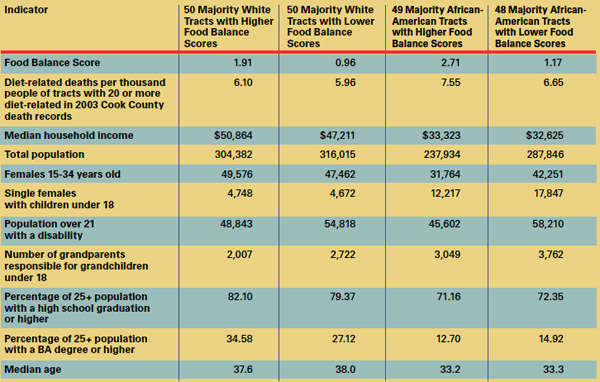
As well as these statistics:

A "low-balance" score is good: "the distance to the closest grocer divided by the distance to the closest fast food venue." A grocery store one mile away and a fast-food joint a half-mile away is equivalent to a food balance score of two.
* The majority African-American tracts with low food scores have fewer diet-related deaths than high-score tracts (and slightly higher levels of education, despite a marginally lower income) which supports Gallagher's theory.
* The majority white tracts with lower food balance scores have fewer as well (despite a slightly lower median income and a considerably lower percentage of college graduates) though the difference is less significant.
* But the number of diet-related deaths in African-American majority tracts with low scores is higher than that of white tracts with high scores, despite a substantial difference in the food balance score.
Again, all this might not be so conflicting as it appears at first glance. Some of Gallagher's data makes a compelling argument for the efficacy of access to healthy food, and common sense dictates that people won't eat healthy food if they have no access to it. But it's a small piece of a larger puzzle, and likely one of the more simple ones.
Photograph: Linda N. (CC by 2.0)


