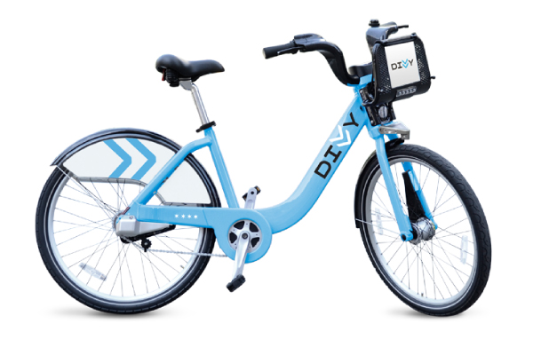
photo: Chicago Divvy.
Is our local two-wheeler the worst-looking bike-share bike in the world?
After reading Adam Doster's thoughtful story yesterday about other cities' experiments in bike-sharing—and what Chicago can learn from them—it seemed time for a more superficial follow up: Why is our bike so ugly?
As Jeff Ruby put it: It looks like a Smurf got in a fender-bender with a Huffy.
Is it this bad in the rest of the bike-sharing world?
Here's a look at how Chicago's blue cruiser measures up against the bike-share rides in eight other world cities.
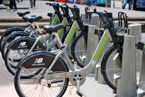
Photo: Boston Hubway
Boston Hubway
The Boston ride looks quite a bit like the Divvy. In fact, if a lot of the US-made bikes appear to be of a really similar construction, it's because these guys make the Bixi bikes used by a lot of the major markets.
But in the details, Boston's bike has a slight edge over the Chicago style—the slate gray with neon green lettering is just a better color than our baby blue tone. (Yeah, the Chicago flag, stars by the back wheel, I get it.) Points off this one for the lame New Balance branding.
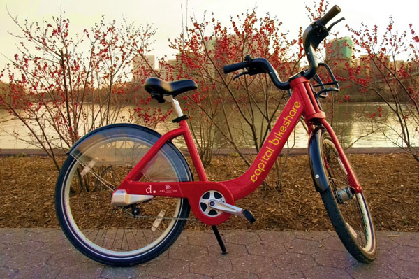
Photo: Capital Bikeshare
Capital Bikeshare in DC
This is another Bixi design, so it's similar to the Boston and Chicago bikes. But you know what? It's red. Red just lends any vehicle a little extra attitude. For a bike, it also sends a useful universal signal to the drivers around you: Stop, please, don't hit me while I awkwardly ride this borrowed bike.
The translucent mud guard looks good while it's clean. That might not be the case after a couple hundred miles of road muck builds up in there.
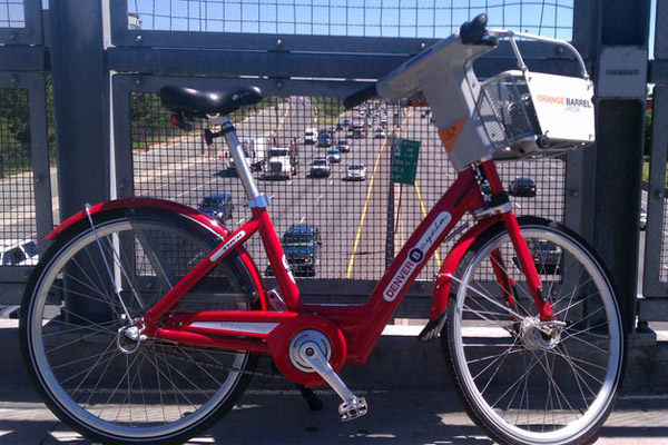
Photo: Denver B-Cycle
Denver B-Cycle
With Denver, we get onto a slightly different design. It's a little better, with classic mud guards, stronger angles, and a less cruiser-like body. And it keeps useful touches like a chain guard. But then you get to the front handles. What is that? So bulky. So plasticky. At least there's a built-in basket.
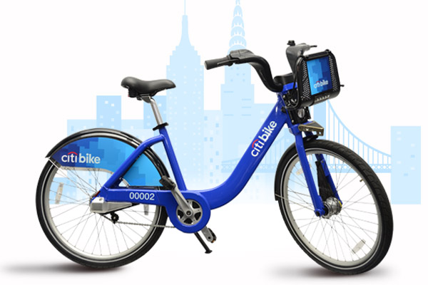
Photo: Citi Bike NYC
Citi Bike NYC
Sorry Chicago, New York's got you beat: This is the worst-looking bike in America. Same Bixi constuction, but an even worse shade of blue. Bank branding all over it. Let me ride this to the CitiBank ATM. On my way to Citi Field. I love New York Citi.
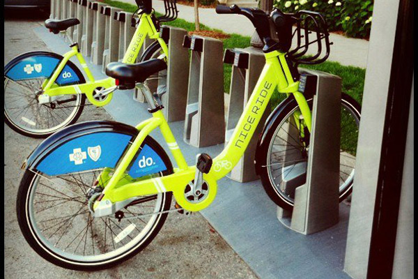
Photo: Nice Ride Minnesota
Nice Ride Minnesota
Okay, one more Bixi type. If you want a chartreuse frame with blue health insurance branding on it, this is the one for you. As Luke Seemann put it: I think the ugliness is a security mechanism. But this is Jennifer Tanaka's fave among the Bixi types. Emmet Sullivan called it fun and spunky. "Oh Minnesotans," Jeff Ruby said. "You and your crazy individualism."
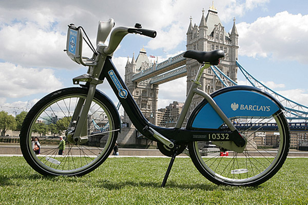
photo: visit london
London's Barclays Cycle Hire
Despite the bank branding plastered all over it, this is actually not a bad-looking bike. But then you have to consider it's going around in a city with those beautiful double-decker buses and classic black cabs. So maybe it's a weak option. More bulky, big, dumb-looking handles. But not as bad as Denver.
PS: Toronto has a pretty cool black version of this same Bixi style.
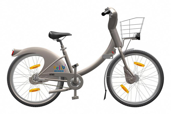
Photo: Velib
Paris Velib
This might be the single worst-looking bike share bike in the world. Chicago is absolutely more stylish than New York and Paris in the bike-share category. That's right. Seriously, is this thing completely made of plastic?
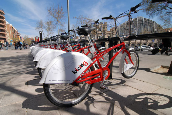
Photo: Bicing
Barcelona Bicing
In spite of its big white rear wheel cover, this might be the best looking bike in the bike-share world. Great color. Elegant lines. Cool high handlebars with plenty of room for baggage. Maybe it's because this is the one that looks most like a regular bike—but it's the only one that I would feel fine riding.