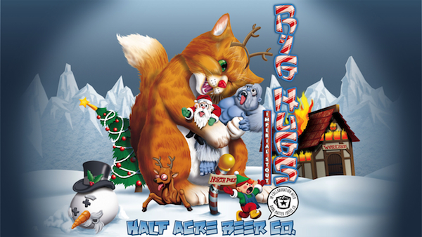
This year's Big Hugs label, designed by local printmaker Phineas X. Jones
While many craft beer companies release special edition beers during the holiday season, only one features on its label a menacing-but-cuddly kitten squeezing the life out of Santa Claus and wreaking havoc on the North Pole. Half Acre's Christmas stout, Big Hugs, is back, and the beer company is hosting a public release party at Blind Robin in Ukrainian Village tomorrow at 8 p.m. There to celebrate the occasion will be local printmaker Phineas X. Jones, the designer of the label for the third year in a row.
Jones, who holds a BFA in printmaking from Colorado State and trained at Chicago's Screwball Press, has produced prints for local artists such as Andrew Bird, The Neo-Futurists, and Strange Tree Group, among others. A mutual friend introduced Jones to the Half Acre folks in 2009, and the printmaker has designed most of the beer company's labels since.
From bunnies with tentacle ears to a pinstriped-suit-wearing squid, Jones's work displays his affinity for animals—particularly the biologically impossible. In fact, his company's name, Octophant.us, was inspired by one, a fantasical half-elephant, half-octopus creature. Here, we chat with Jones about the Big Hugs's terrorizing feline, ad agency life, the local printmaking scene, and more. PLUS: Check out the gallery below for more of his work.
ER: How has the Big Hugs kitty evolved over the last three years?
PJ: The first year he was kind of cute and adorable, hugging a building to pieces in an oblivious Godzilla style. Then the next year, [Gabriel Magliaro, owner of Half Acre] decided he was going to be more aggressively destructive. He was rampaging through some kind of fairy land, stomping a castle and breathing fire. This year, it was decided that he should be cute and oblivious again, so he destroys the North Pole with love.
ER: So this year’s Big Hugs started off much more menacing, with dead wildlife at the North Pole. Whose idea was it to pull back?
PJ: [Gabriel] said it looked like Big Hugs was global warming, which he kind of was. I actually liked that idea, but people might not get the cleverness of the whole thing. Global warming is people using the earth too much, and Big Hugs is the manifestation of loving everything to death, but people don’t look for that kind of depth in a beer label.
ER: Are you happier with the PG version?
PJ: Oh, who knows. Maybe we’ll be able to use that for something else. [Big Hugs] has become one of Half Acre's flagship products, so you have to be a little more sensitive to brand positioning.
ER: There are the obvious space constraints when designing a beer label. How do you deal with those?
I do all the labels much larger than they actually get printed. [Half Acre] never knows what size things might eventually end up. I have to think about type sizes when things get shrunk down, but it’s not a huge consideration. I have to think a little bit about how things sit on the bottle. We changed sizes a while back to a shorter, longer label that wraps farther around. The first one I did at that size, I discovered that you couldn't see all of it on the bottle at one time, so I had to adjust.
ER: Do you apply personality traits to your “hideous children,” as you like to call your characters?
PJ: I hope their personalities come out in how they look. If you look at my Noah and the Whale poster, which is the latest one that I’ve done, all the birds have their own little attitudes about what’s going on. I’m not necessary writing narratives about them, but they’ve got their motivations.
ER: You quit advertising agency life to work for yourself, correct?
PJ: I didn't quit agency life as much as it quit me. It was never my favorite thing, and advertising kind of sucks. I had a job at Playboy, which was cool, but I got laid off after eight months. That was not my fault. That’s just because they’re going to hell. At that point, I was over the cubicle life. Now I don’t have to deal with office politics and commuting downtown every day. It’s kind of nice.
ER: Could you do what you’re doing anywhere else, or is there something unique about Chicago's craft beer scene?
PJ: I don’t know, actually. Half Acre is unusual among brewers because they don’t have a specific style. Even though I’ve done it all, it’s still all over the place. Most places have a more established graphical standard because you want people to realize what they’re looking at [on a shelf], so [other breweries] need a consistent brand. Half Acre does most of the selling straight out of the shop. They don’t get into stores that much. There’s a lot more latitude in how things can look. Gabriel and I both always want to be doing something different than we did the last time. We’ve gone all over the place. Most places aren't like that. Three Floyds is a little bit, although they still have a fairly consistent tone in their illustration.
ER: Do you draw inspiration from other beer labels?
PJ: Not necessary content. Sometimes I see things that they’re doing with production and try to figure it out or want to try it. Like silk-screening straight onto glass bottles. I have talked to the guys [Half Acre] about trying it out. I don’t really try to follow any other designs I see, at least not consciously.
ER: How is the Chicago screen printing scene, and whose work do you admire locally?
PJ: Chicago is a great place for screen printing. There’s a huge screen printer scene in Chicago and lots of really well-known guys—especially if we’re talking about the rock poster scene. There are guys like Steve Walters, Jay Ryan, and Dan Grzeca. There are a lot of accessible facilities, and everyone’s friendly. Jay Ryan has been a big help. He was one of the first local printers that I noticed. And Steve Walters, who runs the Screwball Press, which is where I do my printing. If that didn’t exist, I probably wouldn’t have done much printing.
ER: I hear you don’t like to call your work “art.” Why is that?
PJ: Art is such a horrible, loaded term now. When people are talking about art, they’re talking about [artists] like Damien Hirst. They’re not just talking about pictures, and I don’t want any of that absurd baggage. Those are the things that get press. It just looks like nonsense to me. Not everything needs to say something profound about the human condition or our connection to the consumer culture. I just like drawing things that are cool, and I don’t want it to have any pressure on it beyond that.
Photograph: Phineas X. Jones, Octophant.us