During the 2008 campaign season, a skinny young presidential candidate adopted a sophisticated campaign graphics-design scheme that impressed the design world—and catapulted him to victory against the stiffly traditional design of primary opponent Hillary Clinton and the menacing aesthetics of John McCain ("like what you’d hope to see from Darth Vader if he was running for Dark Overlord of the Universe"). And the less said about Mike Huckabee, the better.
Obama’s design scheme hinged on a wide use of Tobias Frere-Jones’s Gotham typeface, originally commissioned by GQ. In an interview with the New York Times, Brian Collins, a branding expert and Ogilvy & Mather vet, made a couple excellent points about Gotham:
It has a blunt, geometric simplicity, which usually makes words feel cold and analytical (like Univers), but it also feels warm. It’s substantial yet friendly.
[snip]
Newer fonts don’t carry as much historical visual baggage for candidates looking to the future instead of the past.
The Obama campaign added warmth to the typeface by slapping gradients on or behind it, and pairing it with a now-familiar "O" logo that suggested both a rising sun and the crop rows of the prairie. It was a clever, adaptable aesthetic—not to mention a winning candidate’s design—and perhaps as a result, I’m seeing visual echoes in the 2010 mayoral race.
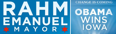
We get it—you were his chief of staff.
O rating: ![]()
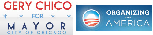
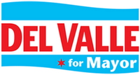
More flavored with than derivative of, but I see minor similarities in the palette (hard to avoid given that we’re in Chicago, but the light blue/dark blue strikes me as Obamaesque) and the contemporary kerning.
O rating: ![]()
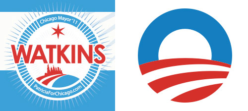
Well, that’s obvious, but it’s a nice adaptation. The blue is switched over to represent the lake; the red-white stripe changes from field to road. And I dig the sunbursts.
O rating: ![]()
Her main logo is pretty conventional, so she was going to get zero Os until I noticed her Web site: note the formal cursive sandwiched by the sans-serif font with applied gradient and soft blue tone compared with the screencap from the current barackobama.com. Again, soft blue is practically unavoidable if you’re running for mayor, I guess, but she still gets…
O rating: ![]()
Regular guy, regular logo. The only candidate not to register on the O design scale.
If you’re further interested, this two-part interview with Sol Sender, the Chicago designer who originally conceived of the "O" logo, is interesting. I do wonder if history would be different if they’d gone with the speech-bubble concept.