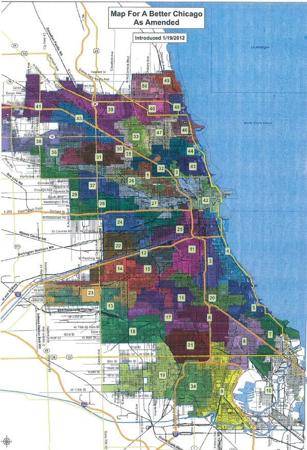
The new ward map, below, passed City Council today by a vote of 41-8, a melding of the "Map For a Better Chicago" and the "Taxpayer Protection Map."
* WBEZ has an excellent interactive that's much clearer than the ordinance map.
* The Sun-Times explains the parliamentary back-and-forth that brought the map to a vote today, and how the makeup of different wards shifts as a result.
* The first thing many will notice is the skinnier, more elaborate Second Ward. The Trib explains in part how it came to be:
Both dismissed the notion that a wholesale shifting of the 2nd Ward, which was north of Lincoln Park in the plan presented to voters, was a significant change from what was presented at public hearings.
The 2nd Ward change kept most of the 43rd Ward intact – as residents from Lincoln Park had demanded at a contentious hearing last week.
* Chicago Journal has a report from that contentious hearing.
* On Twitter, Derek Eder makes a good point: with the city's increasing desire to make government data not just accessible but available in useful digital forms, a KML or shapefile version would be a good start.
* Speaking of data, I thought this was a good point: