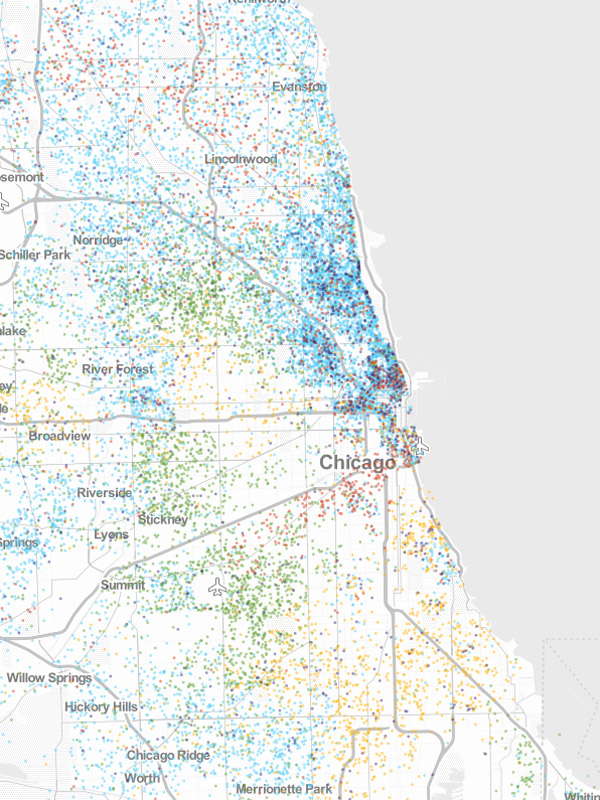
The Urban Institute's valuable MetroTrends site has a slick new functionality: visualizations of all sorts of data for metros throughout the country, from employment to demographics to housing. One of the data sources they have is "owner-occupied first-lien home purchase mortgage originations," with excellent point maps, one point per loan. Here's what it looked like by race in Chicago for 2011 (blue is white; green is Hispanic/Latino; orange is black; red is Asian/Pacific Islander; and purple is unknown):
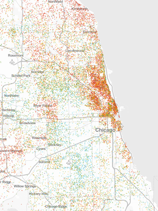
And by income (red is 120 percent of the adjusted median income; orange, 80-120 percent; green, 50 to 80 percent; blue, 50 percent or less):
In other mapping news, this map of Chicago's changing race demographics by Reddit user professor pan is quite interesting.