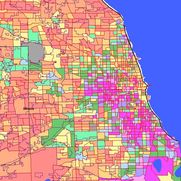
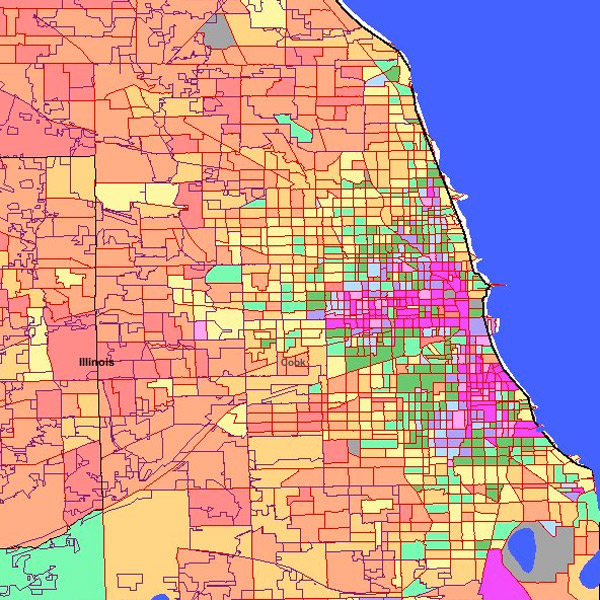
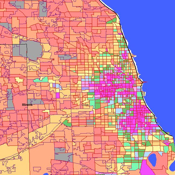
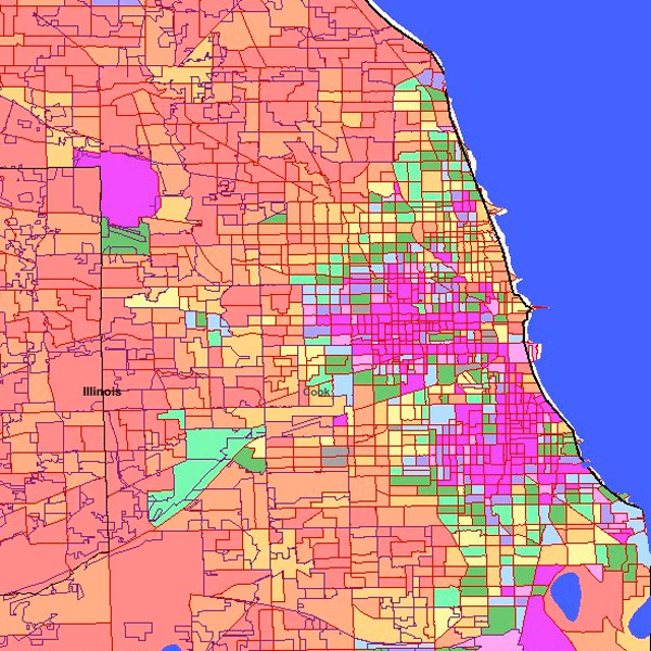
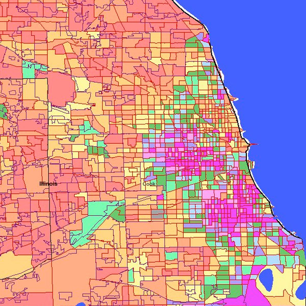
While on a long search for census tract-level Chicago demographics, I came across a wonderful, useful mapping site: MapUSA. It contains a wealth of census data that's easily browsable, so I used it to generate maps of high and low poverty areas in Chicago, at the nicely granular tract level. Here's what the change looks like over time, in terms of the percent of each tract that's in poverty.
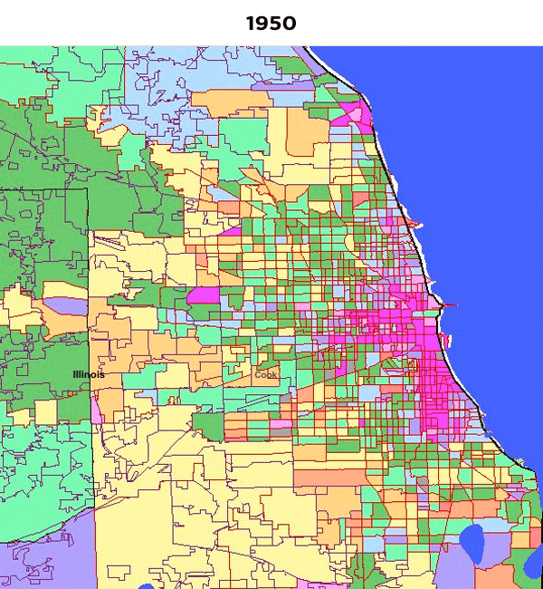
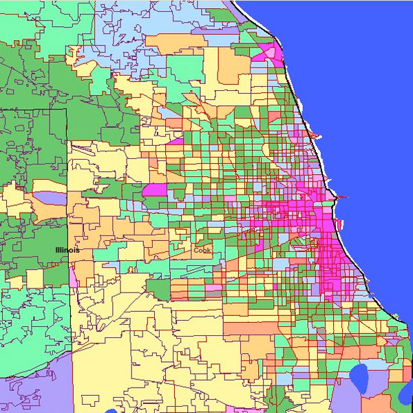
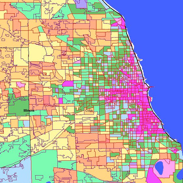
A couple patterns are notable. One is that the central city used to be very impoverished. A frequent theme of urbanism in Chicago and other major cities is the "Europeanization" of income, where a poor inner city surrounded by gradients of income out towards the suburbs changes, so that the inner city is relatively well-off, and surrounded by more impoverished rings in the city and inner suburbs.
Another is the rapid decline in poverty in the suburbs from 1960-1970. Green tracts represent medium levels of poverty; orange and yellow, relatively low levels. From 1960-1970 there's a big shift from double-digit poverty to single-digit poverty in the near Chicago suburbs. Parts of south Chicago are perpetually in the high-poverty fuscia.
Obviously, census tracts change, and the Census bureau has changed how it measures poverty over the years, but it's a good at-a-glance look at its history in Chicago.

If you find animated GIFs distracting, here's a static history.
1950:
1960:
1970:
1980:
1990:
2000:
2009: