
While looking into the subject of whether Chicago's often-terrible winters—when they're not eerily, unsettlingly warm—I was puzzling over the question of whether its summers make up for it. Fortunately, there's a graph for that.
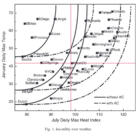
The graph is from "Moving to Nice Weather," by the Kansas City Fed's Jordan Rappoport; the curves are indifference curves (refresher). In theory, someone with the indifference curve above would be just as happy with Orlando as Chicago because the good winters substitute for bad summers, but they're just examples, depending on one's preferences.
(I added the red lines, based on this: "expected population growth increases as average daily maximum temperature increases above its sample mean value of 41°F…. Both July heat index and July relative humidity have negative, statistically significant coefficients on their linear terms. Expected population growth falls as summer heat index and relative humidity increase from their respective sample means of 98°F and 66%.")
The upper-left-hand quadrant is the best of all possible worlds; the lower-right-hand, the worst, depending on your own personal tolerances. Santa Barbara is freakishly pleasant; the monthly average high temperature varies ten degrees all year, compared to 52 for Chicago.
It's also kind of a rorschach test of weather: one person's tolerable compromise is another's complete lack of satisfaction (Washington D.C., and the correct answer is the latter). The one surprise is Minneapolis, which is beloved despite having worse weather than Chicago in both summer and winter—almost as far out on the indifference curve as Duluth, and proof that even a city with totally crap weather can survive.