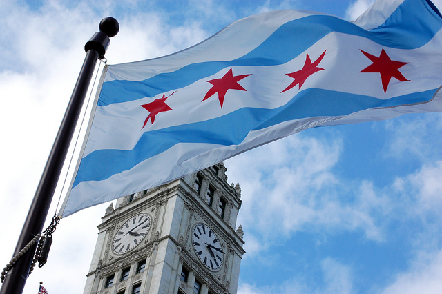
The Chicago flag turns 100 years old next week and that’s a pretty big deal—since, unlike most other cities in the U.S., we really love ours.
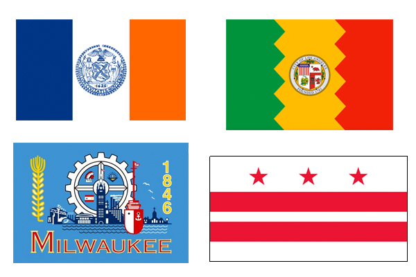
New Yorkers probably wouldn’t recognize their flag if it wasn’t stamped on every police officer’s shoulder, and even Time Out Los Angeles can’t deal with L.A.’s zigzagging mess, which it dubbed a “Rastafarian clip art nightmare.” Some flags are so bad that they drive their cities to shame: Milwaukee’s original design was so overcrowded that they changed it last year.
Our flag is elegant, bold, and symbolic. We wear it with pride on T-shirts and hats, and on the skin of our biceps, calves, and chests. Its admirers include members of the North American Vexillological Association (people who care more about flags than you or I ever will), who voted Chicago’s flag the second best in the U.S. The only flag that better embodies the ideals of vexillological design, per the NAVA, is Washington D.C.’s red-and-white standard, which, if you ask me, wants for a little pizzazz.
On April 4, the Chicago History Museum will throw a free party to celebrate our grand old flag’s 100th birthday. Attendees with Chicago flag tattoos will receive two VIP tickets for a return visit to the Museum.
In advance of the centennial, the museum's chief historian, Russell Lewis, shares some lesser-known trivia from the flag’s storied past.
1. It’s not Chicago’s first flag.
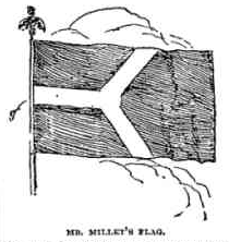
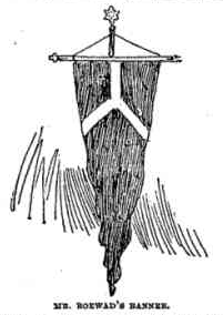
More than 20 years before our current flag was approved by the city council, Chicago found itself in need of a color scheme. The architects and designers of the legendary 1893 Columbia Exposition wanted a unified visual theme for the fair. To remedy this, the Tribune held an open call for hues with which to decorate the exposition. The idea of a city having official or “municipal” colors was relatively foreign at the time; few U.S. cities had official crests, let alone flags. The best reference point the Tribune could give for what, exactly, they were looking for was European heraldry. Ten days and 829 entries later, Alfred Jensen Roewad, an architect for the exposition, emerged the winner. The colors he suggested were “terracotta and white,” and he included in his submission a flag design: a horizontal Y, representing the forked Chicago River and the city’s North, West, and South sides.
The Y clearly resonated with Chicagoans, as it became a popular motif on official and unofficial designs around town. You can still see the Y in medallions and mosaics on some of the city’s older structures, including City Hall, the Cultural Center, several bridges, and the official seal of the Chicago Public Library.
2. It’s not even the second one, actually.
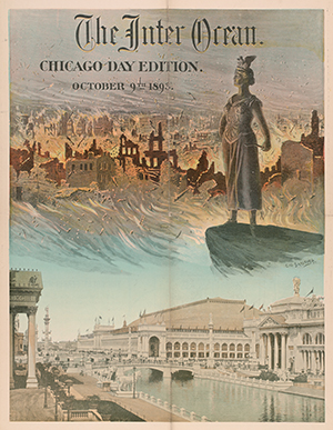
But before the Y, another symbol reigned supreme over Chicago—a human personification of Chicago’s “I Will” slogan, which was popular in the post-fire years. Lewis describes her as “a sort of Wagnerian warrior woman with a breastplate and a phoenix perched on her head.” She was the product of a similar contest to provide Chicago with a civic identity, this one put on by the Tribune’s then-rival paper, the Chicago Inter-Ocean. By 1893, says Lewis, she was starting to feel a little dated, and she faded into the history books with the rise of the more popular Y.
3. It started out a bit lopsided.
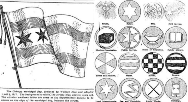
The flag we know and love today was the product of yet another contest, this one set by Chicago’s first official flag committee in 1917. The man behind the winning design was Wallace Rice. According to Lewis, Rice taught heraldry and flag design at the Art Institute of Chicago, and the flag committee called upon his expertise when setting the rules of the contest. The original design featured just two stars (more on that later) and they were located on the pole-side of the flag.
4. It was made to be modular.
This asymmetrical design left room for customization. New York, the flag committee noted, allowed city departments to stitch their names onto the city’s official design. But, says Lewis, the committee decided words had no place on Chicago’s handsome standard. As a workaround, they commissioned a series of 24 circular patches that visually represented each of the city’s departments, plus three more for the three branches of city government. Each department could use its respective symbol to create a unique flag without despoiling the clean design. Unfortunately, the iconography didn’t really stick—in a perfect world, every public works vehicle would be stamped with an X of crossed crowbars.
5. The flag is jam-packed with meaning—with a chronological caveat.
Most people know the flag’s four stars stand for important events in Chicago’s history: The original stars represent the Great Chicago Fire and the World’s Columbia Exposition. In 1933, Mayor Edward Joseph Kelly added a third star to represent the Century of Progress Expo. In 1939, a fourth star was added to commemorate Fort Dearborn.
What you might not know is that the stars are meant to be in chronological order, so this final star is technically the first one of the flag when going from left to right.
6. Even the stars’ points symbolize something.
Each of the individual points of each star represents one of the city’s values or ideals, and they’re organized by star. On the Great Fire star, for example, the points stand for transportation, trade, finance, industry, populousness, and healthfulness. If you want to really get into the weeds on this one, you can find a complete list of the meanings here.
But why, you might ask, six points on the stars? Why not a more traditional, all-American five? Mayor Thompson asked precisely that question of Wallace Rice, and the flag’s designer got a little personal in his response: “Five-pointed stars are the symbols of states and could manifestly have no place in a municipal flag. Mayor Thompson is making not only himself but the flag ridiculous by [suggesting] the change.”
Thank your lucky, six-pointed stars we didn’t end up with a ridiculous flag like that.