A friend of mine pointed me towards a new mapping website, Mapnificent, that lets you enter an address and commuting time to figure out how far you can theoretically get on public transportation or bicycle (my mistake, I misread that; as @stevevance points out, including a bike would double the area; there’s an extra setting for that, screenshots are transit only) in a given amount of time, based on schedule data. One suggested use is for meeting up with people, but my first instinct was that it would be useful to, say, figure out where to look for housing if you wanted to keep your commute within a certain range. For instance, here’s everywhere that’s theoretically a 15-minute commute from my office:
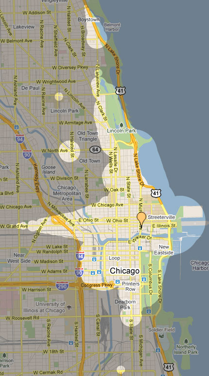
Boystown seems like a bit of a stretch, but I reckon if I hit the Red Line just right, it might be doable.
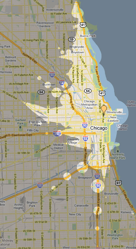
Here’s 25 minutes:
Obviously these are just estimates based on CTA/Metra/Google schedule data, but it does seem to give results within the realm of plausibility. For instance, the University of Chicago, I know from experience, is a pain to get to or from on public transportation. And the half-hour commuting distance—the lower limit for being a pain—reflects that:
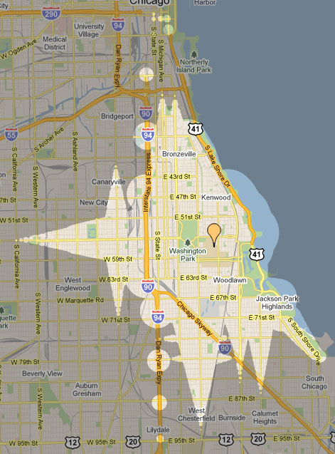
What’s interesting to me is how much easier it is to get north-south, at least according to Mapnificent’s estimates, than it is to get east-west. Obviously to go very far with it you’d have to correlate it to other data and your own experience, but it’s still an interesting tool (h/t alm).