.jpg)
Look! Up in the sky! Above that public library.
There’s Old Glory, the American flag, with 13 stripes and 50 stars.
There’s the Chicago flag, with the six-pointed red stars reproduced on hundreds of t-shirts and tattoos.
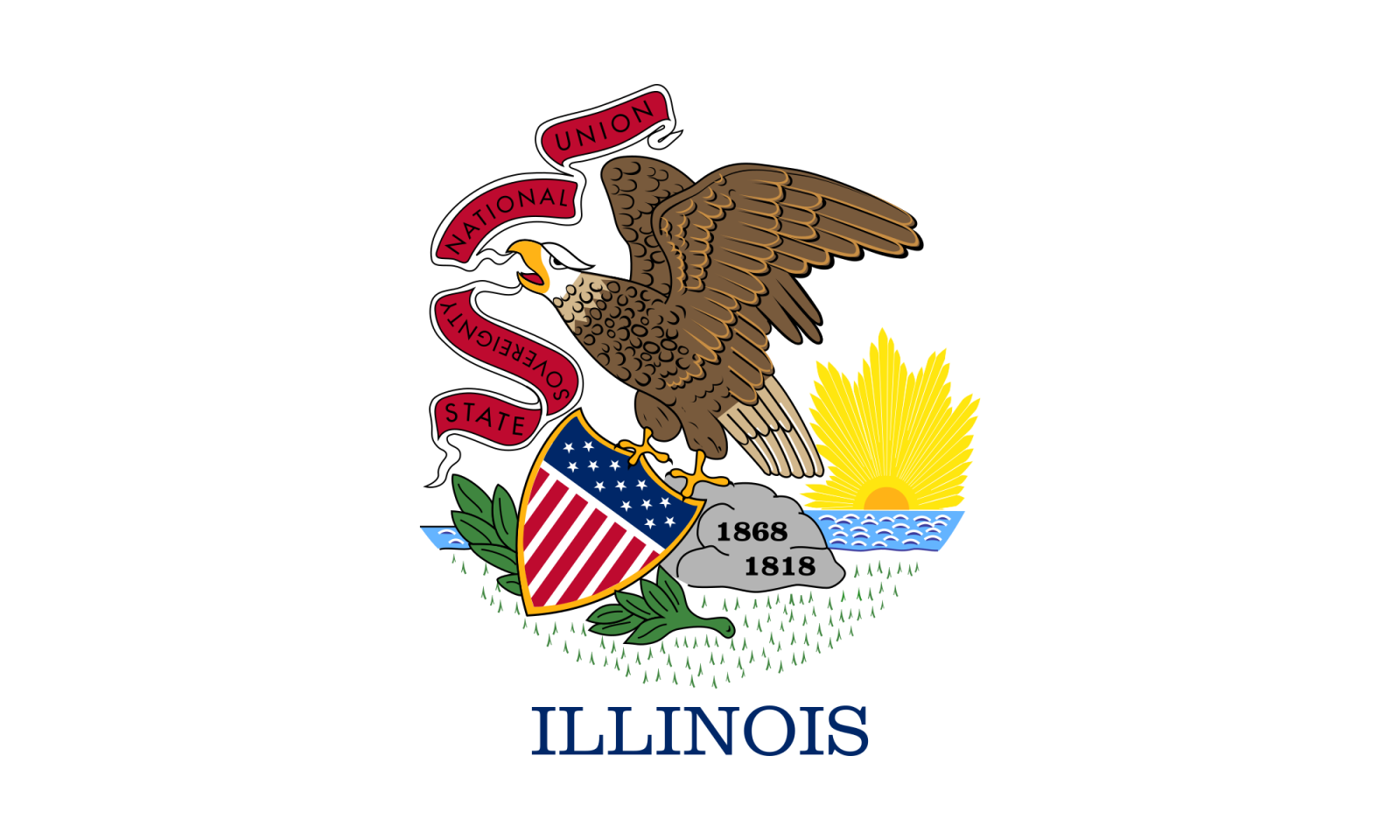
And then there’s a white flag with an insignia that looks like an eagle vomiting two strips of bacon, holding Captain America’s shield in his talons, and standing on a rock while the sun rises behind him. Ah, OK, it says “ILLINOIS” at the bottom.
The Chicago flag is a bold, simple design that has come to symbolize the city over which it flies. The Illinois flag, on the other hand, looks like a bunch of random clip art pasted into a Google doc.

In a 2001 survey by the North American Vexillological Association (vexillology is the study of flags), Illinois ranked 49th out of 72 state and provincial flags. The top finisher was New Mexico, whose flag is a red Zia sun symbol on a yellow field.

According to the membership, Illinois’s jarring collection of emblems violated all the rules of good flag design:
"A flag should be the simplest possible design consistent with bearing a unique, easily distinguished identity…those with complex detail in their composition defeat the purpose of a flag."
"Simple flags, clear colors, not too busy. Shields on fields are bad."
"A flag which needs to indicate its significance by spelling out the state signified…is defeating the very purpose of a flag, that is, to signal ‘visually’ without need of written signs."
"A ‘good’ design for a flag, in my opinion, is one that can be identified at a glance (even in a stiff breeze!) and which is easy for, e.g., school students to sketch… Everyone ought to be able to draw those flags that have significance for them."
So, where did we go so wrong?
Illinois’s flag simply reproduces the state seal, which was designed in 1867 by Secretary of State Sharon Tyndale. Written on that bacon-looking ribbon in the eagle’s mouth is the state motto: “State Sovereignty, National Union.”
The seal did not appear on a flag until 1915, at the instigation of Ella Park Lawrence, a member of Galesburg’s chapter of the Daughters of the American Revolution. When Mrs. Lawrence attended the DAR’s National Congress in Washington, D.C., she noticed that Illinois was not represented among the state flags in Memorial Continental Hall. When Mrs. Lawrence returned home, she began lobbying for a state flag, writing to DAR chapters around the state with the offer of a $25 prize for the best design (more than $600 today).
The winner was the Rockford chapter, which suggested the state seal on a white background. That was … not a very original design.
In fact, it was so unoriginal that in 1969, the legend “ILLINOIS” was added to the bottom, after a naval serviceman complained that many of his shipmates in Vietnam could not identify the flag as Illinois’s.
That’s because Illinois duplicated the pattern used by so many other states: a seal on a blue or white field, the so-called "seal on a bedsheet design."
Illinois pride is not a big thing in this state. But nobody likes a boring flag, so there have been several proposals for a new banner.
The first actually came from Wallace Rice, the Canadian vexillologist who designed the Chicago flag. In 1918, on the occasion of Illinois’s 100th anniversary, Rice produced a “Centennial flag” with 21 stars, to symbolize that Illinois was the twenty-first state.

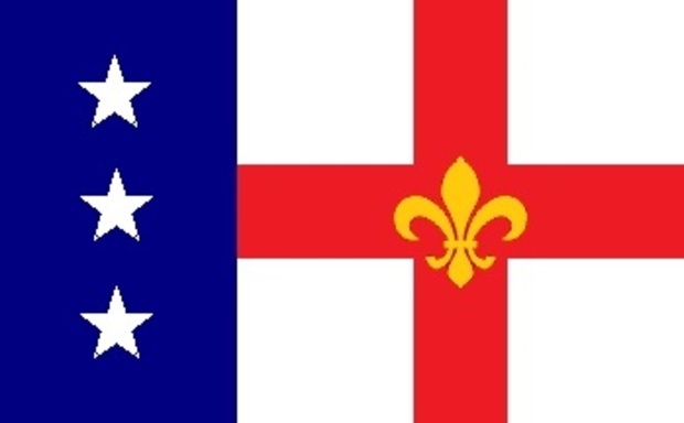
More recently, some Illinoisans have taken it upon themselves to draft their own designs. One of the more successful attempts came from David Morris, a Lincoln Square native and then–Ph.D student at Notre Dame University. His design featured three white stars on a blue stripe to symbolize Northern, Central, and Southern Illinois, and a fleur-de-lis on a red cross in honor of the state’s French settlers.
"The emphasis on flags stems from the public's growing sophistication concerning good design and how it should be brought into public spaces," Morris told DNAinfo in 2016. "You see how Chicago's flag has become much more prominent now in marketing and civic displays, and you see the flag of Illinois, and how lackluster it is by comparison."

Morris's flag had the support of state Rep. Robert Martwick, D-Chicago. "I don't have a personal attachment to the state flag," he said. "A flag that's more related to the history of the state of Illinois sounds good to me."
However, the flag was never adopted, and Martwick has since gone on to more important matters, such as getting a constitutional amendment for a graduated income tax through the House. The state flag may be ugly as sin, but it looks like we’re stuck with it — for now.


Comments are closed.