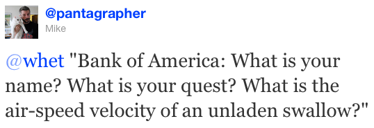
Blair Kamin has two good posts today about the city's decision to permit "the hideous, widely despised Bank of America signs on the Wabash Avenue Bridge" (not to mention the pittance the city got for it), writing that "it angers people who cherish the lakefront as an escape from ad clutter." The second post is a dispatch from WMAQ's Phil Rogers, about the blight of "corporate graffiti" in Venice.
My reaction was that a great deal of it has to do with context. In a city as old as Venice it's difficult—well, I haven't been there, so I presume so—to find a space where advertising doesn't look out of place. In a new, visually heterogenous city like Los Angeles, the risks of generating a gross anachronism like the BoA ads are much lower. Chicago's sort of in between: it's a city with a lot of monumental architecture that makes a poor backdrop for ephemeral advertising, but sufficiently commercial and dynamic that it's not a terrible idea.
And my beef with the BoA ads is simple: they look cheap. Not just the vinyl; not just the fact that the wrap is pointlessly large and poorly proportioned. But also that it's just a logo and a motto on white? The city sells Bank of America on prime real estate on an iconic location downtown, and no one could get a creative—in the home of the real Don Draper, for pete's sake—to make it look like something other than a giant bumper sticker, much less anticipate the backlash?
Not even a clever tagline? ("Bank of America: Post Your Bills!")
Update: this is so much better than my idea:
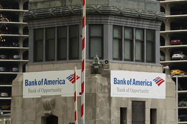
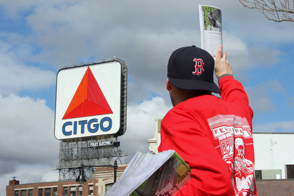
Sigh. See, where I come from, the most iconic architecture in the city is an advertisement.
H&C still exists, though unless you're from Roanoke you probably haven't heard of it; I had to look it up myself to make sure it's still an active brand. In Roanoke the sign is a much bigger deal than the coffee—it's a historical landmark that was restored with money from a fundraising drive, and there's an endowment to keep it running.
Granted, Roanoke doesn't have much in the way of iconic architecture, so the bar's a bit low. Nonetheless, it's a beloved part of the skyline. I've got a H&C coffee mug because the H&C coffee sign means home. But it's not like only small cities without anything along the lines of an architectural heritage embrace advertising as some kind of substitute.
It's not just the fact that the city sold the BoA ads for a song that makes me sad, nor their location on one of the city's most photogenic intersections. It's also that they're chintzy and sloppy and no one seems to care, not the city—"a temporary first-time initiative… revenue from it is really minimal because the focus was primarily on regenerating interest from the business community"—nor Bank of America, which… well, got what it paid for.
Photographs: Chicago Tribune / jpmueller99 (CC by 2.0) / ojbyrne (CC by 2.0) / Briles Takes Pictures…. (CC by 2.0)