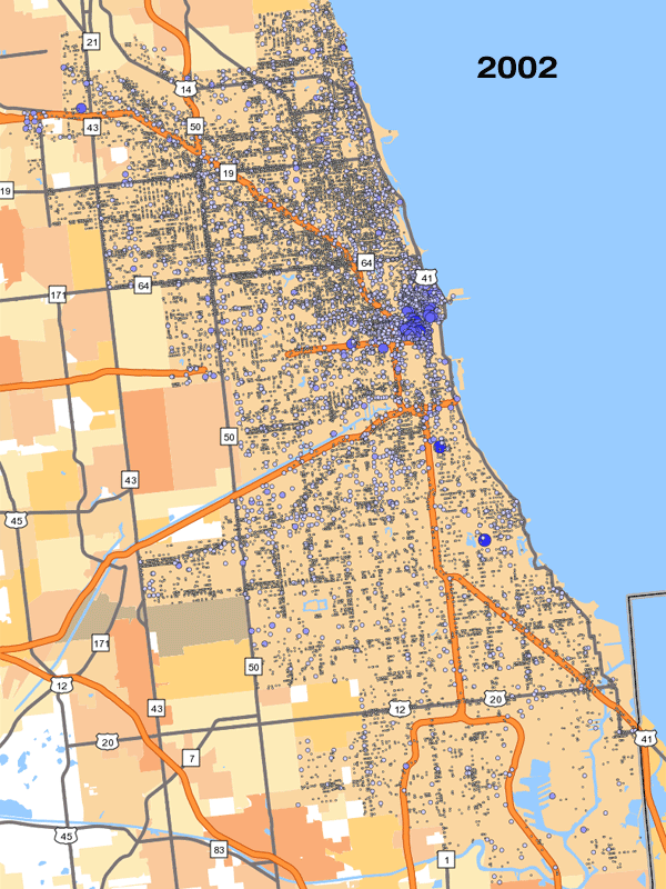
One of the things I was most thankful for over Thanksgiving week was stumbling across the Census Bureau's OnTheMap application, which features a pretty nice interface loaded with longitudinal employer-household dynamics data—all sorts of stuff about where people work, what sort of jobs they do, and how much they make. Below is an animated map for jobs in Chicago, from 2002 through 2010: up to, during, and after the crash (the size and color of the points represents job density; the smallest dots are one to 59 jobs, the largest represent about 15,000 jobs and up).
For reference, here's the unemployment rate for Chicago during that period: