Over at New York University's Furman Center, Stanford's Sean F. Reardon and Cornell's Kendra Bischoff, two sociologists who have been collaborating in recent years on income segregation, have a piece on how neighborhoods are changing as the middle class has been squeezed since 1970.
The impact of recent economic trends are pretty well known, but it's interesting to see how it plays out on a geographic level—on the streets instead of on a spreadsheet. And it's pretty dramatic. In 1970, 65 percent of metropolitan-area residents (basically big cities and their suburbs) lived in middle-class neighborhoods, where the median income was 80-120 percent of the metro median. In 2007, it was 44 percent. Meanwhile, the percentages of people living in affluent and poor neighborhoods doubled over that same period.
Reardon and Bischoff's work touches on Chicago, obviously; you can see the results here. I put the numbers in a different type of graph, for curiosity's sake. I think it helps emphasize the changes by time period a bit more. The y-axis is the percentage of people living in those five neighborhood types: Affluent is 150 percent of the metro median; high income, 125-150 percent; high-middle, 100-125 percent, low-middle 80-100 percent, low 67-80 percent, poor below 67 percent.
Alternately, here's what happens when you compress the categories down to three: just high (125+ percent of the metro median), middle (80-125 pecent), and low (below 80 percent).
A couple things jump out in these graphs. One is how brutal the 1970s were, something I've touched on before. The decline of middle-class neighborhoods and the growth of low-income neighborhoods is strongest during that decade.
Another is the increase in affluent and generally high-income neighborhoods, and how it's timed. The percentage of the population in affluent neighborhoods actually decreases from 1970-1980 (it increases substantially for merely high-income ones). Then it explodes from 1980-1990. The increase slows from 1990-2000, and picks up again after 2000.
When you compress the categories, obviously the trends smooth out, but you can see the same patterns.
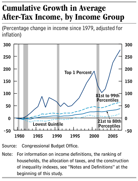
Compared to national averages, Chicago isn't far off. And it looks a lot like the broader income picture nationwide. Here's a chart from the Congressional Budget Office demonstrating how incomes have changed since 1979.
The picture is particularly dramatic in the city proper. Here's the change from 1970-2007, where purple is poor and green is affluent.
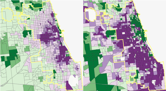
In 1970, much of the city is low-middle-income. That basically vanishes, replaced by rich neighborhoods and poor neighborhoods, save for a patchy belt on the fringes of the city. The geographic growth of affluent neighborhoods is less dramatic than that of poor neighborhoods, but it still represents a massive amount of wealth, and one that's remarkably (or at least very) contiguous, as greater economic trends spread like Conway's Game of Life across the city.