Charles Duhigg, author of the fascinating The Power of Habit (the best part of which ran as his widely read New York Times Magazine piece on Target's use of data), had a neat piece the other day on campaign data-mining, and what the Obama campaign knows about you:
Officials at both campaigns say the most insightful data remains the basics: a voter’s party affiliation, voting history, basic information like age and race, and preferences gleaned from one-on-one conversations with volunteers. But more subtle data mining has helped the Obama campaign learn that their supporters often eat at Red Lobster, shop at Burlington Coat Factory and listen to smooth jazz. Romney backers are more likely to drink Samuel Adams beer, eat at Olive Garden and watch college football.
Obama is doing well with Red Lobster diners, probably because he's black, right? I don't think so: "The family restaurant Fuddruckers and fast-food restaurant Hardee’s were favorites among likely McCain voters. Mrs. Clinton’s likely supporters skewed toward Red Lobster and Krispy Kreme. The Cheesecake Factory, along with Panera Bread and Starbucks, were popular among groups likely to vote for Mr. Obama." I dug into this for awhile (Darden Restaurants, which owns both Olive Garden and Red Lobster, plays demographic data close to the chest). Perhaps this has something to do with it (PDF):
When running against Clinton, blue-collar voters were a concern for the Obama campaign:
Two key demographic groups are often called, in campaign parlance, the "beer track" and the "wine track." Obama attracts strong support from the latter – highly educated voters with high incomes who tend to be more content with their stations in life. Polls have shown Clinton stronger among lower-income voters who lack a college education and harbor deep economic anxieties.
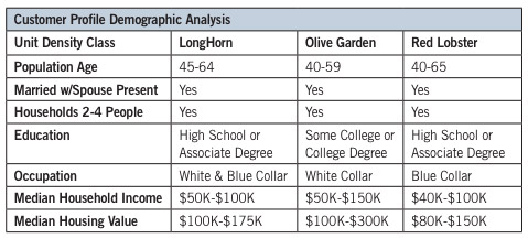
Why the change? Perhaps this: incomes around $100k—where Red Lobster tops out and in the heart of Olive Garden's market—is where support for Romney tends to break out.
Or maybe Red Lobster represents the elusive swing voter, in which case political scientists should be aware that combination Red Lobster-Olive Gardens portend the coming of a dominant centrist party (David Brooks and Thomas Friedman may use this thesis, for a small fee).
Anyway, the whiz kids at "The Analyst Institute," the in-house Dem shop doing strategic marketing for the Obama campaign (Dems tend to go in-house, Republicans tend to source out market research; how's that for a political metaphor?) assuredly know:
The Obama campaign’s “experiment-informed programs”—known as EIP in the lefty tactical circles where they’ve become the vogue in recent years—are designed to track the impact of campaign messages as voters process them in the real world, instead of relying solely on artificial environments like focus groups and surveys. The method combines the two most exciting developments in electioneering practice over the last decade: the use of randomized, controlled experiments able to isolate cause and effect in political activity and the microtargeting statistical models that can calculate the probability a voter will hold a particular view based on hundreds of variables.
The Obama campaign has been tight-lipped about their data mining, from Project Dreamcatcher to Narwhal. So Pro Publica has been trying to reverse-engineer the process by collecting, posting, and analyzing campaign e-mails: "So far we have found that the campaigns have been sending on average two variations of each email, but we’ve seen as many as nine variations of a single email. Most often the variations are small, and based on whether (and how much) the recipient has donated in the past. But sometimes the variations are more interesting." Using algorithms, they attempt to figure out what kind of targeting the variations indicate. And the future of campaining—not to mention campaign reporting—is moving in that mathematical direction, as Sasha Issenberg, author of Victory Lab, writes:
Over the last decade, almost entirely out of view, campaigns have modernized their techniques in such a way that nearly every member of the political press now lacks the specialized expertise to interpret what’s going on. Campaign professionals have developed a new conceptual framework for understanding what moves votes. It’s as if restaurant critics remained oblivious to a generation’s worth of new chefs’ tools and techniques and persisted in describing every dish that came out of the kitchen as either “grilled” or “broiled.”
[snip]
The smartest people I talk to in political campaigns — the ones who spend the most time in the company of advanced data and sophisticated experimentation — are also the quickest to concede how little we ultimately know about what it takes to win. For them, empiricism breeds uncertainty. Only by knowing what is measurable can we appreciate how much isn’t, and be honest with readers about the fact that everything else may have to remain a mystery.
Well, some of it is a lack of math and programming nerds in journalism, but that's being fixed by places like Pro Publica. A bigger problem is proprietary data. Campaigns have access to often expensive data that journalists don't: "large commercial databases, voter files, boutique lists, and an unprecedented quantity of voter interviews it regularly conducted using paid phone banks and volunteer canvassers," as Issenberg writes in his piece on Dreamcatcher. Sometimes little bits do get out, and they demonstrate how big a difference little differences (as in the e-mails Pro Publica is collecting) can make:
We tried four buttons and six different media (three images and three videos). We used Google Website Optimizer and ran this as a full-factorial multivariate test which is just a fancy way of saying we tested all the combinations of buttons and media against each other at the same time. Since we had four buttons and six different media that meant we had 24 (4 x 6) total combinations to test. Every visitor to the splash page was randomly shown one of these combinations and we tracked whether they signed up or not.
The buttons were "join us now," "sign up now," "learn more," and "sign up." Learn more (the least committal) did the best; sign up now (no one wants to sign up for e-mails) did the worst. Of the splash pages, ones with video did the worst, and the one with the super-cute picture of Obama and his family did the best.
It's basic A/B testing that resulted in sensible layout decisions. Not, in other words, anything groundbreaking—which is probably why we know about it. Actually catching up to them will require shaking loose their sacred data, or obtaining and learning to use equally powerful tools to reverse-engineer their mysterious science.
Photograph: Calgary Reviews (CC by 2.0)