There is one map of Chicago. It repeats itself over and over again. I’m sure you’ve seen it. Any cartographic representation of the city’s urban maladies is always a backward-leaning crescent that begins on the Far South Side, takes a left turn at Madison Street, and ends on the West Side.
“I was telling my staff, you know, there’s one map,” Cook County Board President Toni Preckwinkle told me recently. “If you’re talking about food deserts, or violence, or under-resourced schools, or educational attainment, are all the same, right? The maps are all the same, right? And they reflect historic generational disinvestment in these communities.”
Whatever the legend on that one map, it’s always illustrating the same thing: segregation, Chicago’s original sin. It’s a map of the city’s poorest, Blackest neighborhoods. Segregation begets poverty begets high school dropouts begets crime begets shorter life expectancies. Alden Loury has made a career of charting Chicago’s demographics, at the Chicago Reporter, the Better Government Association, the Metropolitan Planning Council, and now WBEZ, where he is Data Projects Editor. In those capacities, Loury has drawn that one map dozens of times.
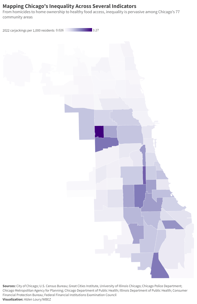
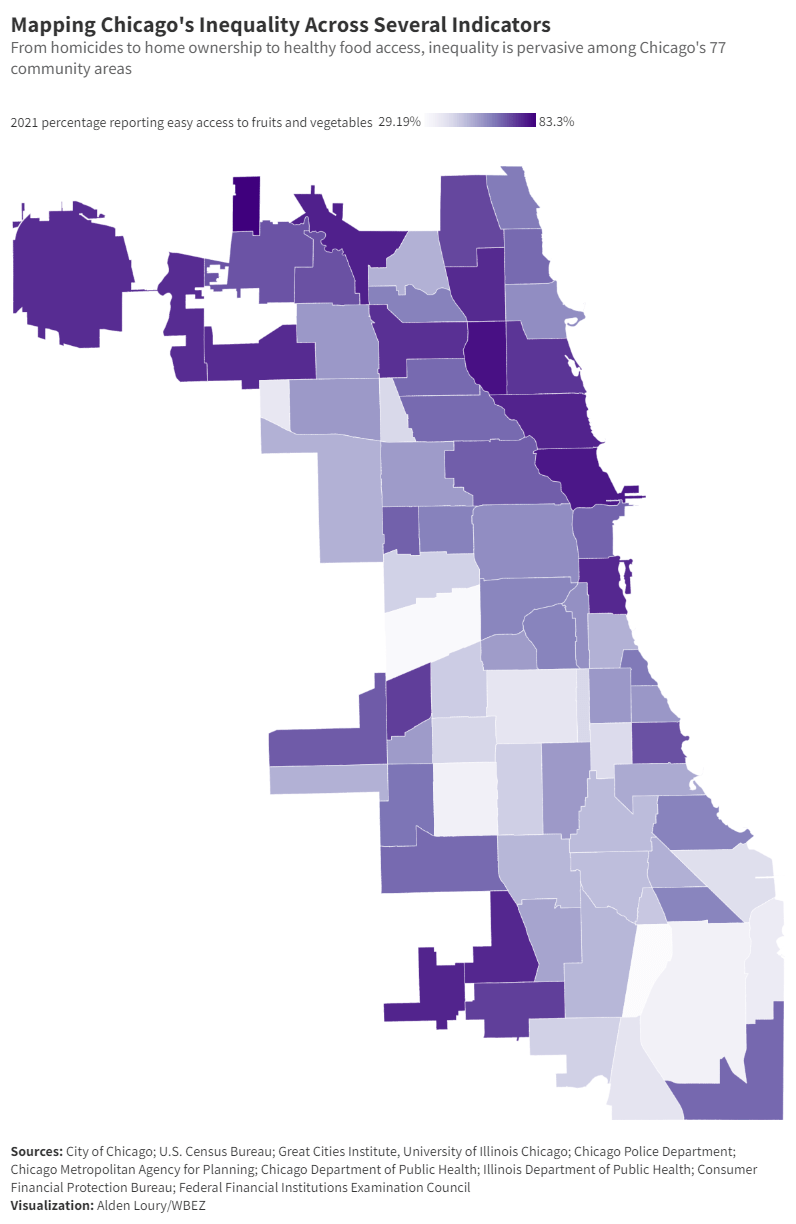
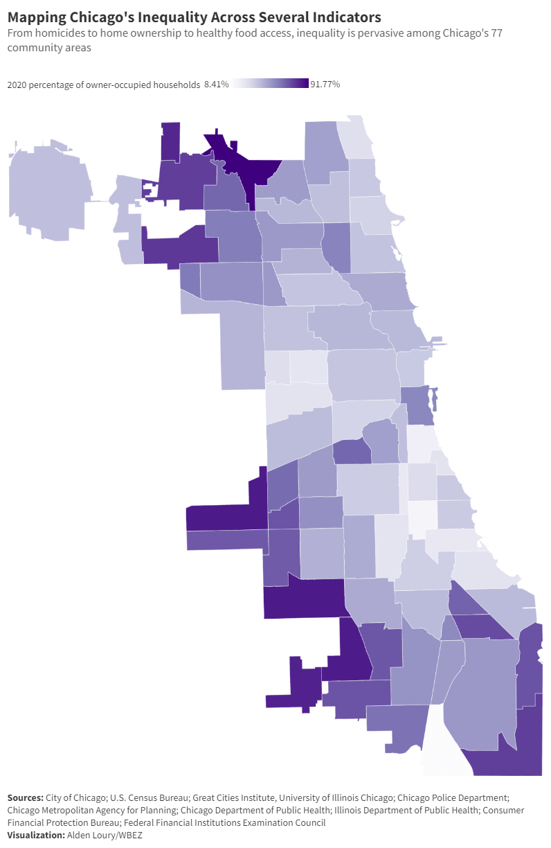
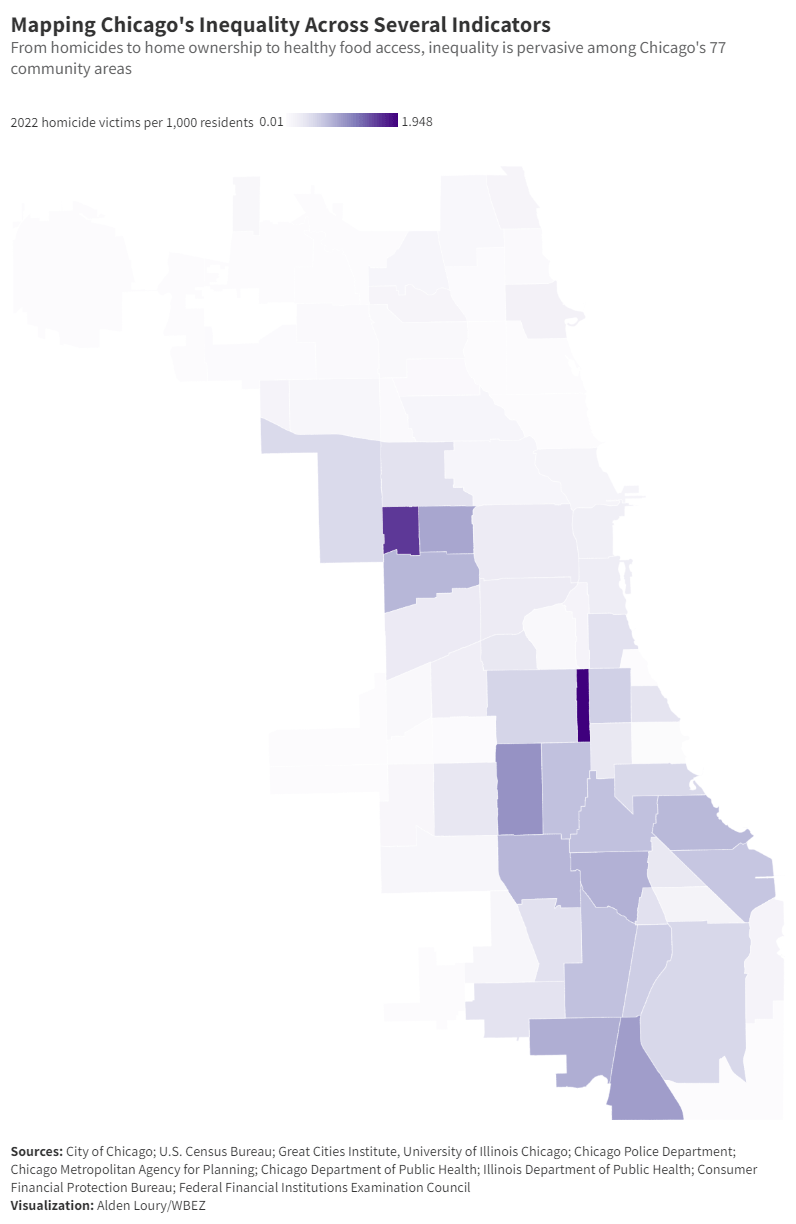
“When I was at the Chicago Reporter we would kind of joke that we could recycle the same map for many of our stories,” Loury told us in an email. “The map for a story about fatal police shootings is practically the same map we could use on a story about drug arrests, police traffic stops, concentration of people with criminal records, retail leakage, school expulsions, red light/speed camera tickets, mortgage loan denials, properties with delinquent property taxes, municipal water debt, rates of violent crime, pharmacy closures, COVID-19 cases and deaths, and the list goes on and on.”
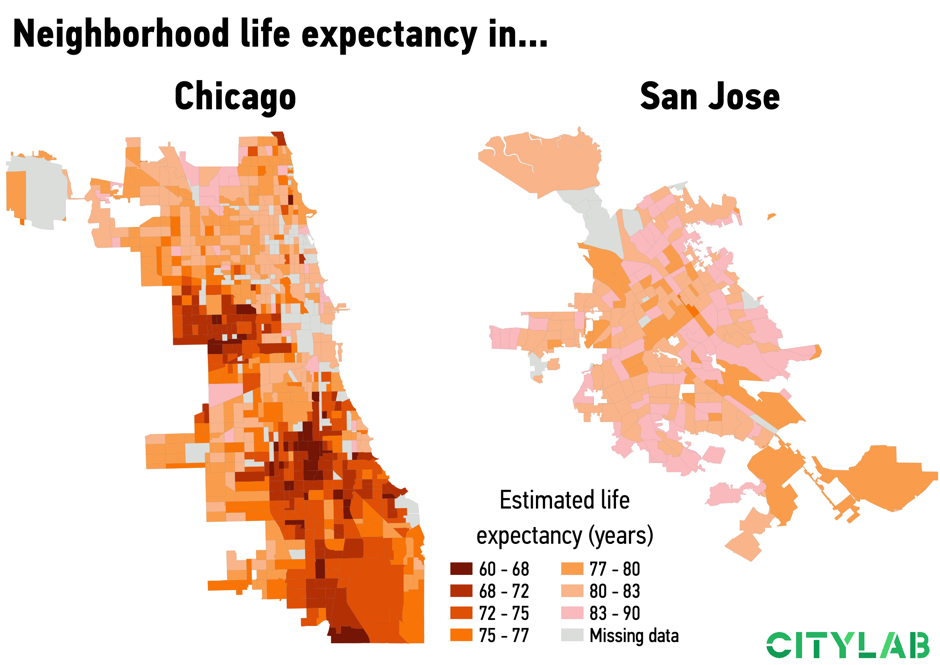
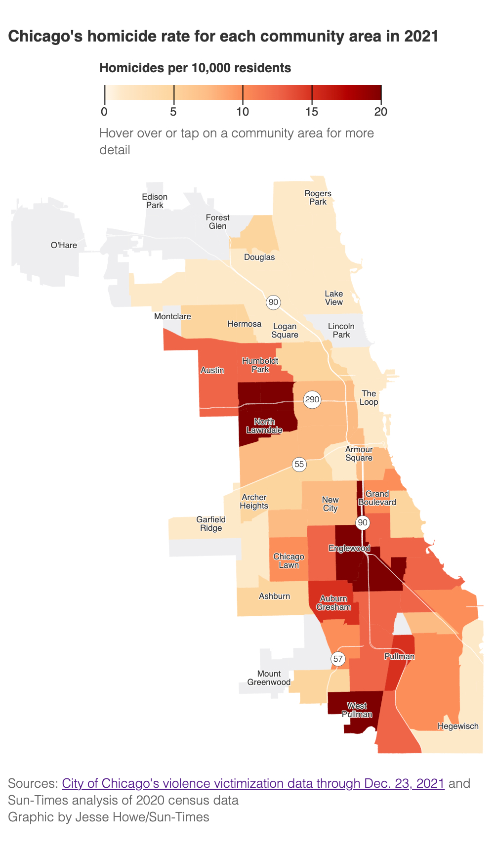
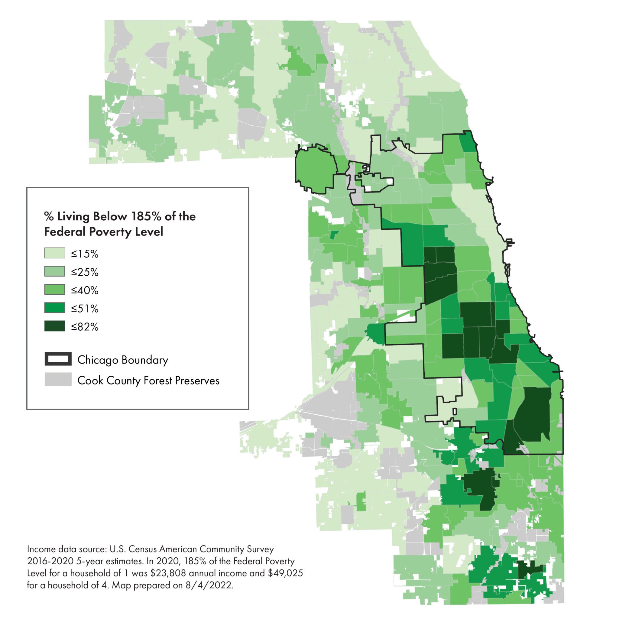
Certain neighborhoods are almost always shaded on that one map: West Pullman, Auburn-Gresham, Englewood, North Lawndale, West Garfield Park, Austin.
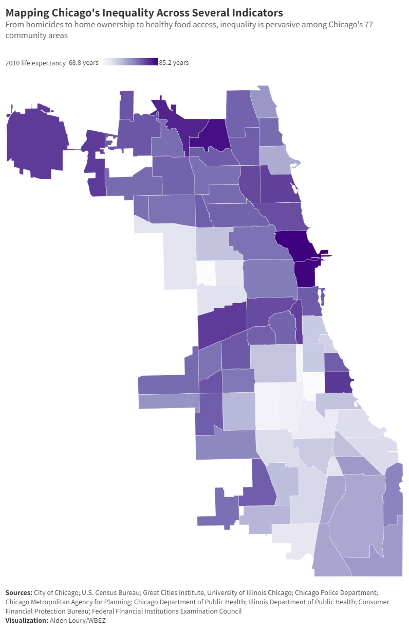
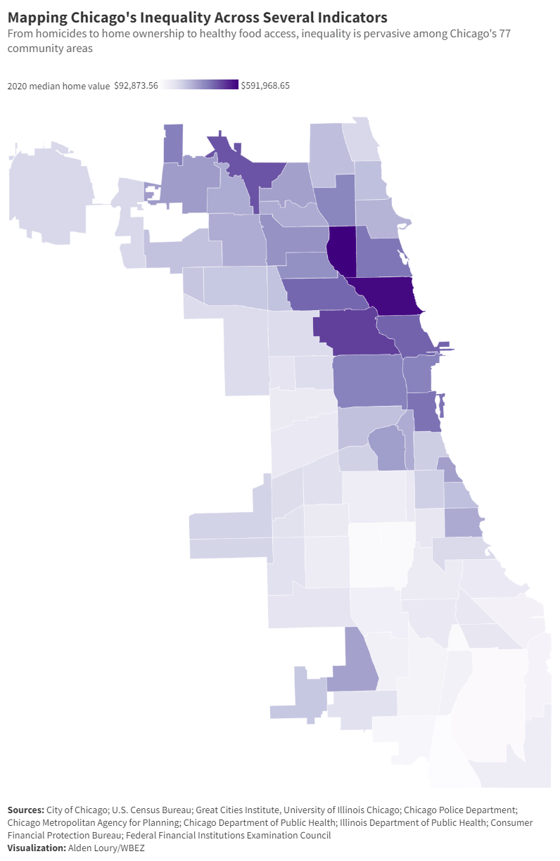
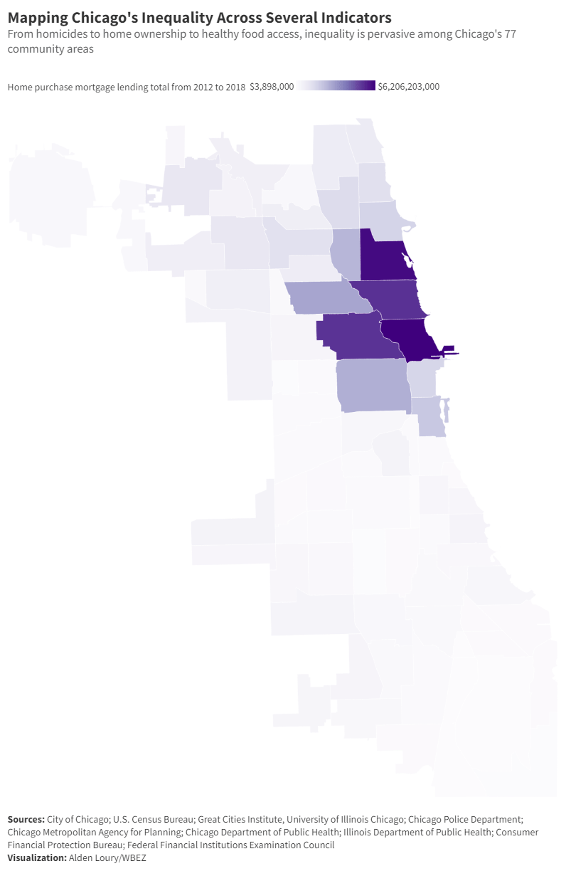
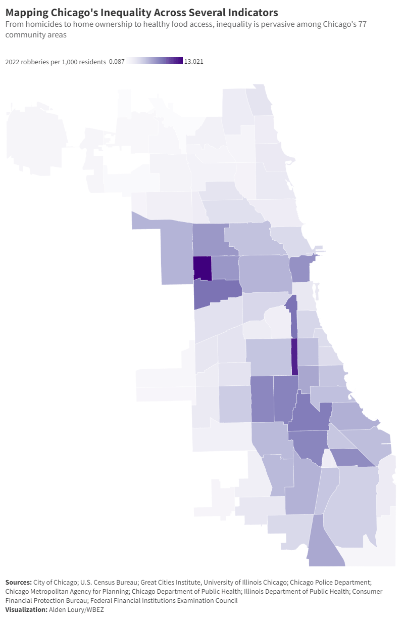
Swipe through the images below for examples.
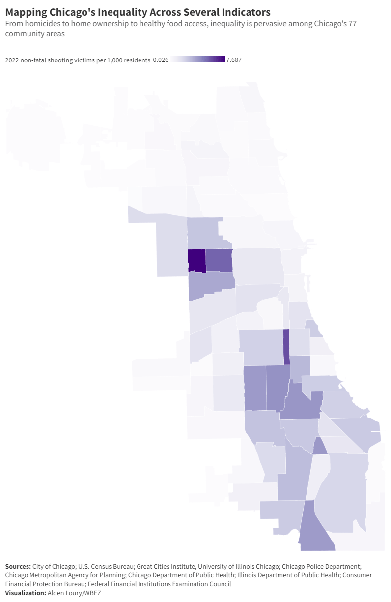
“It should be noted that these communities also struggle with poverty, undereducation, underemployment and trauma — all factors that contribute to other social issues,” Loury said. “However, at the top of the list of the reasons why is race. Structural racism is a real thing — when you have elements of implicit bias and racial prejudice at play among individuals and institutions across various systems like our education, employment, economic and criminal justice systems, it creates a self-sustaining infrastructure of racial inequality that is visible in every aspect of life. I think that’s the primary reason why the maps resemble each other and why it has been so difficult to address the challenges. Essentially, the only way we’ve figured out how to change those maps is by changing the people who live in those communities that are typically home to the worst outcomes.”
Lori Lightfoot tried to change the outcomes with her INVEST South/West program. A map of projects funded by INVEST South/West is yet another iteration of that one map. In the first round of this year’s mayoral election, the precincts Lightfoot won formed that one map. (It looked very similar to Harold Washington’s 1983 election map, but because of the social ills illustrated by that one map, there aren’t nearly as many voters there as there were 40 years ago, hence Lightfoot’s loss.) In the second round, those precincts voted for Brandon Johnson, who lives in Austin, a community frequently represented on that one map. Johnson has also promised to change the outcomes that produce that one map.
“I know what I’m talking about when people rely on public transportation, because it is not reliable,” Johnson said on election night. “People have lost their jobs because of an unreliable unsafe transportation system. So when I talked about investing in people, I know what I’m talking about. When I talk about this city, feeling unsafe for so many, because as a husband, as a father, raising three children on the west side of Chicago, I’ve had to shield my children from bullets that fly right outside our front door. Or the student who looked me in the face, who said, ‘Mr. Johnson, you shouldn’t be teaching here. You should be teaching at a good school.’ Too many people in the city of Chicago, we recognize value, but too many of us don’t believe that we deserve it. That changes under a Johnson administration.”
Can the map ever change, though? Its contours are almost as permanent a feature of Chicago’s geography as the lakefront. Until it does, here are some examples of that one map of Chicago: